This site uses cookies to improve your experience. To help us insure we adhere to various privacy regulations, please select your country/region of residence. If you do not select a country, we will assume you are from the United States. Select your Cookie Settings or view our Privacy Policy and Terms of Use.
Cookie Settings
Cookies and similar technologies are used on this website for proper function of the website, for tracking performance analytics and for marketing purposes. We and some of our third-party providers may use cookie data for various purposes. Please review the cookie settings below and choose your preference.
Used for the proper function of the website
Used for monitoring website traffic and interactions
Cookie Settings
Cookies and similar technologies are used on this website for proper function of the website, for tracking performance analytics and for marketing purposes. We and some of our third-party providers may use cookie data for various purposes. Please review the cookie settings below and choose your preference.
Strictly Necessary: Used for the proper function of the website
Performance/Analytics: Used for monitoring website traffic and interactions
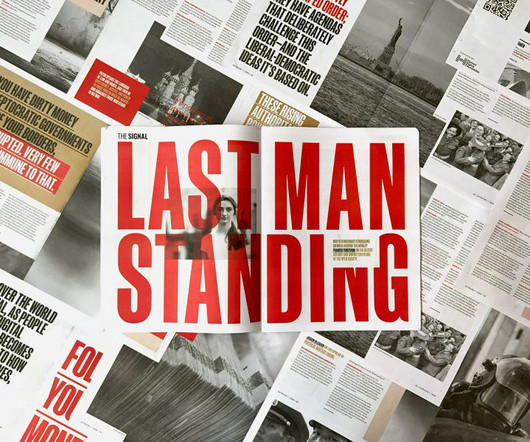
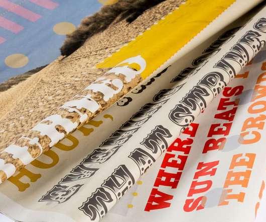
Reworking a sensitive political topic into an engaging, accessible and design-led publication was one of the challenges that design studio Sister Mary encountered during the project. Sister Mary has designed a limited-edition printed publication for an emerging current affairs brand, The Signal.
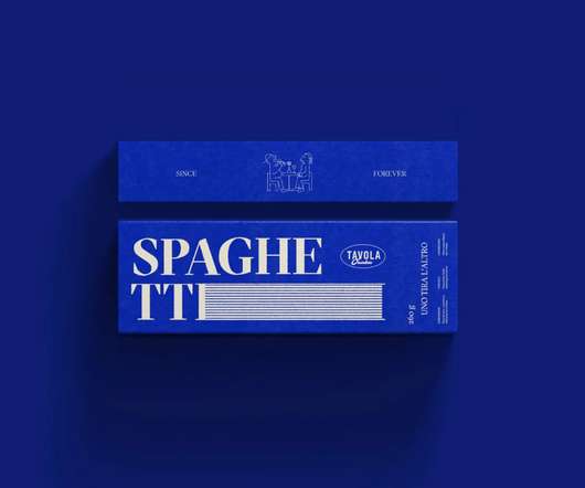
Focused on typography and elements around it, the design uses lines, waves, and simple shapes to suggest the pasta rather than placing photos on it. The choice of colors and simplicity, along with simple line-based illustrations, are an amazing publicity for this Italian restaurant located in the heart of Osaka, Japan.
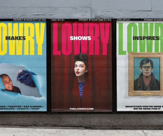
With big, industrial-era typography, a "straight-talking" tone of voice and a vibrant colour palette, the new identity marks a fresh chapter for the arts centre. EDIT's challenge, therefore, was to help Lowry redefine its public image and communicate the full breadth of its offer.
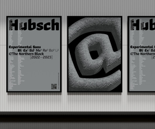
Nurom Next by The Northern Block Ten years in the making, Nurom Next represents a significant evolution in multilingual typography. Its thicker weight draws from public announcement styles, while the thinner variant evokes sophisticated architectural and invitation design.
Zoos increasingly see themselves as champions of the natural world, helping protect endangered species and educate the public about environmental destruction. Logo, typography and patterns The new logo is a custom 'C' with a hidden counter form inspired by a rhinoceros horn. But behind the scenes, there's a lot more going on.
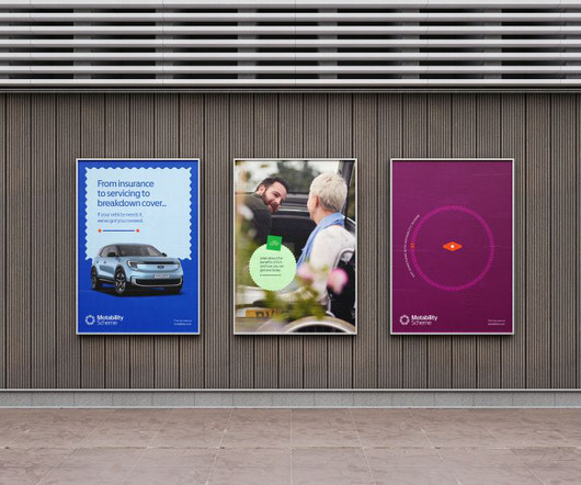
Most recently, the service has begun providing extensive support for its new range of electric vehicles (EVs), including standard home charge point installations and help to access the public charging infrastructure.
Unlike platforms that encourage public sharing, mymind keeps your repertoire entirely private. Whether you're working on branding, typography or photography, this platform is an excellent resource. If you're ready to expand your horizons, here are eight alternative platforms to ignite your creativity.
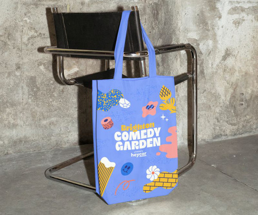
Hosted by Sarah Horn, designer at studio.build and author of En-Suites Available , along with Justin Burns , Head of Art & Design at Leeds Beckett University and researcher of British seaside typography, the tour on 14 May will begin at the Comedy Carpet, then lead from the promenade onto the adjacent streets and deep into the seaside city.
The studio is widely celebrated for its bold use of colour, form and typography, pushing the boundaries of what branding and design can achieve. This year, they've also launched a sister agency focused on typography and type design, called Type of Feeling. KALW by COLLINS KALW by COLLINS KALW by COLLINS 25.
Returning to Milton Keynes this May, All Flows has curated a proper treat for anyone with even a passing interest in graphic design, typography, illustration and creative innovation in general. The festival takes place at MK Gallery, an architectural gem that presents significant exhibitions alongside extensive public programmes.
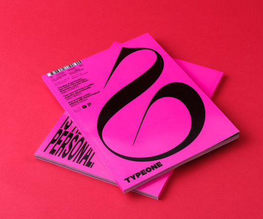
Taking inspiration from an underground, often undesigned, style and elevating it into a premium publication was one of the design studio Sister Mary's challenges with the project. Sister Mary has designed a limited-edition printed publication for an emerging current affairs brand, The Signal.
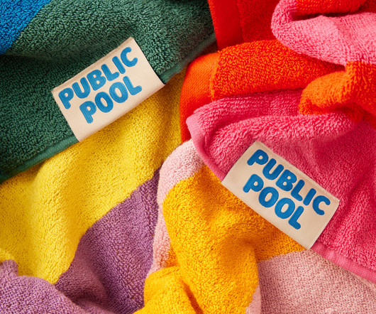
But we’re becoming a little more attuned to the joys of an open air funsplash: over the past few years we’ve seen the The post Public Pool by Perky Bros appeared first on BP&O - Branding, Packaging and Opinion.
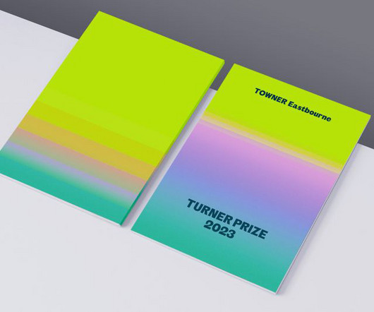
Tangent's design cleverly integrates the existing Towner brand elements, such as typography and colour, presenting the Turner Prize as a natural extension of Towner's identity. It represents renewal, the cyclic nature of art, and the continuous public discourse fostered by the Turner Prize.
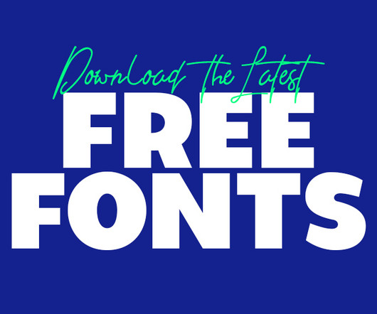
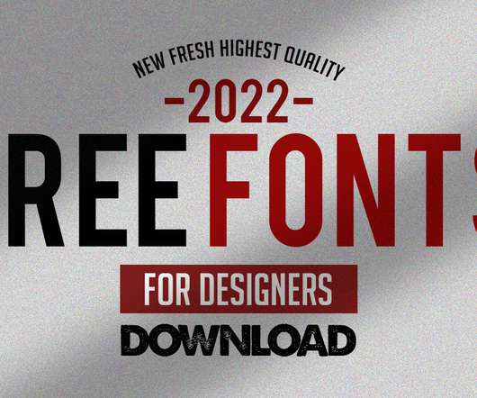
Using the latest free fonts and fresh typography styles can instantly improve your work and keep your designs looking modern and creative. Whether you’re designing a logo, creating typography for brochures, or working on brand guidelines, the latest free fonts can be a game-changer.
All photography by Yeshen Venema TYPEONE magazine isn't just a beautifully designed print publication; it's also full of key insights about the evolving interaction between typography and graphic design. Ultimately, typography doesn't exist in a vacuum but is just one element in a dynamic and ever-evolving design landscape.
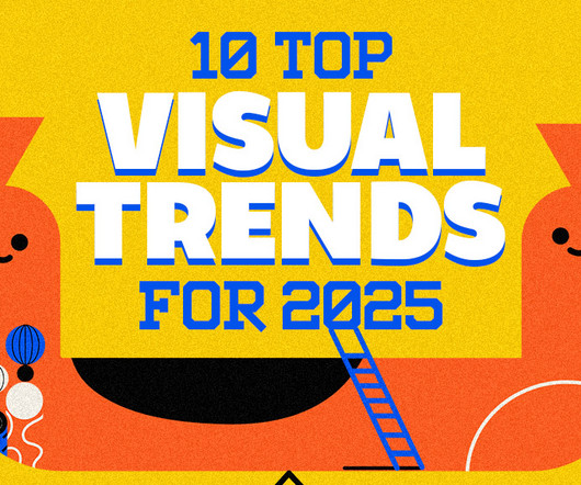
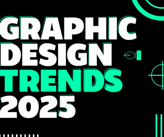
As we delve into graphic design trends 2025 , web design trends 2025 , and logo design trends 2025 , we’ll also highlight the influence of AI, typography innovations, and sustainable practices. Whether you’re a designer, marketer, or brand strategist, staying ahead of these trends is essential to creating relevant, impactful designs.
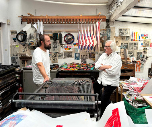
His career spans decades, from co-founding the experimental printing workshop at Watford to establishing The Typography Workshop in 1989, where he continues to champion movable type in the modern era. Theo Hersey, now the director of The Typography Workshop, continues Kitching's tradition of teaching and printing.
Even if you love typography, your view of it may be blinkered by geographic and historical filters. From the screens we tap on, the movies we clap for, the transit system we navigate or the books we cosy up with, typography is around us all the time. Much of this work has been rarely or never before seen by the public.
Fight for Kindness 2024: A Global Typography Showcase for Kindness A Showcase of Global Participation “Fight for Kindness 2024” attracted over 500 submissions from 355 artists spanning 23 languages and scripts, marking its largest and most diverse turnout yet.
Gemma O'Brien Fuchsia Macaree, in association with Creative Boom Since its inception, Add-Art has tripled in size on its mission to provide the public with uplifting visual narratives. "Rather than having to see something that plays on your emotions to get to your pocket, we can offer something light and easy on the eyes, mind and soul."
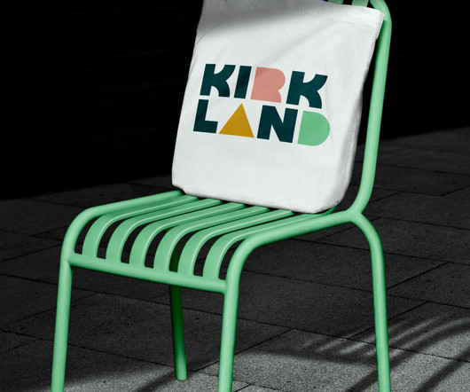
From the public's point of view, inner-city development is always a bit of a mixed bag. Kirkland Urban is a vibrant extension of downtown Kirkland, bringing together a collection of neighbourhood services, shops, restaurants, and a large public plaza. On the one hand, we all like to see urban renewal and shiny new places to visit.
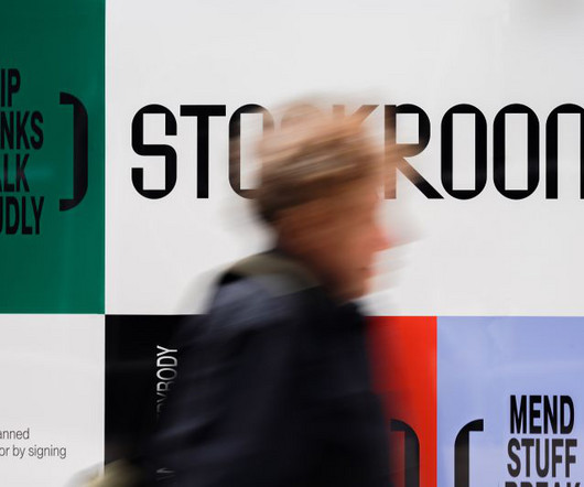
Otherwise, the consequences for social and public life could ultimately be quite serious. The typography reflects the large, rectangular structures that crown the building, paying homage to the past while looking forward to the future. Public participation Unusually, Stockroom also engaged the local community in its design process.
This trend takes inspiration from the past’s vision of the future, often characterized by neon colors, metallic accents, bold geometric shapes, and vintage typography. Graphic Design Elements: Designers use retro-futuristic color schemes and typography to create posters and social media graphics.
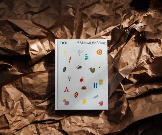
So I design the typography for all the books first in that way. The length of the title and the subtitle dictates how big the typography will be. With strict rules laid down for the typography, then, the image comes second. Recently, he's been super excited to work on The Book of Do, the publisher's anniversary publication.
Best of all, this is a flexible degree that can be tailored to your interestsfor example, in app development, animation, visual identity and branding, illustration, photography, typography and publishing, or graphic design in general. He has also shared his expertise through Guardian Masterclasses.
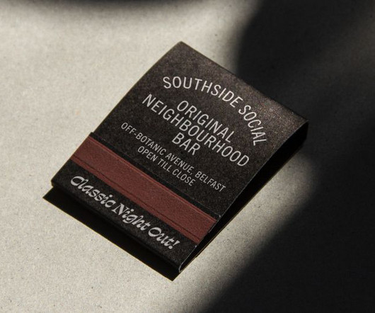
From the colour palette to typography, here's how they went about it. Colours and typography Along similar lines, the Southside Social's colour palette was informed by the spirit of 80s bars and smokey social clubs, with hues such as Beer Foam White and Gulf Blue. It's often difficult to define what makes a specific bar a hit.
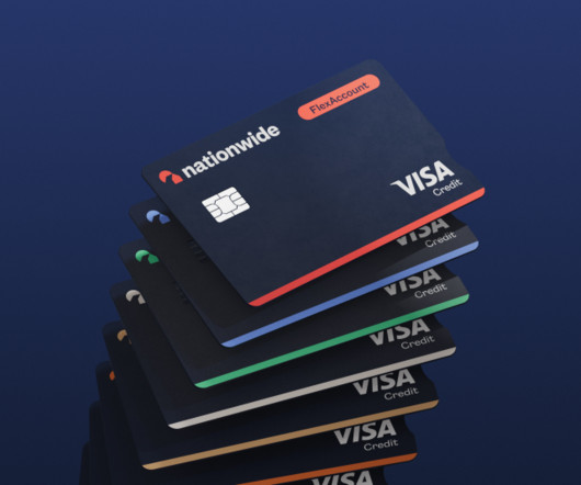
The modernised rebrand, its biggest since 1987, is set to be rolled out across Nationwide's network of 605 branches and reinforces its promise to keep all of its hubs open to the public in an era when other banks are closing their doors. The new logo modernises and simplifies the Nationwide icon.
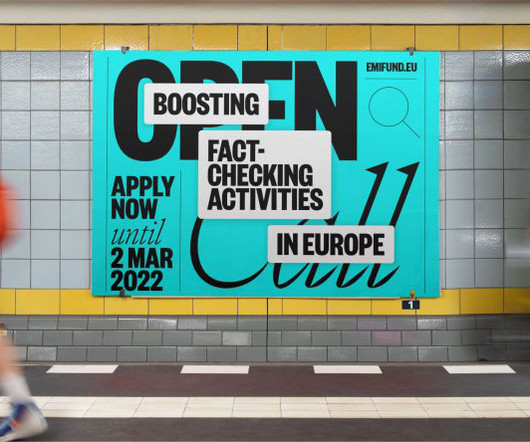
EMIF provides grants to projects that improve the quality of information in the digital age, foster critical thinking, and enhance the public's ability to discern reliable information. From print design, we incorporated the typography style of traditional publications and a visible grid with thin lines separating columns and spaces.
Logo and typography Once the illustrations were approved, Oat Studio extended this style across all festival materials, including social media assets, T-shirts and signage. We wanted the typography to complement and enhance Hedof's playful illustrations while ensuring the festival names remained prominent."
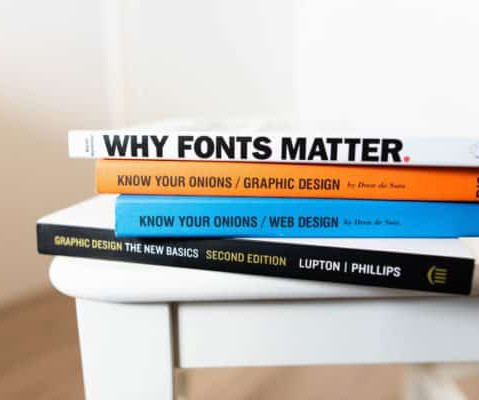
Learning about Typography: The Typography Primer Book was actually first published waaaay back in the day, circa 2000, but the contents are still very relevant over a decade later, and includes Glossary of Typographic Terms. I’ve printed mine out, and actually had it spiral bounded and laminated. What’s in a Letter 2.
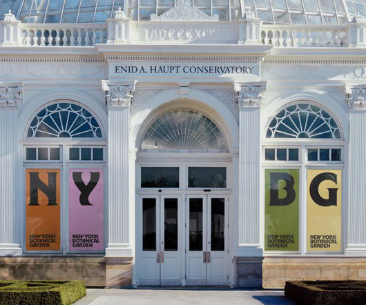
It has played a crucial role in shaping the cultural landscape of New York City and has been a pioneer in public education and community engagement. Logo and typography At the heart of the new identity is a refreshed logo featuring a modern sans serif typeface. But its significance extends beyond its vast collection.
Whether you’re creating a print publication or a simple mockup, they offer a professional look. From there, typography helps to inform readers and create a mood. Combine bold typography with product shots or illustrations to catch the reader’s eye. Use big, bold photos and typography to style your product.
Their work ranges from graphic identities and experimental typography to spatial design and experiences in public spaces. The studio is interested in exploring the boundaries of visual systems and how these can be presented in various ways.
Its goal was to make the best use of Mexico's cultural wealth to promote economic growth and social development, working on two main challenges: firstly to protect Latin America's rich cultural heritage, and secondly to bring arts and culture into public education.
The Degree Show is open to the public from 1-9 July at the university's Greenwich campus. Buckinghamshire New University's annual Art & Design Summer Show will be open to the public from 17-22 June at their High Wycombe campus (in W7 and on the first floor of Timberlake). The Degree Show , Ravensbourne University.
classic & decorative typography Web Designs. All twenty five of these fonts have been demonstrated to be free to use on both non-public or commercial projects, however please do take a look at the licenses simply in case they do change. The following fresh free fonts are ideal to make an creative design and perfect for any artwork.
Learn More Latest Price on Amazon: Sale 81 Reviews Design Is a Job Audible Audiobook Mike Monteiro (Author) - Mike Monteiro (Narrator) English (Publication Language) 03/31/2014 (Publication Date) - A Book Apart (Publisher) $12.99 Those three are well-known as Typography, Gestalt, and Interface. Buy on Amazon 3. Thinkertoys.
There's no point in just being wacky just for the sake of it, though: there has to be an underlying, original idea or goal if you want to push typography forward. In other words, it would sit just as comfortably at home in a video-game interface as it would in concrete for a piece of public architecture.
So, tell us as much as you can about the visual components of your design, discussing the colour palette, typography, logo, and any other key visual elements. Consider an embargo Indeed, if you're sending to multiple media outlets, then you're always going to have the problem of no publication wanting to be second with the story.
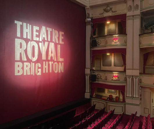
Visual identity The rebrand includes a full overhaul of the theatre's visual identity, encompassing a new logo, colour palette, typography, and comprehensive design system. The new brand was unveiled to the public with a series of celebratory events and promotions. New internal wayfinding will follow in the next phase of the project.
However, with various stakeholders managing the destination and no single brand to define the region, communications had become cluttered, complex and confusing to the public. Meanwhile, the wider design language ebbs and flows through the use of supergraphics, integrated typography and a colour palette lifted directly from the region.
EMIF provides grants to projects that improve the quality of information in the digital age, foster critical thinking, and enhance the public's ability to discern reliable information. From print design, we incorporated the typography style of traditional publications and a visible grid with thin lines separating columns and spaces.
To unite the spirit of New York City and the natural beauty of the Garden, the typography references hand-drawn forms found in nature while also evoking a confidence that speaks to the organisation's impact. This includes a new hand-drawn logo focusing on the shorter, bolder NYBG abbreviation.
We organize all of the trending information in your field so you don't have to. Join 66,000+ users and stay up to date on the latest articles your peers are reading.
You know about us, now we want to get to know you!
Let's personalize your content
Let's get even more personalized
We recognize your account from another site in our network, please click 'Send Email' below to continue with verifying your account and setting a password.


Let's personalize your content