This site uses cookies to improve your experience. To help us insure we adhere to various privacy regulations, please select your country/region of residence. If you do not select a country, we will assume you are from the United States. Select your Cookie Settings or view our Privacy Policy and Terms of Use.
Cookie Settings
Cookies and similar technologies are used on this website for proper function of the website, for tracking performance analytics and for marketing purposes. We and some of our third-party providers may use cookie data for various purposes. Please review the cookie settings below and choose your preference.
Used for the proper function of the website
Used for monitoring website traffic and interactions
Cookie Settings
Cookies and similar technologies are used on this website for proper function of the website, for tracking performance analytics and for marketing purposes. We and some of our third-party providers may use cookie data for various purposes. Please review the cookie settings below and choose your preference.
Strictly Necessary: Used for the proper function of the website
Performance/Analytics: Used for monitoring website traffic and interactions
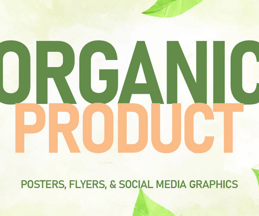
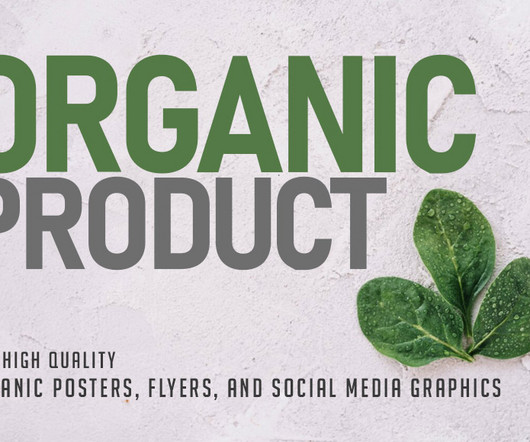
Whether youre promoting eco-friendly products or running a sustainable business, using well-designed organic posters, flyers, and social media graphics can help you connect with customers who value nature and health. These designs should reflect your brands commitment to sustainability while showcasing your products in a clean, appealing way.
Creating compelling designs for organic products can be the key to engaging eco-conscious consumers. With growing awareness of sustainability and health, brands that focus on organic products need visuals that communicate these values effectively. Promote your Products and services with this great looking Banner Set.
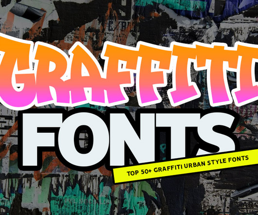
Graffiti-inspired fonts are more than just an artistic expressionthey’re a bold way to infuse personality, energy, and urban flair into your projects. Start exploring these graffiti-inspired typefaces to create standout visuals that captivate your audience and elevate your projects.
While brands in the fusion space are already falling into stereotypes, STEP is standing out from the crowd with a colour palette inspired by the synthetic image of future plasma. NASA is more than a space centreits brand is iconic, something people wear on t-shirts and tote bags, something that could inspire future generations.
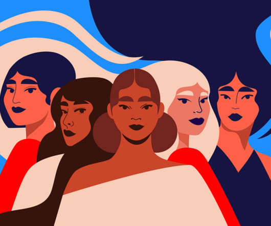
But with that comes a million products, all vying for attention – against both each other and knock-off versions on sites like Teemu. From New York to Seoul, they demonstrate how great branding can elevate health and beauty products from mere commodities to transformative experiences that resonate with people's values.
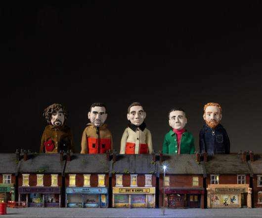
"These technologies enable us to create pre-visuals before production begins, allowing for more effective scheduling and providing clients with a clearer vision of the final product," says Jennifer Kidd, director at Scale Model Studios.
Each piece is an invitation to see the world a little differently – to feel seen, understood and inspired. With so many varied interests, one aha moment always leads to another, keeping me inspired and curious." She's staying positive, always looking for new ways to learn, explore, and experiment, and seeking new forms of inspiration.
A family affair The production became an ambitious family enterprise, with each member taking on significant creative responsibilities. When production hit technical hurdles that threatened to derail the project, the family received crucial guidance from the Rasch family, respected figures in the stop-motion animation industry.
A typeface inspired by the waggle dance of a bee and illustrations that help visualise the location and seasons behind each product – OMSE ends the year on a high with its new identity for a British honey brand that aims to "free the bee". Did you know that honey is the world's third most faked food product?
The rebrand brings a sense of freshness and flair that matches the product's personality. Inspired by the texture of fresh fruit and the tactile charm of traditional coffee equipment (notably the iconic Italian Moka pot), the shape delivers both a functional and aesthetic punch. Design-wise, the label balances familiarity with flair.
Curious about the production process, we asked Georgsen to share how the Tivoli tables came to life. His answers from the original inspiration to the techniques used in crafting the collection might surprise you. What inspired you to reimagine Play-Doh creations as a concept for the Tivoli table designs?
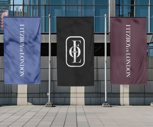
Studio Up North (SUN) has rebranded accessible bathroom designer and manufacturer Fitzroy of London, giving it an identity that reflects the craft and quality of its products while unifying its portfolio under one name. It conveys the emotional appeal of the products to win a lasting place in customers' minds.
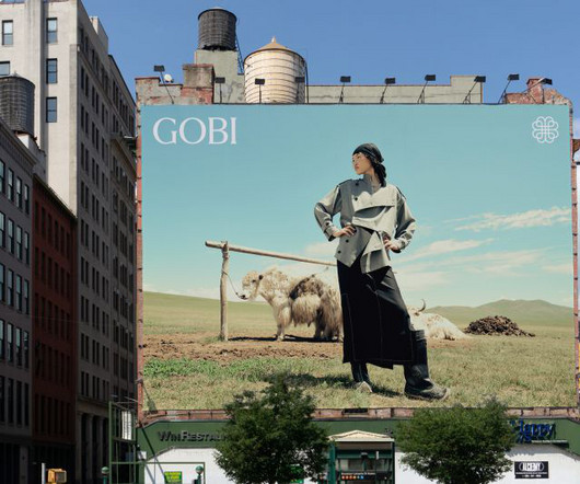
This creates a higher-quality, noticeably softer product. The symbol, created by interlocking four heart shapes, represents a virtuous cycle in which everything from the raw product to the garments is produced in Mongolia by Mongolians. Rob immediately fell in love with the people and the landscape of Mongolia. "We
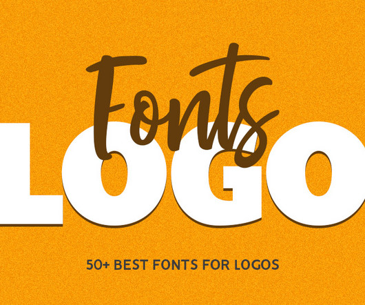
Thats why designers often turn to collections of the best logo fonts for inspiration. Fasrie Luxury Modern Logo Font Fasrie is a modern, elegant and classy serif typeface, best used as a display for headings, logos, branding, magazines, product packaging and invitations. Aqem Logo Font Aqem Inspired by art nouveau Design Era.
The Brooklyn studio began by creating a system inspired by the visual cues of track mixing with certain elements becoming subtle gestures that hint at BPM's product without being too literal. Motion brings the system to life thanks to Thales Muniz and Duncan Brazzil. Neutrals sit beside this vibrant palette to add trust and confidence.
This work, imbued with emotional sensitivity, can be found in art galleries, books and commercial products. Unbridled sensations "I was inspired by an idea called 'Walking meditation', that is, to discard the distractions of thought and embrace the unbridled sensations of objects and our surroundings," says Zhongwen.
Inspired by a diverse range of artists, including Prince, Frida Khalo, Barry McGee and Norman Rockwell, to name a few, Sam began developing his own signature style. "I I was inspired by Prince because of his stubborn dedication to being original and for having such a range in his music," Sam explains.
How can branding help to communicate urgency and the dire state of the planet while still inspiring hope and optimism? The goal of the rebrand was to better communicate the urgency of WRAP's ambition to reform unsustainable 'take-make-dispose' production systems in favour of more sustainable and circular ones.
But beyond high-profile events, Tellart's work consistently explores how spatial experiences can shift perspectives, spark curiosity, and inspire action, particularly in the realm of climate awareness. We acknowledge our immaterial reality," she explains. Our material world can no longer be separated from the immaterial digital plane.
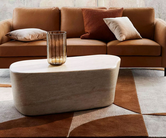
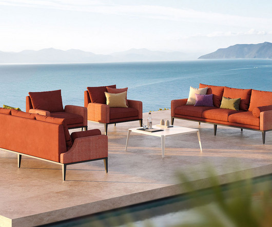
When it comes to idyllic outdoor living, Italy’s picturesque coastlines and lakefront vistas often come to mind and offer timeless inspiration for creating a luxurious home retreat. “We regularly design custom furniture in our projects, and it’s exciting to see Varenna and Avant join the esteemed line of Walters products.
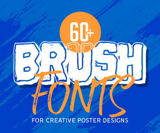
The ultimate collection of creative Brush Fonts for posters is here to inspire and elevate your designs. Inspired by traditional hand-painted signs, this typeface showcases bold, sweeping brush strokes and a natural, textured look that brings an authentic, handcrafted feel to any design. Proudly present brush font Corza.
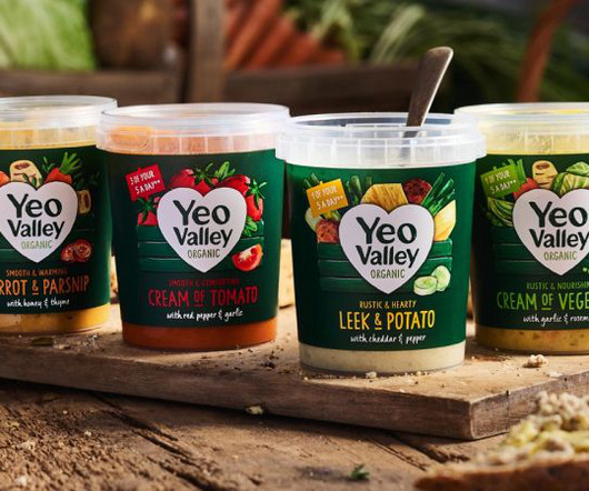
New illustrations are a key part of the brand's new identity, designed to help its new Greek and Kefir products stand out on the shelf. London-based B&B studio has revamped Yeo Valley Organic's entire visual identity and product range architecture through a combination of small tweaks and more dramatic overhauls.
Through its identity, Lazy Tan wanted to spotlight its hassle-free product and celebrate sun avoidance as a smart, modern choice. Gibbs says, "We overcame this by focusing on a unique shadow-inspired identity and a confident, minimalistic approach. Having a cohesive and impactful brand experience was also a priority for Derek&Eric.
Designed to accommodate the evolving needs of its employees, the automotive brand’s office integrates contemporary, colorful aesthetics with ergonomic principles to foster a productive and inspiring work environment. Distinctive design elements further personalize the space.
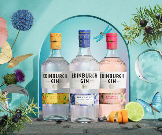
Some elements of the new identity are inspired by the architecture of the brand's new home in Edinburgh's city centre, The Arches. With this project, D8's scope was to develop key product visuals that could be applied to many touchpoints, as well as a toolkit of supporting assets, templates and comprehensive guidelines.
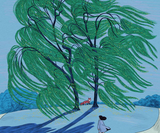
And it's this crowded way of living which has inspired local illustrator Yuki Uebo to fill her drawings with as many people as possible while also capturing the unique essence of Japan in the process. I use the power I feel in the gathering of people and things as inspiration for my illustrations. The secret behind her success?
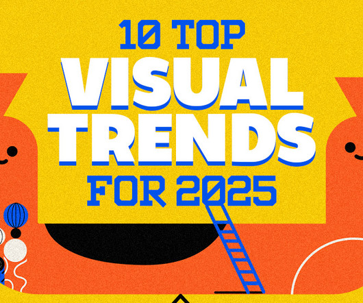
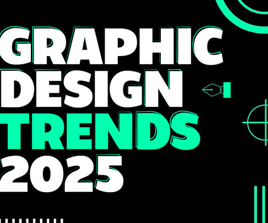
How AI-Powered Generative Design Works The Impact on Visual Design Applications of AI-Powered Generative Design The Future of AI in Design Challenges and Ethical Considerations Why AI-Powered Generative Design is One of the Top Visual Trends for 2025 Trend 3: Biophilic Design and Nature-Inspired Aesthetics What is Biophilic Design?
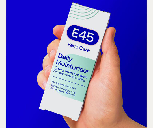
Iconic skincare brand E45 has revealed a modern and inclusive rebrand inspired by skin cells. That meant our design strategy for revitalising its brand had to strike a balance between capturing scientific expertise – summed up by pharmacists and people seeking help with specific skin conditions – and those who use E45 products more every day.
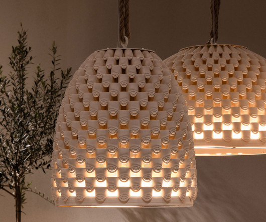
In the world of ceramics, 3D printing has revolutionized design and production, offering levels of precision that are difficult to achieve by hand. The design of the Haibu lamps, which work both indoors and outdoors, is inspired by the natural, organic structure of a beehive.
As for the colour palette, Athletics channelled a diverse array of tones – modernist aesthetics inspired by fashion and skincare, film culture and research consultancies. As a transitional asset – a lockup with a full 'Extreme Reach' wordmark was created for the launch.
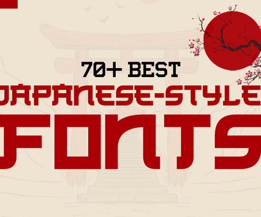
Incorporating these fonts into your designs can: Elevate Branding : Establish cultural relevance and authenticity, especially for businesses targeting a Japanese or Asia-inspired market. Designed with minimalist rough stroke and Kanji letters inspired. Inspired by modern Japanese food branding and anime title. Download 3.
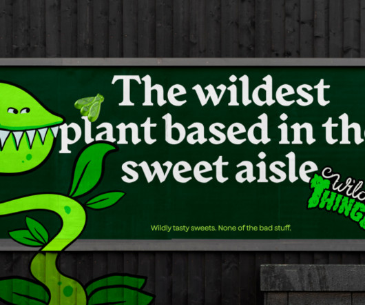
The logo is made out of thorns and bushes—a Venus flytrap mascot with a mohawk supposedly inspired by grunge skater and snowboard brands. Cat How and the team then developed the product SKUs and designed packaging, point-of-sale media, launch assets and the website. The typeface is very much rock-and-roll. Kids are going to love it.
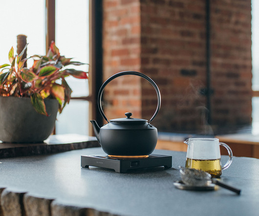
MoonKettle is outfitted with various sound options, including a Kyoto-inspired piano, a xylophone inspired by Japanese gardens, and a Chinese night market-inspired string instrument. This light, crisp white accentuates the carefully wrought curves of the MoonKettle, inspired by generations of tea culture that came before it.
One such winner was Studio Tumpić/Prenc 's contemporary bottle design for Istriana, inspired by Roman containers that might have stored olive oil. Custom caps and an elegant palette distinguish each product, with vibrant gold-printed labels for shelf appeal. as a vibrant standout in the market.
Every creative should know about these 25 design studios and learn from their inspiring work. In a world overflowing with creativity and design innovation, there are thousands of outstanding design studios to be inspired by. Hopefully, their work will inspire you too.
HALFDAY, known for its prebiotic iced teas with all-natural ingredients and reduced sugar, already had a product that ticked all the functional boxes. The classic taste sitting at the heart of HALFDAY's product was inspired by those '90s brands," Bruce says, "so it felt natural to capture that spirit but modernise it for today's audience."
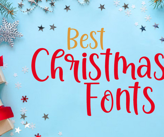
Whether you’re creating seasonal ads, personalized gifts, or social media graphics, these fonts are designed to inspire and elevate your creativity. Be it a hand-lettered Christmas card or a stunning holiday menu design, your work could inspire others to embrace the magic of typography this season.
This trend takes inspiration from the past’s vision of the future, often characterized by neon colors, metallic accents, bold geometric shapes, and vintage typography. A prime example is the work by digital artist Beeple, who often combines retro-inspired aesthetics with futuristic concepts in his digital art.
This only adds to the organic feel of her work, which is balanced, structured, and hierarchical thanks to her background in graphic design, but also infused with positivity and inspired by nature. Julie's self-initiated DANSK products. Julie arrived in Vancouver in 2017 after finishing her degree at the Royal Danish Academy of Design.
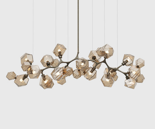
Designed in collaboration with renowned American architect David Rockwell , this new collection retains the geometric essence of the original while offering a contemporary twist inspired by natural clusters in crystals, clouds, and chemical compounds.
Product Box Mockup Psd 14. This saves time and boosts productivity, leaving you with more energy to focus on other aspects of your project. Many mockups are specifically tailored for different types of designs, such as product packaging, business cards, social media graphics, or even website templates. Cream Tube Free Mockup 10.
To gain valuable insight that would inspire and inform the design work, SomeOne conducted research groups, interviews, consultations, and meetings with members of the disabled community. This created an interesting challenge: how to improve every aspect of the brand experience for its diverse audience."
To me, the main product of my work is not the drawing in the end, but the time I spent with the drawing," says Karlotta. "I This was such a beautiful way to kick off because now I am very inspired and have all these ideas for compositions and colours that I can use as a basis for this project," says Karlotta. "In
Created by husband-and-wife duo James and Vicky Wall, Art Around Every Corner offers a deep dive into the stories, processes, and inspirations behind some of Leeds' most iconic murals. That focus on creating a comfortable atmosphere is reflected in the documentary's stripped-back production style. "We That day, I took the time.
We organize all of the trending information in your field so you don't have to. Join 66,000+ users and stay up to date on the latest articles your peers are reading.
You know about us, now we want to get to know you!
Let's personalize your content
Let's get even more personalized
We recognize your account from another site in our network, please click 'Send Email' below to continue with verifying your account and setting a password.


Let's personalize your content