Design is not about just making things “pop” or look cool. Fundamentally, design must serve a purpose and communicate an idea effectively. More importantly, solve problems for users while employing empathy.
Empathy, which is defined as the ability to understand and share the feelings of another, is a word getting tossed around a lot recently and shouldn’t be used simply as a marketing buzzword. It’s an important practice that should help bridge the gap between people. A way to truly understand another person, with their myriad of life experiences and influences, and how that affects their views, needs and life. One should endeavor to aid their audience in a way that works for them – NOT what YOU assume is the solution to their problem.
I take the time to stress this definition because “good” design employs understanding of a person’s psychological and emotional response when making seemingly innocuous decisions like color palette, the wording of a call to action, or imagery selection. At the end of the day, you aren’t designing for yourself or what makes you look cool; you’re designing for the audience you’re trying to communicate and solve problems for – you are being of service to them (but we can definitely still do this AND make things pretty rad).
Admittedly, as the pace of work seemingly only increases, it’s hard to keep this frame of mind and action genuinely intentional. Still, it’s something we should strive for – but this is a whole other can of worms and, frankly, I’d prefer to keep things light . . . so onto the importance of Accessibility.
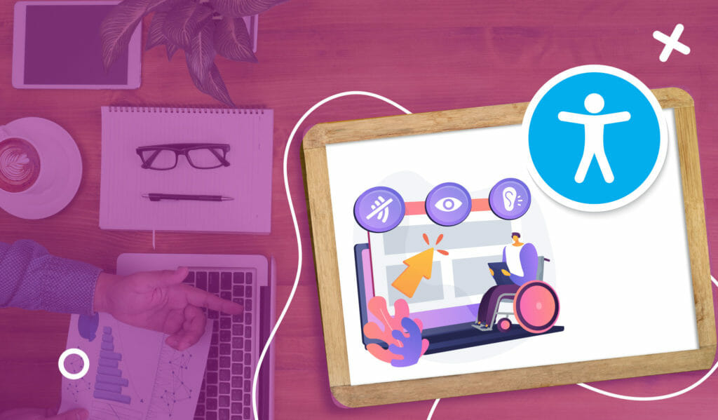
Soooo what can accessibility look like in a finished design?
Accessibility is thankfully gaining increased awareness in not just design but any services, communication, and so forth. Due in large part to increased empathy, we are learning that there are more people than we realized who struggle with challenges like color blindness, vision impairment, dyslexia, sensory overload, learning disabilities, and so much more that can greatly affect if they receive the information you’re trying to give them – effectively or at all.
Let’s take a look at how a landing page design can significantly impact how a user interacts with it.
Are the colors high contrast to help people with visual impairments?
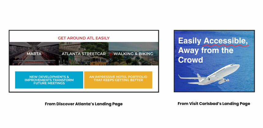
Colors can play a huge role in attracting attention to specific information or even be what makes them click on that CTA for your Lead Generation campaign, but what happens if someone couldn’t visually distinguish that button’s importance? A loss in a potential lead.
You can take a gander at what we did for Discover Atlanta & Visit Carlsbad’s landing pages. When it came to Atlanta’s page, utilizing their branding colors for color blocking purposes allowed us to section specific information visually. For Carlsbad, we used a vibrant red color as an accent to emphasize specific wording.
Does the usage of imagery on your landing page take into account sensory sensitivity and those with learning disabilities?
People who fall under this category might struggle with images or graphics that have too much visual clutter or colors that “vibrate” (when two high contrast colors are put together, it creates a vibrating effect that hurts the eyes. Some examples of these combinations are blue and pink, green and orange, or red and purple.) This could provide a sensory overload effect and lead them to leave your page.
Walls of text can also spell doom for those with learning disabilities who struggle to keep attention or are overwhelmed committing to reading something that isn’t broken up into digestible chunks through use of imagery, graphics, or concise writing. People are individuals as well as how their brain processes information, and that should be accommodated.
Attentiveness to social and culture contexts that might disrespect your audience
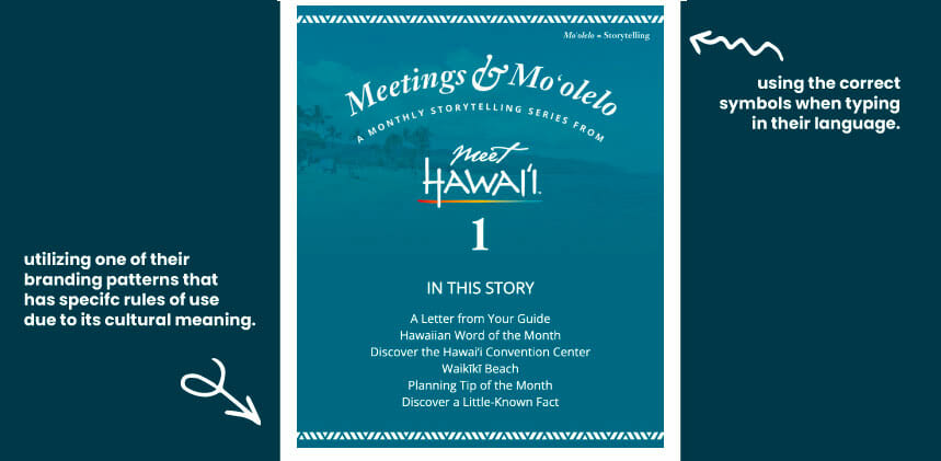
What might seem normal to you in terms of verbiage, imagery, or even colors could represent something demoralizing for someone else, and it’s important to keep that in mind when designing for your audience. For example, those who identify with being on the Autism spectrum find the puzzle piece symbol to be demeaning and reflective of an organization they don’t align with, thus pushing the adoption of the rainbow infinity sign to represent their neurodivergence.
Our work with Meet Hawaii has allowed us to become an extension of their team, taking the necessary care and attention to detail to represent the destination’s culture with respect to sales tools like their landing page, Digideck and meetings newsletter.
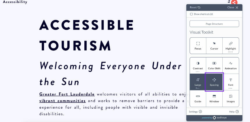
CVBs are taking notice, and we want to shout out Visit Lauderdale for including an accessible tourism page on their website. They also added an amazing feature onsite that allows users to customize their experience while on their website – from fonts and font size to color contrasts and turning off animations if possible.
As designers and those who employ us, it’s imperative to try and keep accessibility in mind when producing creative. It’s also important to be given the trust as professionals that we are trained in making these decisions when we work on projects. In the same vein, mutual accountability plays a major role; we must work together because, at the end of the day, it’s not who is right or wrong but are we serving our audiences in the best way we can with the resources and time we have.
Digital Edge is working on implementing our further education into the world of accessible design with our amazing clients and if you’re interested in working with us – reach out!