This site uses cookies to improve your experience. To help us insure we adhere to various privacy regulations, please select your country/region of residence. If you do not select a country, we will assume you are from the United States. Select your Cookie Settings or view our Privacy Policy and Terms of Use.
Cookie Settings
Cookies and similar technologies are used on this website for proper function of the website, for tracking performance analytics and for marketing purposes. We and some of our third-party providers may use cookie data for various purposes. Please review the cookie settings below and choose your preference.
Used for the proper function of the website
Used for monitoring website traffic and interactions
Cookie Settings
Cookies and similar technologies are used on this website for proper function of the website, for tracking performance analytics and for marketing purposes. We and some of our third-party providers may use cookie data for various purposes. Please review the cookie settings below and choose your preference.
Strictly Necessary: Used for the proper function of the website
Performance/Analytics: Used for monitoring website traffic and interactions
Traditionally, engraved designs are carved into metal or wooden surfaces with sharp tools, but the visual style of engraving is also replicated in design and illustrative work. Ornate floral elements, detailed patterns, and intricate linework are common features that make engravings such a fascinating art style. In today’s inspiration showcase I present 40 amazing designs that are based on the aesthetics of scratchboard illustrations, etching, and vintage engravings.
A Logo is like a face for a company, it defines your whole corporation in a single name, pattern or design. However, the question is why do we need to update this face? Well not everyone gets their logo right for the first time (of course except some classic logos of companies like Mercedes, Audi, apple etc). A logo designed in the 90’s might not connect to people of the present day.
Opinion by Richard Baird Origen México is a encyclopaedic collection of cultural reference points from Mexico, and an expression of love for its land and identity, edited by Ámbar Editores and Paola Gonzalez Vargas. Written in Spanish it covers things such as, Barro negro pottery; the black clay pottery of Oaxaca, Barrancas del Cobre; the six canyons […].
Call it Dadaism or Dada, but it put avant-garde design and abstraction on the map in a big way. Emerging from the ashes of World War I, this movement was as anti-establishment as you could get for the times. The curious element of this way of looking at art was its revolutionary worldview that rejected the norms, both in design and society, of the culture around it.
Speaker: Amber Asay, Creative Director and Founder of award-winning design studio Nice People
Understanding what trends are happening and how they’re impacting the competitive landscape is crucial to providing top dollar design strategy to your clients. With so many trends coming and going, it can be overwhelming to determine which ones you should capitalize on and which ones might not be worth the trouble. In this exclusive webinar with Amber Asay, we’ll explore graphic design trends that need to die, trends that are starting to pick up and why, trends that have come and gone, and how t
Logo design trends 2020 are here and they look amazing! Scroll down to check them out. Logo design is a quite major and important niche of graphic design. Although let by graphic design trends, logo design trends are usually more stable and don’t change as much from year to year. The reason is that a logo’s life lasts long – sometimes up to a decade, sometimes even more before the company decides to redesign.
A highly corporate Business Flyer Templates suitable for startup business industry and promotions. Professional leaflet design with amazing workflow and very easy to edit templates. Use these multipurpose flyer templates to create traditional print advertising such as magazine advert, newspaper ads placement, promotional posters and all other ways you can think of. .
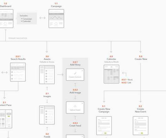
All websites should start with a good plan. Focussing on the design process first may be common for smaller sites. For larger sites, when user experience is paramount, creating an initial sitemap or user flow map is an effective way of working out how you want visitors to use and navigate around. UX is key to a successful site. And always remember the 5PS of planning a site – Proper Planning Prevents Poor Performance.
All websites should start with a good plan. Focussing on the design process first may be common for smaller sites. For larger sites, when user experience is paramount, creating an initial sitemap or user flow map is an effective way of working out how you want visitors to use and navigate around. UX is key to a successful site. And always remember the 5PS of planning a site – Proper Planning Prevents Poor Performance.
Typography plays a quiet role in our lives, whether you notice it or not. From shop signage, product labels, to movie posters, and cover letters – type is everywhere. And it’s been here long before people specialized in it. Today, there are all kinds of typography as well as a study dedicated to it. There are experts who make sure the right kind of letters is used in the right settings.
Klee Larsen is a Vancouver based visual artist, inspired by horizon lines in nature. Klee loves to combine old and new technologies by using film and then digitalizing the image. Working with film gives Klee her favourite end result of grain from high speed film and being able to work with a large negative. Painting has become a part of her practice and you can find her in her studio at 1000 Parker Street.
Access All Areas members have a beautiful pair of fonts to download this week, courtesy of Maryam Kamal Co. Sunkissed x includes an SVG watercolour sans font and a regular script font. The SVG technology of the watercolour font produces realistic texturing that regular fonts can’t offer. The stylish textured script was designed to complement the watercolour sans font, but it also looks amazing on its own.
Type designers take care of the details, so that we aren’t unnecessarily distracted by them. And good type designers relish those details. To listen to them explain their craft and describe their font-making processes is like watching the child of zero-sugar parents eat its first candy bar. Talking of ‘deep dives’, if you haven’t already, then […].
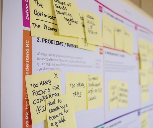
Brands must create and share impactful content to thrive, but they have less people, tighter budgets, and fewer resources to do so. Learn how to publish and market digital content with the same professionalism as organizations with million-dollar budgets.
Brand marketing campaigns are all the rage. They’ve always been happening, but lately, every brand and their parent company are getting in on the show. Traditional sales marketing is dying. People want to buy into things they believe in or believe (rightly or wrongly) they have a connection with. Companies like MailChimp and Wistia are setting up their own content production studios.
Glittering 3D graphics, dystopian metal-inspired typography, and futuristic streetwear feature heavily in the work of Obby & Jappari, the Frankfurt-based graphic design studio. Read more.
I know my readers love a good fonts bundle, so I’m excited to share the news about the latest deal from Design Cuts. For a limited time you can get your hands on 16 professional font families for just $29, giving you an unbelievable 99% saving of over $2800! The fonts included are top quality too, they are all best-sellers at their full price, which is more than the $29 sale price of the entire bundle.
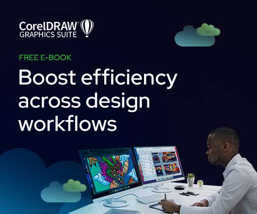
As the design industry evolves, teams are facing new challenges and a need to produce more outstanding creative work than ever. Leaders must learn how to adapt their processes to solve today’s—and tomorrow’s—unique design challenges. In this e-book, you’ll learn how to establish your creative workflow and leverage the power of CorelDRAW® Graphics Suite to streamline the entire design process, from start to finish.
Photographs: Griffin Simm. To balance out his working life as a graphic designer focused on 2-D digital projects, Greg Olijnyk creates cardboard sculptures in his free time. The remarkably refined artworks are made with packaging-grade cardboard and tracing paper, and finishing touches added with LED lighting and glass accessories. Cardboard’s affordability and malleability, as well as its surprisingly pleasing surface texture and color, have made it the medium of choice for Olijnyk.
Whimsical and playful is not usually the first thing you think of when someone mentions the medieval ages, but that is precisely the world that Jakarta-based illustrator creates with her work. Often mashing together multiple historical references in a single image, Anindya’s artistic practice came from a rather unusual origin. Read more.
The post CMYK Printing Demonstration using 4 Individual Colour Acrylic Slides appeared first on The Logo Smith. CMYK Printing Demonstration using 4 Individual Colour Acrylic Slides Having come from the traditional side of commercial printing, whilst serving out my apprenticeship, I found this simple demonstration of 4 colour CMYK Printing to be pretty useful.
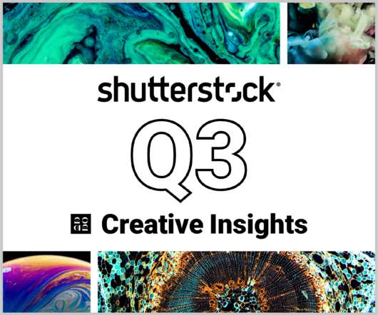
In today’s competitive markets, how do you make sure that your content not only stands out but performs well? How can you predict whether certain design choices will result in clicks, engagement, downloads, and other drivers of ROI? Shutterstock’s Creative Insights Report (Q3) is your window into the hottest trends that are transforming the creative world.
Artist Matt Huynh works with brush and ink, pulling technical inspiration from Western comics and Eastern sumi-e (ink brush painting). He frequently uses his art to explore and amplify stories of refugees, of migrants and asylum seekers and their communities. For the October/November issue of The Believer , Huynh created Cabramatta, pulling readers into the Australian city he grew up in.
New York-based photographer and director Ryan Struck. Each week our members share their projects with us and we highlight our favs as Editors’ Picks. If you have work you’d like to submit, you can learn more about becoming a member. Ryan Struck’s Website. Ryan Struck on Instagram.
Inspired by typographic Swiss posters from the 60s and 70s, the Lausanne-based designer wanted to add another dimension to modernise that tradition: motion. Kenny’s work turns simple ideas into complex, eye-catching animations that anyone can admire. Read more.
Inspiration can come from anywhere. So, on the first Friday of each month, we’re sharing some of our Shillington team’s favourite things from the past four weeks. This month, Shillington Manchester Teacher Nick Smith tells us what was on his radar in October. 1. To Follow: Birmingham Design. Being a Brummie in Manchester there is a constant struggle to defend good ol’ Brum as the second city.
Thomas Edison once said “Vision without execution is hallucination.” This statement applies not just to invention, but to graphic design. One of the greatest strengths of graphic designers is the ability to first develop a concept and then execute it to make it real. From visualization and ideation all the way through to actuation and execution, each step of this process takes skill and expertise.
When Ingo Maurer died last week , at the age of 87, the design world lost one of its great artists. The German designer was not only the eponym of a staggeringly successful lighting brand , he was also a singular poet of light. His works were enamoured with nature and humanity and appeared to be powered by their own momentum: He arranged constellations of swirling butterflies around incandescent bulbs, dripped dazzling crystals from fishermen’s nets, tossed up a shattering of porcelain dis
Type foundry Fontsmith has released a collection of nine variable fonts, which are available to download and trial for free via a dedicated microsite. Variable fonts have become a hot topic among graphic designers tackling type for digital formats, as the technology allows for entire font families to be condensed within one file, as opposed to multiple files for each style (weight, width, etc), hence speeding up load times.
The ramifications of our hyperconnected culture have been widely reported, but they’re mainly been framed within the context of big data and global corporations. Yet, as a new exhibition in Somerset House points out, just as important is privacy in the sense of peace and quiet, dreams, and switching off – not just from the outside world but your own body too. 24/7 examines how, or indeed whether, people can disconnect in the modern world.
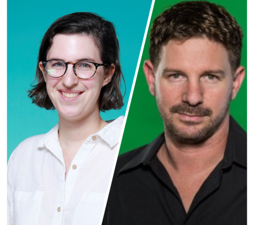
Speaker: Eden Spivak, Design Expert and Editor at Wix & Nir Horesh, Accessibility Lead and Senior Product Manager at Wix
When we design products or websites for people like ourselves, there are many others who are, as a result, left out. From visually impaired users who rely on assistive technology, to people with a temporary injury such as a broken arm, tech users are forever diverse and beautifully unique. The products we design can, and should, reflect the extremely wide range of human experiences and needs.
The venerable HTML table may (thankfully) be long-dead in terms of its use for page layout. But it’s still going strong with regards to its original intention: displaying tabular data. They’re still incredibly useful and have been enhanced further by the likes of CSS and jQuery. Still, large tables aren’t always a great experience on mobile screens.
Piotr Foksowicz is a concept artist and illustrator from Wroclaw, Poland. His work is mainly sci-fi art that focuses on post apocalyptic environments as well as exceptionally detailed character and cover designs for publisher Fabryka S?ów. “Inspiration for painting may come from many sources, and I often have plenty of ideas about the way I want my image to look,” he says.
Recently adding animation to her practice with the helping hand of her partner Lorenzo, we catch-up with the Italian-born and now New York-based illustrator on how making elements move is building upon her characterful work. Read more.
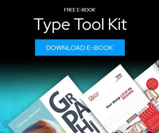
Download this free eBook to learn how you can create stunning typography, using the basics, such as placing text, to advanced controls like ligatures, variable fonts, effects, tracking, range kerning, and everything in between. Learn how to: Use Character Control to add variety to your font styles. Use Paragraph Control to manage spacing, alignment, justification and more.
We organize all of the trending information in your field so you don't have to. Join 66,000+ users and stay up to date on the latest articles your peers are reading.
You know about us, now we want to get to know you!
Let's personalize your content
Let's get even more personalized
We recognize your account from another site in our network, please click 'Send Email' below to continue with verifying your account and setting a password.


Let's personalize your content