This site uses cookies to improve your experience. To help us insure we adhere to various privacy regulations, please select your country/region of residence. If you do not select a country, we will assume you are from the United States. Select your Cookie Settings or view our Privacy Policy and Terms of Use.
Cookie Settings
Cookies and similar technologies are used on this website for proper function of the website, for tracking performance analytics and for marketing purposes. We and some of our third-party providers may use cookie data for various purposes. Please review the cookie settings below and choose your preference.
Used for the proper function of the website
Used for monitoring website traffic and interactions
Cookie Settings
Cookies and similar technologies are used on this website for proper function of the website, for tracking performance analytics and for marketing purposes. We and some of our third-party providers may use cookie data for various purposes. Please review the cookie settings below and choose your preference.
Strictly Necessary: Used for the proper function of the website
Performance/Analytics: Used for monitoring website traffic and interactions
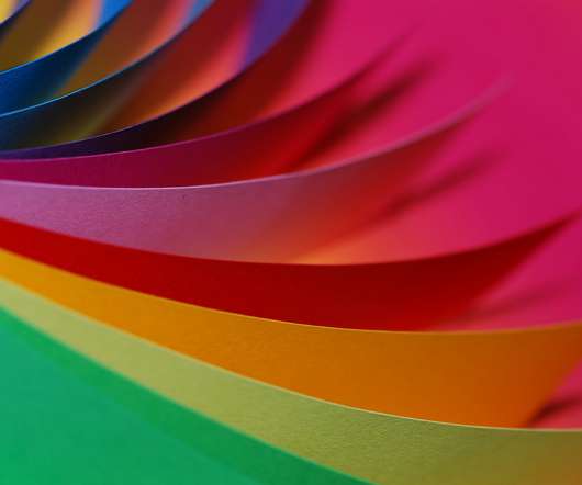
The overall quality of a website’s design is often in the details. Those seemingly-small elements such as microinteractions , typographic spacing and color accents can be real difference makers. They have the potential to transform the mundane into something that stands out. In these cases, being picky about design is a good thing. Whether that trait comes from you or your client, the goal is the same.
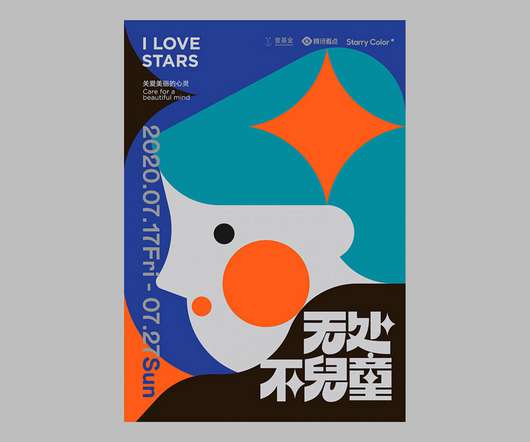
Cheng Peng is a creative designer who works for Heizi, a branding agency that belongs to Tencent. She recently created a series of posters that hope to help autistic children to feel more welcome in the city of Shenzen, where the designer is based. Peng’s work cleverly combines colorful flat surfaces with abstract geometry in a perpetual quest for new combinations.
Follow along with today’s Adobe Illustrator tutorial to create a simple but effective text effect with somewhat of a retro vibe, featuring stacks of text elements that are progressively spaced further apart. It reminds me of the kind of design you might see on an old VHS tape box or an ad for an 80s technology brand. Illustrator’s Blend Tool will be used to create the basic effect, but I will also show you a trick to alter the spacing of the text with a cool easing effect and show ho
This article has been contributed by Nick Voorhees. It’s no secret that social media is over-saturated with competing interests ruthlessly seeking attention. An unfathomable amount of new posts are uploaded every second and most of us mindlessly scroll while our minds are elsewhere. Like any other business owner, musicians, music producers, DJs and other music creators are forced to navigate these oversaturated waters that are essentially a popularity contest.
Speaker: Amber Asay, Creative Director and Founder of award-winning design studio Nice People
Understanding what trends are happening and how they’re impacting the competitive landscape is crucial to providing top dollar design strategy to your clients. With so many trends coming and going, it can be overwhelming to determine which ones you should capitalize on and which ones might not be worth the trouble. In this exclusive webinar with Amber Asay, we’ll explore graphic design trends that need to die, trends that are starting to pick up and why, trends that have come and gone, and how t
Scene creators are a great way to present your designs exactly the way you want them. A great scene creator will have different elements as separate files or objects that you can place and arrange as you please. You can then use them for design presentations but also as website hero images or section backgrounds. Check out the collection below with the best free hero and scene mockup creators for Photoshop.
My friends at Heritage Type Co. recently launched a magnificent new collection of vintage fonts and ready-made label designs. If you love the detailed design style of vintage branding with ornate embellishments, this extensive set of tools and resources may be just what you’re looking for to create nostalgic logos, packaging designs, posters, wedding invitations, and much more!
My friends at Heritage Type Co. recently launched a magnificent new collection of vintage fonts and ready-made label designs. If you love the detailed design style of vintage branding with ornate embellishments, this extensive set of tools and resources may be just what you’re looking for to create nostalgic logos, packaging designs, posters, wedding invitations, and much more!
Streamlining business operations remotely has been one of the biggest challenges in 2020. The moment the pandemic shocked the world, people started adapting to remote work environments. Around 88% of organizations encouraged their employees to work remotely and 91% of companies in the Asia Pacific region implemented compulsory work from home policies.
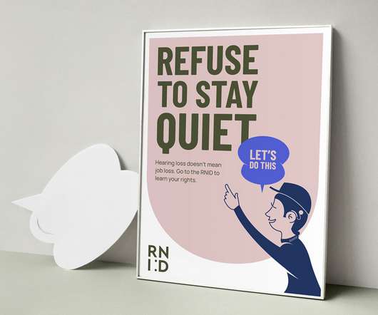
Founded in 1911, for the last century the Royal National Institute for Deaf People’s mission has been to make life inclusive for deaf people and those with hearing loss, whether through pioneering new treatments for tinnitus or promoting access to sign language. The charity, which has been known as Action on Hearing Loss since 2011, decided to rebrand and rethink its mission in a bid to reach a wider community of people.
You must have heard the saying ‘the first impression is the last’ quite a few times in your life. People don’t just say it for the sake of saying it; it holds some truth. All it takes is just a few seconds for your target audience to decide whether to buy products from your website or not. Here the need and importance of color psychology come into the picture in order to attract the attention of your potential audience and compel them to buy your products.
Brands must create and share impactful content to thrive, but they have less people, tighter budgets, and fewer resources to do so. Learn how to publish and market digital content with the same professionalism as organizations with million-dollar budgets.
This article has been contributed by Vincent Sevilla. If you have ever been involved in social media marketing, you know that one of its biggest challenges is the amount of time that it takes. You need to continuously conceptualize content ideas that your audience will find relevant and useful. You have to research and produce the content and feed it to them frequently enough that they remain interested and engaged.
The participants in GDUSA's Socially Responsible Designers editorial feature – an annual look at creative and thought leaders who are designing for good – choose to see a silver lining to the annus horribilis that is 2020.
You’re up for the biggest interview of your life. You’re determined to make a killer first impression. Would you wear sweatpants? Of course, you wouldn’t. Why? Because presentation is everything. Just like you wouldn’t wrap a diamond in toilet paper, don’t wrap high-quality blog content in bad graphic design. You’re only asking people to abandon your blog before they’ve even given it a shot.
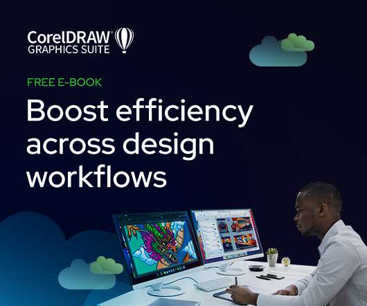
As the design industry evolves, teams are facing new challenges and a need to produce more outstanding creative work than ever. Leaders must learn how to adapt their processes to solve today’s—and tomorrow’s—unique design challenges. In this e-book, you’ll learn how to establish your creative workflow and leverage the power of CorelDRAW® Graphics Suite to streamline the entire design process, from start to finish.
In James Molle’s animation Black Sheep Boy, the audience is treated to a retro video game aesthetic and a questioning of life, death and happiness in one 8-bit package. The film follows a young boy on an adventure towards happiness through a strange world inhabited by anthropomorphic creatures, and is crammed full of old gaming tropes and jangly sound effects.
A business logo is so much more than just a random design. It can show your customers what your brand means, what it is all about, and is also the answer to how you want to portray yourself. Let us take NBC’ s logo for example. The image is obviously a peacock but the reason they picked a peacock is because at that time there were very few colored channels on the television.
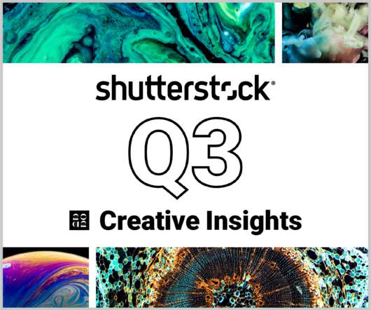
In today’s competitive markets, how do you make sure that your content not only stands out but performs well? How can you predict whether certain design choices will result in clicks, engagement, downloads, and other drivers of ROI? Shutterstock’s Creative Insights Report (Q3) is your window into the hottest trends that are transforming the creative world.
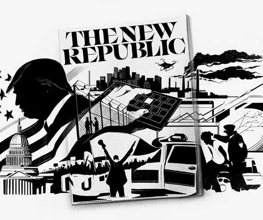
Pentagram partner Eddie Opara has designed a new identity for The New Republic (TNR) magazine, which aims to “reflect its robust brand of liberal inquiry”, the studio says. The work includes a new brand identity, editorial work for the print magazine as well as a new look for the magazine’s digital platform and its sub brands. [link].
Annie Yang of Conran Design Group says that young audiences want a real connection with a brand, one that has 'an authentic integration into our lives.’.
A lovely series from Vancouver-based photographer Grant Harder. See more images from “It Looks Like Jame But It’s Actually Blood” below! Grant Harder’s Website. Grant Harder on Instagram.
With many schools quarantined and a winter-wave of COVID-19 likely ahead, teaching is shifting online once again. Now more than ever, it’s crucial for teachers to embrace online learning to sustain their students’ attention. While online classes used to be exotic and fun when they first started, Zoom fatigue soon set in for most students.
Thomas Edison once said “Vision without execution is hallucination.” This statement applies not just to invention, but to graphic design. One of the greatest strengths of graphic designers is the ability to first develop a concept and then execute it to make it real. From visualization and ideation all the way through to actuation and execution, each step of this process takes skill and expertise.
You probably know that putting too much food on your plate is usually a bad idea. Since research indicates that you’re more likely to overeat if you fill your plate, it’s not a good thing for your waistline. It’s also not a good thing for your eyes. If there’s no focal point, the food can overwhelm you, and you’ll find yourself lost in a vortex of scary, calorie-filled nightmares.
Inspiration can come from anywhere. So, on the first Friday of each month, we’re sharing some of our Shillington team’s favourite things from the past four weeks. This month, Shillington New York Teacher Deepa Shanbhag shares what was on her radar in October. 1. To Follow: Lili Hayes. Lili Hayes is a woman seemingly living her life to the fullest, with her son by her side.
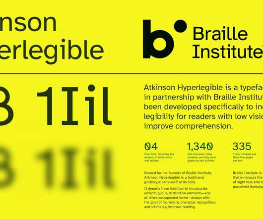
Speaker: Eden Spivak, Design Expert and Editor at Wix & Nir Horesh, Accessibility Lead and Senior Product Manager at Wix
When we design products or websites for people like ourselves, there are many others who are, as a result, left out. From visually impaired users who rely on assistive technology, to people with a temporary injury such as a broken arm, tech users are forever diverse and beautifully unique. The products we design can, and should, reflect the extremely wide range of human experiences and needs.
What You'll Be Creating In this tutorial, you will learn how to use Bitmap mode in Photoshop. We'll look at a couple of different patterns you can use on a photo to create a screen-printed effect. . What You Will Need. You'll need access to Adobe Photoshop—if you don't have the software, you can download a trial from the Adobe website. We'll also be using the following resources: DJ Vintage Disco Lady.
Since launching our Online Course in September, Slack has become an essential medium for students and teachers to interact in, learn, share and deliver feedback, collaborate and catch up. Not only is it great for the online classroom, slack is also a great networking tool. With the ability to follow as many channels are you like, Slack offers a great space to connect with people you work with and now even more than ever, make new connections in your community that previously would have happened
What Causes Failed Payments? Formally known as churn, payment failure primarily stems from the attempting purchaser having insufficient funds, outdated credit card information, or exceeding their credit card limit. However, matters regarding churn can also stem from business technicalities, such as server errors: another instance in which payments may fail.
Download this free eBook to learn how you can create stunning typography, using the basics, such as placing text, to advanced controls like ligatures, variable fonts, effects, tracking, range kerning, and everything in between. Learn how to: Use Character Control to add variety to your font styles. Use Paragraph Control to manage spacing, alignment, justification and more.
We organize all of the trending information in your field so you don't have to. Join 66,000+ users and stay up to date on the latest articles your peers are reading.
You know about us, now we want to get to know you!
Let's personalize your content
Let's get even more personalized
We recognize your account from another site in our network, please click 'Send Email' below to continue with verifying your account and setting a password.


Let's personalize your content