This site uses cookies to improve your experience. To help us insure we adhere to various privacy regulations, please select your country/region of residence. If you do not select a country, we will assume you are from the United States. Select your Cookie Settings or view our Privacy Policy and Terms of Use.
Cookie Settings
Cookies and similar technologies are used on this website for proper function of the website, for tracking performance analytics and for marketing purposes. We and some of our third-party providers may use cookie data for various purposes. Please review the cookie settings below and choose your preference.
Used for the proper function of the website
Used for monitoring website traffic and interactions
Cookie Settings
Cookies and similar technologies are used on this website for proper function of the website, for tracking performance analytics and for marketing purposes. We and some of our third-party providers may use cookie data for various purposes. Please review the cookie settings below and choose your preference.
Strictly Necessary: Used for the proper function of the website
Performance/Analytics: Used for monitoring website traffic and interactions
If you are a graphic designer, or just a design lover that creates print work, you surely know how hard it can be to achieve satisfying work when working on a poster design. One of the main issues is that poster design can be quite constraining, mostly due to the importance of perfectly combining form and function in order to be efficient. In this article, we will give you a few tips in order to stay focused on what matters in terms of poster design. 1.
Nina-Lou Giachetti is one of those creatives who works across several disciplines to create projects that are uniquely her own. Despite growing up on a remote farm in Brittany, France, Giachetti’s parents were heavily into art and gave her a solid cultural base. “I also experimented with a lot of art forms during my childhood, and I always knew I wanted to work in this area,” she says. “I began to specialise in high school, and it was through my graphic design studies tha
Difference Photoshop vs Illustrator Adobe bundle is quite possibly the most amazing total realistic bundles in the world :) Artist and Photoshop are typically regularly utilized and most famous projects from Adobe house:) What's more, here comes the inquiry that pesters numerous new originators moving into these projects. Difference Photoshop vs illustrator What is the distinction between Adobe Photoshop and Illustrator?
While almost everyone would love to take out an Apple MacBook or a Dell Precision laptop when they start working every day, unfortunately not everyone can afford a high-priced laptop. That shouldn’t mean you can’t get a great-performing laptop at a great price. We feel like you should always be able to get a great product without having to take out a second mortgage to afford it.
Speaker: Amber Asay, Creative Director and Founder of award-winning design studio Nice People
Understanding what trends are happening and how they’re impacting the competitive landscape is crucial to providing top dollar design strategy to your clients. With so many trends coming and going, it can be overwhelming to determine which ones you should capitalize on and which ones might not be worth the trouble. In this exclusive webinar with Amber Asay, we’ll explore graphic design trends that need to die, trends that are starting to pick up and why, trends that have come and gone, and how t
“A picture is worth a thousand words”. This archaic statement may seem like hyperbole, but saying that images speak louder than words is no exaggeration. We are an inherently visual species. Vision is the sense we rely on most, a fact reflected by how complex our eyes are in relation to other creatures, including our canine best friends. The truth is that humankind has communicated visually since the dawn of time.
There is an inherent nostalgia to Jazz Grant’s work, which has resonated with audiences and globally renowned clients at a time when the world has been forced to retreat indoors. For creatives as much as anyone else, the past year has presented an occasion to comb through materials and memories, whether archives of work or old home videos and photos.
One of the hallmarks of a top chef is his or her ability to do interesting takes on food combinations that, at first glance, seem like they wouldn’t go together at all. The first person, for example, to pair peas and wasabi together was a culinary genius. Think about it. Someone had to test flavors repeatedly – combining and recombining in just the right increments – to arrive at that particular fusion, which I’m told is quite tasty.
A free online Procreate event kicked off today at Design Cuts featuring live sessions with top designers and discounts of up 50% off various Procreate tools and resources. This is your chance to own some of the best Procreate brushes, drawing kits, background textures and much more at a huge discount. Throughout this week there will also be several FREE Live Sessions with some of the biggest names in the Procreate industry, so you can learn how to use your new tools for lettering, illustrating,
“Without data, you’re just another person with an opinion” – W. Edwards Deming. Several years later, this quote still holds true. However, today the problem isn’t about collecting data as much as it is about communicating and presenting it effectively. Graphs are one such visual you can use to tell a good data story. They can be used to: Convey a specific data point Compare independent values or parts of a composition Demonstrate changes over time Show correlations or reveal relationships.
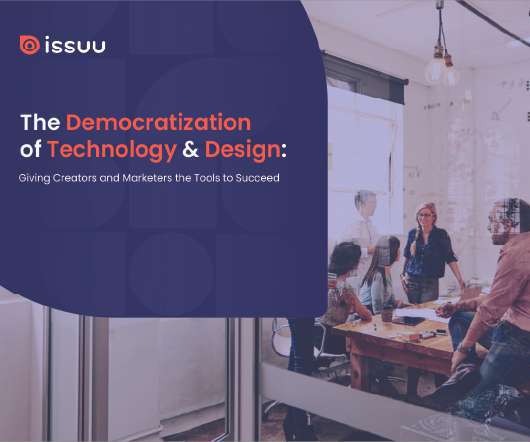
Brands must create and share impactful content to thrive, but they have less people, tighter budgets, and fewer resources to do so. Learn how to publish and market digital content with the same professionalism as organizations with million-dollar budgets.
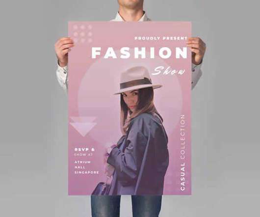
When you’re looking to put together a new flyer to announce a new fashion line or style event, it’s vital that you do so in a visually compelling way. If you lack graphic design skills, this can be quite a challenge. That’s why templates were invented, right? If you’re stumped as to where to look for style and fashion flyer templates, we’ve got your back.
Rachel Seidu’s first introduction to photography happened at her local church when she was about 16 years old. They wanted volunteers to take pictures, but the training was minimal. “We were trained to click the shutter, just that, we weren’t taught to understand the camera or anything,” she says. “But since then I started telling all my friends I was a photographer.” When Seidu got to university in 2018 she progressed onto using her phone to take pictures and
Hilo Life chips introduce their bold graphic design packaging that includes playful illustrations paired with drool-worthy photography. This brand might be keto-friendly, but it'll stand out on the shelf in a sea of competitors through the quirky graphic shapes and vividly colored packaging.
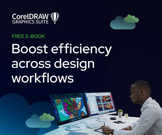
As the design industry evolves, teams are facing new challenges and a need to produce more outstanding creative work than ever. Leaders must learn how to adapt their processes to solve today’s—and tomorrow’s—unique design challenges. In this e-book, you’ll learn how to establish your creative workflow and leverage the power of CorelDRAW® Graphics Suite to streamline the entire design process, from start to finish.
100 underline/overlay animations | The ultimate CSS collection – Use this collection to find the perfect CSS animation for your project. Why Thinking Ahead Is Crucial in Web Design – Learn how to design websites with the future in mind. Charts.css – Check out this modern CSS framework that styles HTML elements as charts. Conditional animations with CSS properties – Make your website more accessible by loading animations based on a user’s “reduced motion” OS settings.
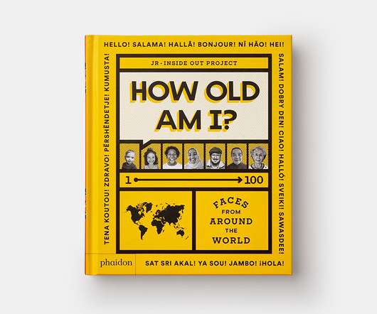
Back in 2011, French artist JR launched his Inside Out project, inspired by his series of large-scale portraits that are pasted in the street. To allow members of the public to do their own pastings, they are encouraged to send in a portrait, shot in black and white, which is then printed in large format and sent back to them for free. The portraits have been pasted across buildings and streets in large-scale outdoor artworks and, ten years, 130 countries and 400,000 posters later, it’s st
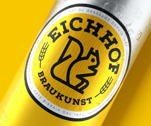
Pearlfisher London has redesigned Swiss beer company Eichhof’s identity, with a look that combines the brand’s design history with modern updates. The work includes updates to the packaging as well as a range of illustrations for Eichhof’s experimental craft range. Eichhof’s previous logo (left) and the redesign (right) Eichhof has been brewed in Lucerne, Switzerland for more than 185 years.
We live in an age of information where data is often more valuable than money itself. Both raw and processed data, as well as the communication channels that convey it, are the lifeblood of most modern organizations, regardless of the industry, they operate in or their size. This, unfortunately, also means that losing that data, either through negligence or via cyberattacks , has become an inevitable aspect of running a successful company.
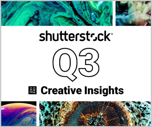
In today’s competitive markets, how do you make sure that your content not only stands out but performs well? How can you predict whether certain design choices will result in clicks, engagement, downloads, and other drivers of ROI? Shutterstock’s Creative Insights Report (Q3) is your window into the hottest trends that are transforming the creative world.
Google’s influence over web designers, website owners, and everyday users is undeniable. The company is hyper-aggressive in detailing what it wants to see from the first two groups in order to serve up relevant results to the third. One of their more recent efforts in this area revolves around something called “ Core Web Vitals ”. These metrics are in place to measure user experience.
The New York arm of global agency Design Bridge has created a new identity system and packaging design for New Holland Brewing Co. The brewery and beer brand is based in Michigan, specifically a small city called Holland, which some locals affectionately refer to as New Holland after the beer, as the agency found during a trip. The new identity maintains the symbolic Dutch orange along with the introduction of navy blue.
Current circumstances have been challenging for all of us, but they’ve also provided opportunities. This is most apparent in the realms of eLearning and app development. Traditional students need new platforms to continue their studies, and businesses of all types are trying to keep their heads above water in a socially distant world. Whether dealing with the transition to a remote work environment or managing the logistics of higher learning in a post-COVID world, education is at the root
Thomas Edison once said “Vision without execution is hallucination.” This statement applies not just to invention, but to graphic design. One of the greatest strengths of graphic designers is the ability to first develop a concept and then execute it to make it real. From visualization and ideation all the way through to actuation and execution, each step of this process takes skill and expertise.
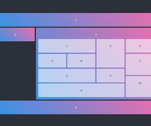
Among the many benefits of CSS Grid is its ability to create complex layouts with ease. You don’t need an excessive amount of code. No precarious hacks are required. A few relatively simple lines can help you quickly achieve something that used to take hours. Of course, CSS Grid is also incredibly powerful. We’ve seen some developers experiment and push the limits of what it can do.
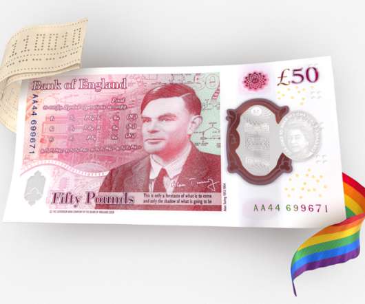
The Bank of England (BoE) has unveiled a new £50 banknote, which features the scientist and WWII codebreaker Alan Turing. Turing was chosen as the face of the new note following a public consultation , where over 200,000 nominations were made. BoE governor Andrew Bailey says that putting the scientist on the note celebrates his achievements and groundbreaking scientific work. “Turing is best known for his codebreaking work at Bletchley Park, which helped end the Second World War,̶
Eric C. Wilder is a graphic designer with over 20 years experience. He is one half of design studio Chapman & Wilder , former publisher of Spine Magazine and producer of Spine Podcast. Here he talks us through his process for designing the cover of Transgression and the Aesthetics of Evil. When the brief came in from Ani Deyirmenjian at University of Toronto Press it included a picture of an engraving of Tigris, at the Foot of Paradise, by Gustave Doré, from 17th-century English poet John Mi
Speaker: Eden Spivak, Design Expert and Editor at Wix & Nir Horesh, Accessibility Lead and Senior Product Manager at Wix
When we design products or websites for people like ourselves, there are many others who are, as a result, left out. From visually impaired users who rely on assistive technology, to people with a temporary injury such as a broken arm, tech users are forever diverse and beautifully unique. The products we design can, and should, reflect the extremely wide range of human experiences and needs.
Gender fluid characterisation, desaturated colour and the enormity of a millisecond squeezed into one image: meet the Taipei-based illustrator and her visually arresting artworks. .
Now owned by Heineken, Eichhof has been brewing beer in the Swiss city of Lucerne for over 185 years, and still has strong links with its home region. Heineken tasked Pearlfisher with evolving the Eichhof brand and its 13 different varieties for a global market. “Eichhof is legendary in the Central Switzerland region but its current aesthetic was inconsistent and there was little distinction across the portfolio and on shelf,” says the agency’s head of strategy, Kristoffer Fink
Design studio Happy F&B has crafted a new identity for children’s literature prize the Astrid Lindgren Memorial Award, inspired by the eponymous writer’s own shorthand and stories. As part of the rebrand, Happy F&B has created a new hand-drawn logo and a graphic pattern based on Lindgren’s handwritten manuscripts. The award has established in 2002 by the Swedish government to honour Lindgren, the celebrated children’s author who is the fourth most translated child
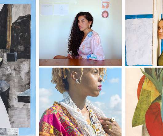
Image courtesy of Absolut Art. Absolut Art is making artworks by some of the world’s most prominent artists more accessible through a collection of limited-edition prints. Ever since The Absolut Company collaborated with Andy Warhol on an iconic ad campaign in 1986, the company has been closely connected with creative voices around the globe and continuously strives to bring diverse voices to the fore.
Download this free eBook to learn how you can create stunning typography, using the basics, such as placing text, to advanced controls like ligatures, variable fonts, effects, tracking, range kerning, and everything in between. Learn how to: Use Character Control to add variety to your font styles. Use Paragraph Control to manage spacing, alignment, justification and more.
We organize all of the trending information in your field so you don't have to. Join 66,000+ users and stay up to date on the latest articles your peers are reading.
You know about us, now we want to get to know you!
Let's personalize your content
Let's get even more personalized
We recognize your account from another site in our network, please click 'Send Email' below to continue with verifying your account and setting a password.


Let's personalize your content