September, 2009

article thumbnail

New Fonts: A Graphic Designer’s Perspective

Fonts by Hoefler&Co.

Most graphic designers choose the fonts that best fit their projects. Brian Hennings does the opposite: he chooses the projects that best fit the fonts. A resident designer at Hoefler&Co, Brian shares with me the responsibility of creating all of the sample art you’ll find on this site. His is a strange universe of the fictitious: signage programs for mythical cities, book jackets for unwritten novels, product literature for items you cannot buy, broadcast graphics for live sporting ev

Fonts 40
article thumbnail

DETAILS (A TAXONOMY FOR BEGINNERS)

Illustration Art

Here's how it goes: There are details that hum and details that sing. There are details that accumulate like silt when the artist isn't paying enough attention, and smother the picture. Then there are details where artists with impeccable technique find refuge from larger questions of meaning and purpose. Wrightson There are details that are diamantiferous.

Artist 29
Insiders

Sign Up for our Newsletter

This site is protected by reCAPTCHA and the Google Privacy Policy and Terms of Service apply.

Trending Sources

article thumbnail

“Someone Found a Letter You Drew Me, On the Radio…”

Fonts by Hoefler&Co.

This afternoon, typography joins the ranks of the wonderfully obscure on Please Explain, my favorite segment of the Leonard Lopate Show : Steven Heller and I will be on hand to discuss, if not actually explain, typography. If you’re in the New York area, join us around 1:20pm EST at WNYC-FM 93.9 or AM 820, or follow the podcast at wnyc.org. —JH.

article thumbnail

Introducing Tungsten

Fonts by Hoefler&Co.

A few years ago, we started wondering if there was a way to make a flat-sided sans serif that was disarming instead of brutish, one that employed confidence and subtlety instead of just raw testosterone. It was an unusual design brief for ourselves, completely without visual cues and trading in cultural associations instead: “more Steve McQueen than Steven Seagal,” reads one note; “whiskey highball, not a martini” suggests another.

Fonts 40
article thumbnail

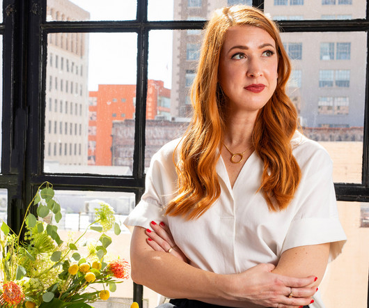
Let's Talk Trends: Designing for Maximum Impact

Speaker: Amber Asay, Creative Director and Founder of award-winning design studio Nice People

Understanding what trends are happening and how they’re impacting the competitive landscape is crucial to providing top dollar design strategy to your clients. With so many trends coming and going, it can be overwhelming to determine which ones you should capitalize on and which ones might not be worth the trouble. In this exclusive webinar with Amber Asay, we’ll explore graphic design trends that need to die, trends that are starting to pick up and why, trends that have come and gone, and how t