March, 2014

article thumbnail

USPS Stamps

Fonts by Hoefler&Co.

Even when “communications” meant an e-mail campaign delivered to 317 readers, Journey Group of Charlottesville, VA recognized that stamps have a story to tell — and not just to collectors. Stamps are built on typography, making the web a natural place to share their rich visual heritage, and making web fonts an important part of the experience.

Fonts 40
article thumbnail

Pied Piper Work In Progress

Chris Dunn Illustration/Fine Art

Hoping to finish this tomorrow.

Insiders

Sign Up for our Newsletter

This site is protected by reCAPTCHA and the Google Privacy Policy and Terms of Service apply.

Trending Sources

article thumbnail

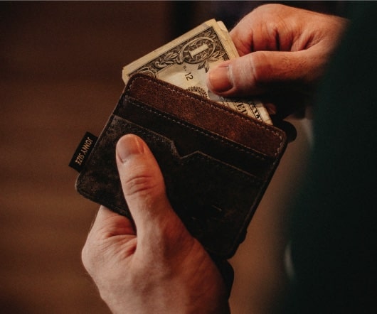
How to be rich like me

Paul Jarvis

People assume that if they’ve heard of you, you must be raking it in. The theory goes something like this: If you work for yourself and make things that other people buy, your income magically skyroc.

48
article thumbnail

Introducing Surveyor

Fonts by Hoefler&Co.

We’re delighted to introduce Surveyor, a new family of fonts for print and web, and sizes large and small. I love maps, and not just for their vintage charm. I admire them as highly functional pieces of design, packing extraordinary amounts of information into small spaces, and invisibly educating readers about how they’re meant to be read.

Fonts 40
article thumbnail

Let's Talk Trends: Designing for Maximum Impact

Speaker: Amber Asay, Creative Director and Founder of award-winning design studio Nice People

Understanding what trends are happening and how they’re impacting the competitive landscape is crucial to providing top dollar design strategy to your clients. With so many trends coming and going, it can be overwhelming to determine which ones you should capitalize on and which ones might not be worth the trouble. In this exclusive webinar with Amber Asay, we’ll explore graphic design trends that need to die, trends that are starting to pick up and why, trends that have come and gone, and how t

article thumbnail

New paintings on the drawing board.

Chris Dunn Illustration/Fine Art

I've started work on two of these ideas this week, the lamplighter and the pied piper fox. The others are an old fashioned rag and bone man (these days it seems scrappers looking for metal have taken their place) and a record keeper which will be loosely based on Autumn Scribe. The top two are for later on but first I have to master multiple hens dancing and the awkward perspective created by medieval buildings on a hill in the pied piper.

Fashion 40
article thumbnail

The Making of Neon Signs

Fonts by Hoefler&Co.

Every neon sign has a “start and stop position,” a point on each letter where a tube begins and ends. I’ve just learned how a signmaker chooses this point, and it’s something I’d never have guessed. It is fascinating. It’s nothing to do with a letter’s traditional form, or its cultural dimensions. These are the first ways that neon speaks to us, whether it’s the plainspoken sans serif on a liquor store or the elaborate fantasy of a Las Vegas casino

Sports 41