April, 2008

article thumbnail

Our Middle Name

Fonts by Hoefler&Co.

Last month’s posts about the ¶ and the ß prompted a flurry of e-mail inquiring about other special favorites in the character set. Matt McInerney guessed correctly that the ampersand is one for which we have special affection, and asked if there was anything else we could say about it. How could we not? Ampersand, after all, is H&Co’s middle name.

Fonts 56
article thumbnail

Unicode Poetry Slam

Fonts by Hoefler&Co.

I feel certain that I’ve seen the logo for Fermata Festival on canvas totebags at the greenmarket, and that Fox Fraction is part of the Action 10 News Team. I’m equally convinced that Falling Family and Feathered February are Lifetime Original Movies, and that Fit Fita Five once opened for Afrika Bambaataa at the Mudd Club. Legendary turntablist Fricative Fritu was the driving force behind that act, before leaving to found Forward Fostering Four in 1979; signed to Furx Records, they

Insiders

Sign Up for our Newsletter

This site is protected by reCAPTCHA and the Google Privacy Policy and Terms of Service apply.

Trending Sources

article thumbnail

London Calling

Fonts by Hoefler&Co.

Just a quick note to let Londoners know that the Editorial Design Organization will be hosting an evening of editorial typography, featuring Janet Froelich of the New York Times Magazine, and Jonathan Hoefler of H&Co. Free to EDO members, £20 for non-members, £5 for students. American Night at the EDO. Wednesday, April 9, 6:00-9:00pm. Rootstein Hopkins Space.

Fashion 40
article thumbnail

Change We Can Believe In

Fonts by Hoefler&Co.

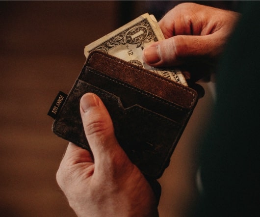
Above, the new face of British currency, announced by the Royal Mint. The striking new designs, selected from an open competition that attracted four thousand entries, are the work of a 26-year old graphic designer named Matthew Dent. They are Mr. Dent’s first foray into currency design. Below, the new five dollar bill, introduced last month by the United States Department of the Treasury.

Agency 40
article thumbnail

Let's Talk Trends: Designing for Maximum Impact

Speaker: Amber Asay, Creative Director and Founder of award-winning design studio Nice People

Understanding what trends are happening and how they’re impacting the competitive landscape is crucial to providing top dollar design strategy to your clients. With so many trends coming and going, it can be overwhelming to determine which ones you should capitalize on and which ones might not be worth the trouble. In this exclusive webinar with Amber Asay, we’ll explore graphic design trends that need to die, trends that are starting to pick up and why, trends that have come and gone, and how t

article thumbnail

Two Fools

Fonts by Hoefler&Co.

I pretty much agree with Anil Dash on the topic of wacky April Fools’ jokes for websites, so instead I thought that today might be a good day to share a piece of genuine idiocy from the archives. By the time Tobias and I began working together in 1999, we'd been friends for a decade, and had spent most of the previous years in close contact by phone.

Fonts 40
article thumbnail

Adventures in Kerning, Part II

Fonts by Hoefler&Co.

A kerning table, which makes special allowances for characters that don’t fit together naturally, can reveal a lot about the personality of its designer. Every font pays special attention to the pair Va , but the font that includes Vr suggests a familiarity with French (vraie) or Dutch (vrouw). Pairs like Wn or Tx hint at an even broader perspective ( Wnetrzne, Poland; Txipepovava, Angola), and the designer who kerns the ¥4 has presumably spent some time thinking about finance.

Adobe 40

More Trending

article thumbnail

Type Tour II

Fonts by Hoefler&Co.

If you missed Tobias’s Typographic Walking Tour last September, and weren’t one of the 22 lucky callers to register for his 2008 encore performance , you’ve one more chance. Come to the 2008 FUSE conference , April 13–16 at the Chelsea Piers, where Tobias joins Malcolm Gladwell, Stefan Sagmeister, Debbie Millman, Chip Kidd and other sharp tacks for a three-day exploration of design and culture.

40
article thumbnail

It’s Alive!

Fonts by Hoefler&Co.

I should have known it would come to this. —JH.

40