This site uses cookies to improve your experience. To help us insure we adhere to various privacy regulations, please select your country/region of residence. If you do not select a country, we will assume you are from the United States. Select your Cookie Settings or view our Privacy Policy and Terms of Use.
Cookie Settings
Cookies and similar technologies are used on this website for proper function of the website, for tracking performance analytics and for marketing purposes. We and some of our third-party providers may use cookie data for various purposes. Please review the cookie settings below and choose your preference.
Used for the proper function of the website
Used for monitoring website traffic and interactions
Cookie Settings
Cookies and similar technologies are used on this website for proper function of the website, for tracking performance analytics and for marketing purposes. We and some of our third-party providers may use cookie data for various purposes. Please review the cookie settings below and choose your preference.
Strictly Necessary: Used for the proper function of the website
Performance/Analytics: Used for monitoring website traffic and interactions
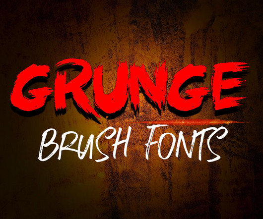
I love typography, and in the world of lettering and typography, grunge brush fonts have a raw, edgy, and artistic appeal that makes them stand out. The post 25+ Best Grunge Brush Fonts for Your Creative Projects first appeared on Graphic Design Junction.
At Cassina Projects in Milan, Viscous presents itself as a corporeal theater of psychological entanglement, where fluidityboth material and ideologicaldictates the boundaries of perception.
Speaker: Amber Asay, Creative Director and Founder of award-winning design studio Nice People
Understanding what trends are happening and how they’re impacting the competitive landscape is crucial to providing top dollar design strategy to your clients. With so many trends coming and going, it can be overwhelming to determine which ones you should capitalize on and which ones might not be worth the trouble. In this exclusive webinar with Amber Asay, we’ll explore graphic design trends that need to die, trends that are starting to pick up and why, trends that have come and gone, and how t
Get full content RSS Feed By means of two formulations - image and word - 'Tempo e Tempo' investigates the juxtaposition of time and weather to search for a world where many worlds are possible to fit in: a dreamlike time where past, present and future meet. Read More CreativeApplications.Net is a community supported website. If you enjoy content on CAN, please become a member.
Get full content RSS Feed By means of two formulations - image and word - 'Tempo e Tempo' investigates the juxtaposition of time and weather to search for a world where many worlds are possible to fit in: a dreamlike time where past, present and future meet. Read More CreativeApplications.Net is a community supported website. If you enjoy content on CAN, please become a member.
Not all thats lost is meant to stay hidden. In Faye Toogoods latest body of work, Assemblage 7: Lost and Found II , the British designer uncovers the beauty of rediscovery, bringing materials from the age of antiquity into the present with a poetic touch. The collection, now on view at Friedman Benda in New York, transforms English oak and Purbeck marble into sculptural works that celebrate British craftsmanship and the passage of time.
Brands must create and share impactful content to thrive, but they have less people, tighter budgets, and fewer resources to do so. Learn how to publish and market digital content with the same professionalism as organizations with million-dollar budgets.
Sculptural, elegant, and slightly anthropomorphic, the new POSE lighting collection by British designer Tom Dixon is set to captivate design lovers this winter. Staying true to Dixons minimalist yet expressive aesthetic , the collection introduces a series of lamps that feel more like poised, architectural objets than mere fixtures. With its clean geometric lines and striking monochrome finish, POSE elevates the everyday task of illuminating a space into a refined ritual.
Any business looking to connect with its audience in the digital age needs to have a navigable website that encourages conversions and loyalty. In order to do this, a big part of web development is UX design. The goal is to use intuitive elements to make the user experience smoother … The post 3 Accessibility Features That Can Improve Your Eyewear Website first appeared on Graphic Design Junction.
Thomas Edison once said “Vision without execution is hallucination.” This statement applies not just to invention, but to graphic design. One of the greatest strengths of graphic designers is the ability to first develop a concept and then execute it to make it real. From visualization and ideation all the way through to actuation and execution, each step of this process takes skill and expertise.
Cityabyss: We are Unpacking the Fragmented Visions of Beata Szczeciska Ever feel lost in the noise? Overwhelmed by the constant stream of information and images? You’re not alone. Artist Beata Szczeciska , also known as Cityabyss , captures that feeling perfectly. She creates art that explores individual identity in a world saturated with sensory overload.
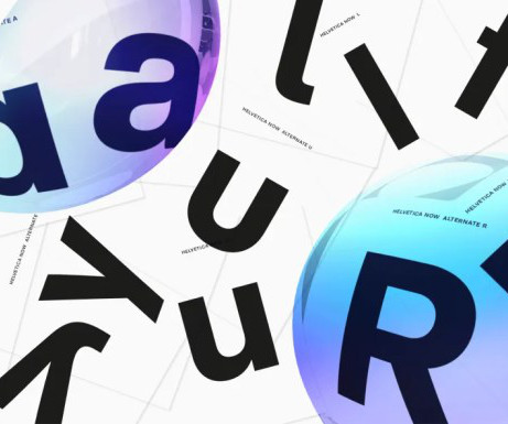
Choosing the right font can feel like a Herculean task, right? You want something that looks good, is easy to read, and perfectly captures the tone of your project. But with so many options out there, how do you even begin? Two titans of the sans-serif world often find themselves in the spotlight: Helvetica and Frutiger. These fonts are both clean, modern, and incredibly versatile.
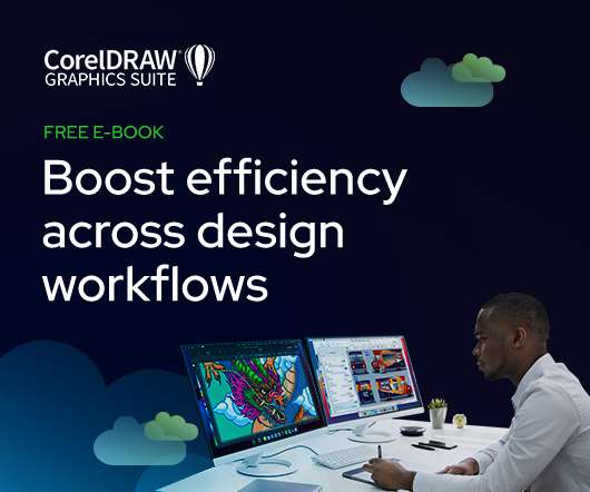
As the design industry evolves, teams are facing new challenges and a need to produce more outstanding creative work than ever. Leaders must learn how to adapt their processes to solve today’s—and tomorrow’s—unique design challenges. In this e-book, you’ll learn how to establish your creative workflow and leverage the power of CorelDRAW® Graphics Suite to streamline the entire design process, from start to finish.
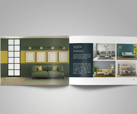
A well-designed product catalog is essential for showcasing your products in a professional and visually appealing manner. By combining a product catalog with Photoshop mockups, businesses can create stunning visuals that enhance their marketing efforts without the need for expensive photoshoots. Photoshop mockups allow you to present your products in realistic settings by applying your designs to pre-made templates.
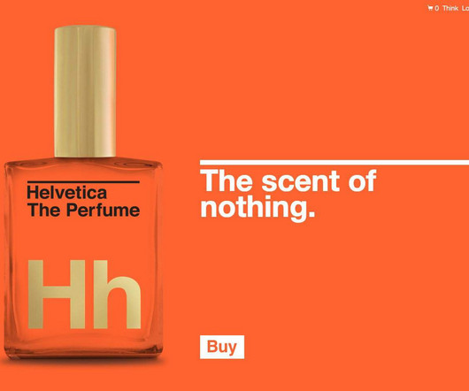
The post Helvetica The Perfume: The Scent of Nothing appeared first on Smitho.graphics All Original Content 1996 2025 Smitho.graphics | Logo & Icon Designer Update: 2025 No longer available, but still like taking a little trip back to 2013 when this was first posted. You know? This is just class! I can easily see people stumping up the $62 to buy a bottle of, Helvetica The Perfume: The Scent of Nothing (UPDATE: GutsandGloryand.us were extremely kind to send me my very own bottle for which
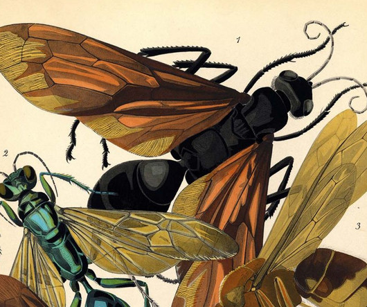
mile-Allain Sguy, a French designer of the Art Deco and Art Nouveau eras, published *Insectes* in 1925 to showcase his fascination with insects, which he regarded as mechanic wonders that fueled his richly detailed interior design concepts. Presented across 20 pochoir pattern plates featuring 80 insect specimens and 16 decorative compositions, *Insectes* employed a costly, labor-intensive stenciling technique popular in 1920s Paris, where each color layer was painstakingly applied by hand throug
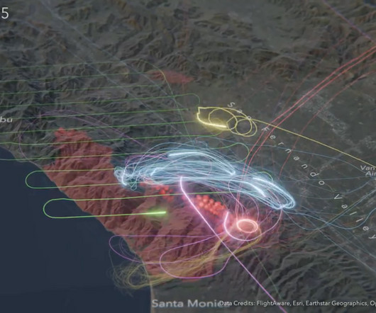
To contain the fires in Los Angeles, aircraft flew back and forth to drop retardant and survey the area for several days. Peter Atwood used an animated map to show 24 hours of activity , totaling over 15,000 flight miles. Atwood used wildfire data from NASA, the ArcGIS Living Atlas for terrain, and FlightAware data for the flights. The neon aesthetic highlights the patterns and urgency of each aircraft’s travels.
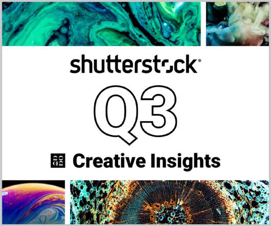
In today’s competitive markets, how do you make sure that your content not only stands out but performs well? How can you predict whether certain design choices will result in clicks, engagement, downloads, and other drivers of ROI? Shutterstock’s Creative Insights Report (Q3) is your window into the hottest trends that are transforming the creative world.
Swiss illustrator and graphic artist Hugo Laubi (18881959) studied in Munich, Paris, and London before returning to Zurich in 1918 to create advertising posters and tourism motifs, including designs for the 1928 Winter Olympics in St. Moritz. In the 1920s, he began a long-term collaboration with the satirical magazine *Nebelspalter* and later became known for illustrating the *Pocomoto* book series and classic works like *Robinson Crusoe* (1951) and *Uncle Toms Cabin* (1956). h/t: vintag.
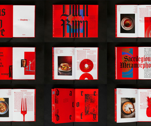
Blasphemy: A Radical Take on Editorial Design and Culinary Rebellion abduzeedo 02/07 2025 Blasphemy redefines editorial design with chaotic layouts, biblical subversions, and bold typography that mirror its rebellious culinary ethos. Cookbooks tend to follow a formulaclean layouts, mouthwatering imagery, and neatly structured recipes. Blasphemy does the opposite.
Blue Memories Ceramicist Caroline Harrius crafts vessels that marry two seemingly disparate materials: thread and clay. Each piece utilizes poked holes in the clay that are later connected like dots via thread. Carolines newest piece titled Blue Memories continues this technique but turns it up a notch. During a three-month residency in a porcelain factory in Porsgrund, Norway, Caroline wanted to test the limits of whats possible with non-plastic industrial porcelain clay.
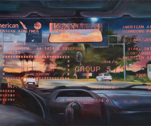
For Jessica Taylor Bellamy , juxtapositions, transparency, and layers shape a way of working that evokes her family history and notions of home and landscape. Born to an Ashkenazi Jewish mother and an Afro-Cuban Jamaican father, Bellamy was raised in Whittier, just southeast of Los Angeles. In glowing oil paintings, she draws from personal mementos like photographs, sales receipts, and newspaper clippings to explore the relationships between utopia and dystopia, humans and nature, image and text
Download this free eBook to learn how you can create stunning typography, using the basics, such as placing text, to advanced controls like ligatures, variable fonts, effects, tracking, range kerning, and everything in between. Learn how to: Use Character Control to add variety to your font styles. Use Paragraph Control to manage spacing, alignment, justification and more.
Travel Photographer of the Year 2024: Winner Piper Mackay, USA The 2024 Travel Photographer of the Year competition showcased an impressive level of talent, making the selection process increasingly challenging for the expert judging panel. The winning photos highlight the remarkable skill and creativity of photographers worldwide, while many other outstanding entries further underscored the competitions exceptional quality.
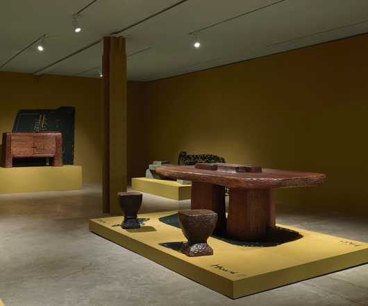
Ceramist Alex Matisse is a member of a storied family of artists and inventors, including his great-grandfather Henri Matisse and father Paul. Raised in a small New England town, he was making things from clay in the fourth grade. By the time he entered high school it was all that he wanted to do. Matisse was hesitant to fully embrace his calling because he didnt want to be compared to anyone else.
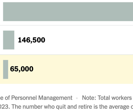
According to the U.S. Office of Personnel Management, about 65,000 federal workers have taken the resignation offer. The New York Times puts that number into context , given the size of the federal workforce. In other words, the federal government is an enormous work force that already experiences sizable turnover every year. In addition to workers who leave the government to retire or simply to quit, about another 50,000 to 60,000 are terminated every year for disciplinary or performance reason
Want to Inject Elegance? Discover Des Montilles Handwritten Script Font! Are you searching for that perfect handwritten font to add a touch of sophistication and warmth to your designs? Its a common quest, right? Finding a font that feels authentic, personal, and professional can be tough. You want something that stands out but doesn’t scream for attention.
Speaker: Eden Spivak, Design Expert and Editor at Wix & Nir Horesh, Accessibility Lead and Senior Product Manager at Wix
When we design products or websites for people like ourselves, there are many others who are, as a result, left out. From visually impaired users who rely on assistive technology, to people with a temporary injury such as a broken arm, tech users are forever diverse and beautifully unique. The products we design can, and should, reflect the extremely wide range of human experiences and needs.
We organize all of the trending information in your field so you don't have to. Join 66,000+ users and stay up to date on the latest articles your peers are reading.
You know about us, now we want to get to know you!
Let's personalize your content
Let's get even more personalized
We recognize your account from another site in our network, please click 'Send Email' below to continue with verifying your account and setting a password.


Let's personalize your content