This site uses cookies to improve your experience. To help us insure we adhere to various privacy regulations, please select your country/region of residence. If you do not select a country, we will assume you are from the United States. Select your Cookie Settings or view our Privacy Policy and Terms of Use.
Cookie Settings
Cookies and similar technologies are used on this website for proper function of the website, for tracking performance analytics and for marketing purposes. We and some of our third-party providers may use cookie data for various purposes. Please review the cookie settings below and choose your preference.
Used for the proper function of the website
Used for monitoring website traffic and interactions
Cookie Settings
Cookies and similar technologies are used on this website for proper function of the website, for tracking performance analytics and for marketing purposes. We and some of our third-party providers may use cookie data for various purposes. Please review the cookie settings below and choose your preference.
Strictly Necessary: Used for the proper function of the website
Performance/Analytics: Used for monitoring website traffic and interactions
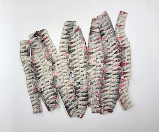
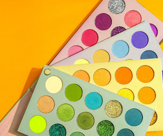
Pantone Color Institute and Valentino: Pink PP My earliest discernible memory of color – and graphic design – dates back to childhood when I watched my mother change the commercial printer inks on equipment for her graphic design business. The LOVE GOOD COLOR® Toolkit 3.
Renowned architect and artist Suchi Reddy and historic Indian brand Asian Paints recently presented Chromacosm , the largest and most comprehensive architectural color system with over 5,300 unique shades. Like a creature among grass, the viewer walks among tall stalks of colored cylinders, all adorned with a myriad of color.
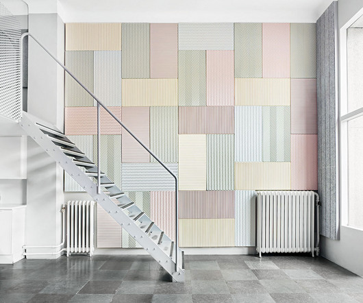
BAUX joins the likes of ABBA, IKEA, and Volvo as an iconic Swedish export cementing itself in the zeitgeist with their inaugural launch into the American market upon the Bio Colors unveiling – six new pastel hues across the Origami Acoustic Pulp range made solely from natural ingredients.
Creating a logo is so much more than just throwing shapes, colors and fonts together to look nice. While you may think specific fonts or colors look good, your customers or potential customers may not feel the same way. When working on your logo designs , create different color variations and orientations. Here they are….
Learn More Latest Price on Amazon: Sale 81 Reviews Design Is a Job Audible Audiobook Mike Monteiro (Author) - Mike Monteiro (Narrator) English (Publication Language) 03/31/2014 (Publication Date) - A Book Apart (Publisher) $12.99 But to improve as an artist, one must receive criticism and comments from peers and the general public.
By utilizing a wide range of colors and fonts can make that design more appealing to site visitors and increase its overall effectiveness. A wide variety of educational opportunities are available to study web design theory. This includes things like colortheory, grid systems, and proportions, among other things.
Neural Aesthetics explores the collaborative synergy between human creativity and artificial intelligence, while the Quantum Color Palette takes us beyond the conventional spectrum. Defying Traditional Color Norms The Quantum Color Palette disrupts the familiar color spectrum, introducing shades and combinations that defy traditional norms.
Visual Design Theory – Understanding colortheory, the basics of composition, and how to use typography among other things are all necessary for designing visually appealing websites. Publications – You can read dedicated websites, blogs, and online media outlets that cover web design and related topics. Final Thoughts.
He has a significant following of over 100K on Instagram, where he shares his work, which has been showcased in noteworthy publications such as The Guardian and It’s Nice That. Take the course at Domestika In this course, you will learn the fundamentals of color and composition and how to use them in street photography from Josh.
Here’s a list of 10 telltale signs that prove you’ve fallen headfirst into the colorful, grid-lined rabbit hole of design obsession. You Speak Fluent Hex Code While most people see colors like “blue” or “green,” you see #1A237E or #4CAF50. when choosing a new paint color. It’s not just math—it’s art!
More: Nick Pedersen , Instagram , Behance h/t: theinspirationgrid Pedersen’s work has been featured in numerous publications, including Vogue, Juxtapoz, and Hi-Fructose. He has also worked with brands like Adobe and Microsoft to create powerful visual statements through his art.
From typography to layout, right through to color and special effects, this list runs through a few basic rules, tips, tricks and guides to some common errors and how to banish them from your design. So, the more important elements are made to hold the most attention through scale, color, type etc. Have a logical color palette.
Ziza is the second digital font release to emerge from Mark van Wageningen’s ongoing experiments in constructing, deconstructing, and reconstructing type, exploring the connections between various type technologies and materials, and — most flamboyantly — revisiting and exploring the possibilities of color type.
A brand’s visual identity is a combination of graphic elements that represent and identify it, including its logo, color palette, typography, imagery, and other design elements. When customers see your logo or colors, they should be able to recognize and identify your brand immediately. What is a Visual Identity?
Costs range from $10,000 annually for in-state public universities to $35,000+ for private colleges. The skills are hugely versatile – from publications to advertising to web/tech roles. As a general rule, bachelor's degrees take around four years full-time. Associate degrees are faster at two years.
You’ll learn color manipulation, lighting, and other small tricks of the trade. Smashing Magazine is a very popular web design blog that also writes publications. Then you’ll add colors and details to design varying styles of icons. Mastering Photoshop for Web Design.
Sale Building a StoryBrand: Clarify Your Message So Customers Will Listen Hardcover Book Miller, Donald (Author) English (Publication Language) 240 Pages – 10/10/2017 (Publication Date) – HarperCollins Leadership (Publisher) −$12.03 $14.96 ” Ralf Speth.
On the other hand, contrast is a method to create emphasis within a design for impact, which can be seen in color choices, scale, or making specific text bold thereby creating a central focal point. Step 5: Study the Fundamentals of ColorColor affects the mood and personality of a design.
The focal point is also brought in through the use of color, the bright red being a stronger color against the washed-out green background. Contrast can be shown through color differences, size, or volume between elements. In this painting by Rothko, contrast is shown through the different color values of blue, orange, and red.
Since the first publication of the Baedeker Travel Guides , stars have been extensively used, from hotels to restaurants. Traffic light rating Ahh, colortheory. One of the most heavily contested and highly debated topics among designers, the meaning of colors, is a very subjective discussion. source: Changi Airport ) 5.
By using typography, color, form, imagery, and organization, we can achieve clear and effective communication. Developing color palettes, choosing the type of images to use, typographic choices, stationery, and other graphic elements will help a brand communicate its personality. . Types of Graphic Design: Publication Design.
Oregon State University Location: Corvallis, West Oregon Course Duration: 3-4 years Founded in 1868, Oregon State University , also known as OSU, is a public land-grant, research university based in Corvallis, a small city in West Oregon. Learn More 2. Made up of nine different colleges, PSU is able to offer degrees in 23 different fields.
She graduated from the Tyler School of Art with a BFA before designing some of the most memorable logos and branding for clients such as Citibank, Microsoft and the Public Theater. Paula Scher Pentagram design legend Paula Scher is well known for her groundbreaking typography and identity work.
Limit it to 2-3 colors max. For example: “Award-winning graphic designer with 5+ years experience creating logos, publications, and marketing materials. Avoid weird fonts that are difficult to read. Use negative space strategically. Whitespace helps guide the eye through different resume sections. Avoid rainbow overload.
Students on the CalArts Graphic Design course are taught the full spectrum of graphic design—from print and publication design to motion graphics for broadcast and film. UCLA is also a great university to foster creativity with its own public arts institutions. Duration: 4 years. California State Polytechnic University Pomona.
User-friendly interfaces are essential for digital products that are meant to be used by the general public. Interface design includes features such as fonts, colors, graphics, buttons, and menus. Interaction Design Skills User-friendly interfaces are essential for digital products that are meant to be used by the general public.
.” Eran Chen Photo: Ohad Kab Recent projects include the renovation of the former Postkantoor in Rotterdam, an urban plan in Chicago, and the conversion of a defunct parking garage into a public park and class A office building in Buenos Aires. “No ideas should be cherished as works of art unless they are,” he said.
The digital transformation is setting a new standard, with hyperrealistic graphics meeting the simplicity of minimalism, while dark mode and colorful gradients create impactful, high-contrast visuals. For instance, AI can quickly adjust layouts, select color palettes, or even generate typography variations that align with a brand’s tone.
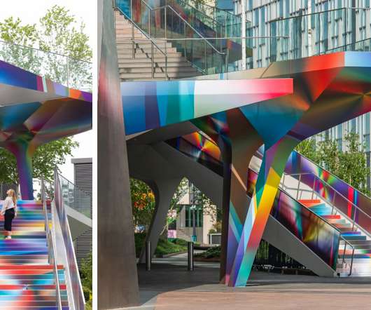
.” Whether working in kinetic sculpture or large-scale murals, Pantone investigates the vast realm of colortheory and its bottomless potential, in this instance transforming the cyan, magenta, and yellow model into a dynamic display.
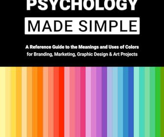
Color Psychology Made Simple: A Reference Guide to the Meanings and Uses of Colors for Branding, Marketing, Graphic Design & Art Projects SANS, EM (Author) English (Publication Language) 98 Pages – 12/08/2023 (Publication Date) – Independently published (Publisher) $19.99
There are different textures and color scripts that will create something unique every time. Double Color Exposure (ATN). But if you want to save yourself a lot of time, this artsy Double Color Exposure Photoshop action is worth the download. Double Color Exposure Effect (ATN, GRD). The results are emotive and intriguing.
From February 3-9, 2025, Sweden welcomed tens of thousands of guests, myself included, into one of their most vibrant cities filled with cultural events, impressive exhibitions, and otherwise private showrooms made open to the public. The comfort of classic colors that conjure emotion concocted by Note Design Studio with Blo.
Is it simply the colors they use, or is there something deeper? Well, understanding design principles like typography, colortheory, layout, balance, and hierarchy isn’t just about following rules. ColorTheory : Knowing how colors interact and evoke emotions is crucial. It is more than that.
We organize all of the trending information in your field so you don't have to. Join 66,000+ users and stay up to date on the latest articles your peers are reading.
You know about us, now we want to get to know you!
Let's personalize your content
Let's get even more personalized
We recognize your account from another site in our network, please click 'Send Email' below to continue with verifying your account and setting a password.


Let's personalize your content