This site uses cookies to improve your experience. To help us insure we adhere to various privacy regulations, please select your country/region of residence. If you do not select a country, we will assume you are from the United States. Select your Cookie Settings or view our Privacy Policy and Terms of Use.
Cookie Settings
Cookies and similar technologies are used on this website for proper function of the website, for tracking performance analytics and for marketing purposes. We and some of our third-party providers may use cookie data for various purposes. Please review the cookie settings below and choose your preference.
Used for the proper function of the website
Used for monitoring website traffic and interactions
Cookie Settings
Cookies and similar technologies are used on this website for proper function of the website, for tracking performance analytics and for marketing purposes. We and some of our third-party providers may use cookie data for various purposes. Please review the cookie settings below and choose your preference.
Strictly Necessary: Used for the proper function of the website
Performance/Analytics: Used for monitoring website traffic and interactions
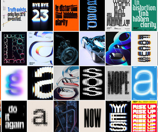
This trend takes inspiration from the past’s vision of the future, often characterized by neon colors, metallic accents, bold geometric shapes, and vintage typography. This can include using old-school fonts and neon color palettes in ad visuals for a nostalgic, tech-forward look.
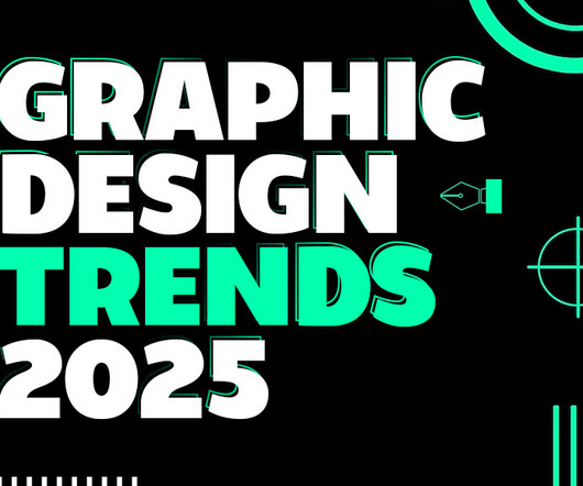
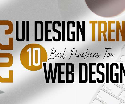
As we delve into graphic design trends 2025 , web design trends 2025 , and logo design trends 2025 , we’ll also highlight the influence of AI, typography innovations, and sustainable practices. Whether you’re a designer, marketer, or brand strategist, staying ahead of these trends is essential to creating relevant, impactful designs.
Typography has become fundamental in web design projects. Typography assists in providing an excellent experience for users before they even click a button or read. Typography has become one of the most popular trends of web design trends among designers. What is Typography? In general, typography brings the text to life.
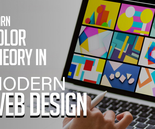
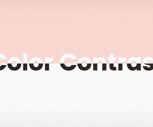
Every color used on a website can convey specific emotions and messages, and understanding this can help designers make informed choices. Firstly, the colorscheme of a website sets the overall tone. On the other hand, a vibrant and colorful palette might be more fitting for a creative or entertainment-focused site.
Typography will always be a key element of graphic design. The use of typography can make or break a design, determine the readability of app contents and directly impact business conversion. When it comes to typography, there are certain ground rules that remain constant. Typography and App Design.
inch business card with bleed, CMYK colorscheme, and 300 DPI resolution for professional results. inches with CMYK colorscheme and 300 DPI resolution, ensuring professional quality. 8, a sleek and modern design featuring minimalist elements, typography, and layout options in both dark and white themes.
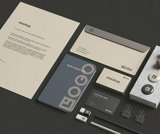
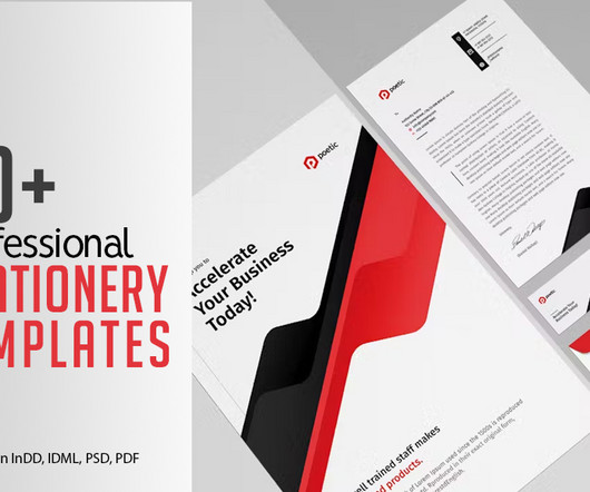
Many free stationery mockups are created with high-quality resolution, ensuring that even the most intricate details, such as logo placement and typography, appear crisp and professional. Designers can try different colorschemes, fonts , and layouts before committing to a final design.
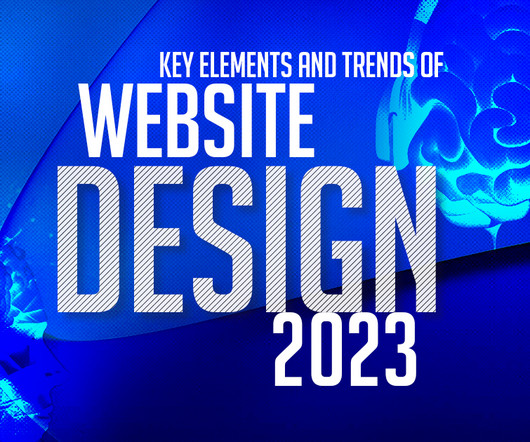
The use of bold, eye-catching typography is another trend in modern website design. Designers are experimenting with unique fonts and typography to create memorable designs that stand out from the crowd. Consistency in design Use a consistent design throughout your website, from the layout to the colorscheme and typography.
This includes layout, typography, colorschemes, and imagery. Typography and Text Elements Typography plays a crucial role in movie poster design. Futuristic posters might experiment with kinetic typography, where the text appears to move or change when viewed from different angles or through digital devices.
From color palettes and typography to imagery and layout, every facet meticulously communicates your core values, personality, and target audience. The refreshed logo, typography, and color palette reflect Buscapé’s dynamic nature and dedication to providing intuitive, user-friendly experiences.
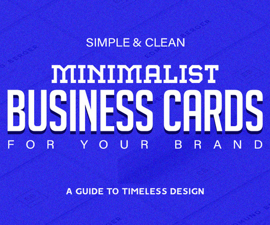
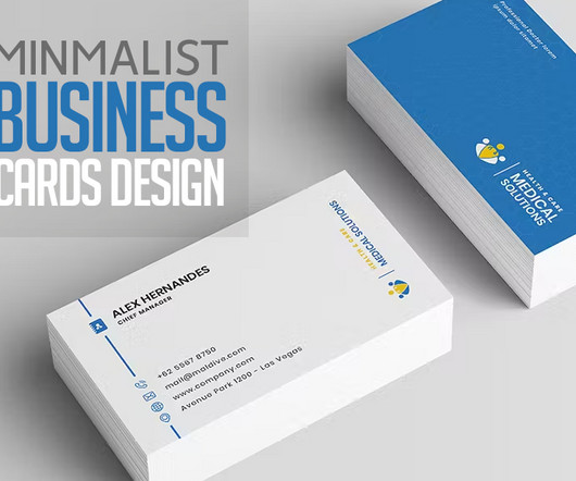
In the context of graphic design, this often means using a limited color palette , simple typography, and strategic use of white space. They can seamlessly adapt to various colorschemes and printing techniques, ensuring that your business cards look consistent across different mediums and materials.
From logos and colorschemes to typography and graphic elements, every aspect of a brand visual identity contributes to its overall image and reputation. With a distinctive logo, cohesive colorscheme, and modern typography, it captures the essence of freelancing in a digital age.
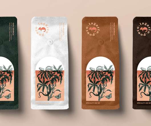
Gorgeous packages with a subtle colorscheme and delightful illustrations, excellent work by FiveStar Branding. The sparse use of color and wild minimalism does wonders for these packages of coffee for Woods, designed by Man Man Van. A real typographer’s coffee packaging, uses only typography, a bit of color, and one icon.
It’s essential to choose colors that complement each other and resonate with the target audience. Typography : The choice of fonts can greatly influence the badge’s character. Whether it’s a bold, modern typeface or a classic, elegant script, typography should be chosen to reflect the brand’s personality and ensure readability.
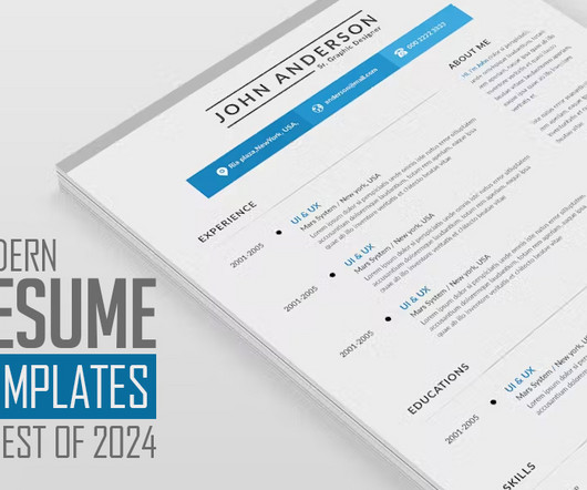
Their dynamic layouts, vibrant colorschemes, and innovative designs serve as a breath of fresh air in a sea of monotonous CVs. Modern resume templates have transcended the conventional norms, incorporating sleek designs, creative layouts, and vibrant colorschemes. List of Modern CV Resume Templates: 1.
Additionally, creative use of fonts and typography adds personality to the flyer and reinforces the overall message. They incorporate the brand’s visual identity, including logos, colorschemes, and brand elements, to establish a consistent and recognizable look. You may be interested in the following articles as well.
Romance novels might benefit from soft, elegant layouts featuring pastel colors and flowing scripts. Thrillers, on the other hand, could utilize bold typography, dark backgrounds, and imagery that conveys a sense of suspense. Typography: The right font choice can elevate your cover design.
Lettering posters are a fantastic medium for expressing creativity, making a statement, or simply exploring the art of typography. Choosing the Right Typography: The choice of font or style of lettering is crucial. These elements should complement the typography rather than overshadow it. It sets the tone for the entire poster.
Typography and Lettering Designs. Corporate identity or Branding is all about creating a logo design and in building up the brand value is essentially best done by a graphic designer who is adept in creating images keeping the colorschemes, and the artistic value of the image that represents the brand as well as the organizations.
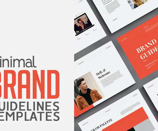
In these templates colorschemes to typography choices, designers can easily reference the guidelines to maintain visual consistency while exploring creative variations. Boasting over 50 unique slides, the template covers essential topics such as core values, typography, colorschemes, and media guidelines.
It encompasses a suite of elements including logos, colorschemes, typography, and design guidelines, ensuring consistency across all communication channels. From captivating logos to cohesive color palettes and elegant typography, every detail is meticulously crafted to resonate with the target audience.
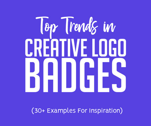
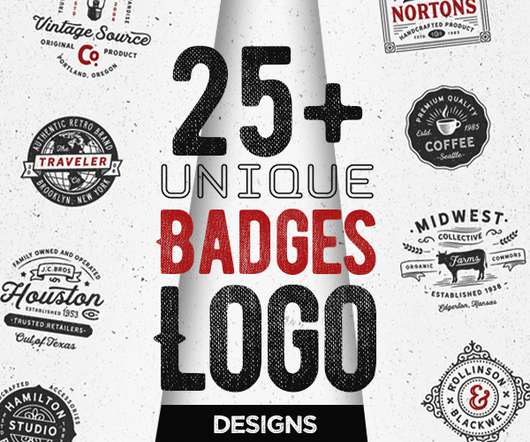
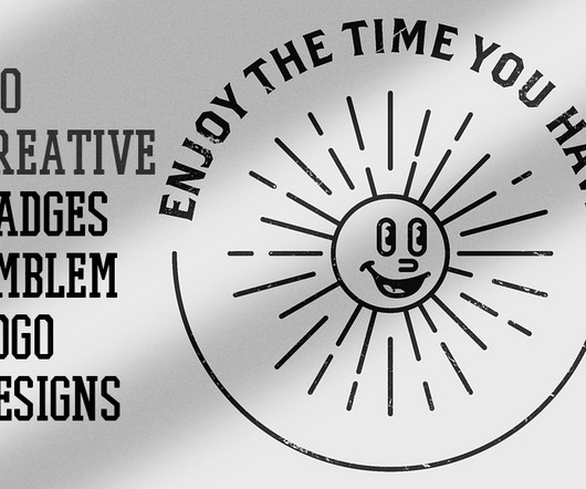
Unique examples of vintage badges logo design concepts and ideas that can use for branding projects, labels, apparel design, typography and more. All logo badges are professionally designed with amazing concepts. Today’s in this gallery I’ve gathered creative badges logo design, concepts and ideas that will surely inspired you.
In this section, we’ll delve into the design and layout aspects, including font selection, colorschemes, white space utilization, and overall aesthetic presentation. They showcase a candidate’s individuality and unique personality while maintaining a professional tone.
Typography and Lettering Designs. Corporate identity or Branding is all about creating a logo design and in building up the brand value is essentially best done by a graphic designer who is adept in creating images keeping the colorschemes, and the artistic value of the image that represents the brand as well as the organizations.
A highly versatile business card template with modern, simple and unique layout and strong typography. The colorscheme can be edited with a few simple steps. Modern, simple and unique layouts with strong typography make your business cards look professional. Clean Business Card Design. Modern Business Card Design.
There are specific design conventions for each genre, which range from colorschemes to imagery. Notice the typeface selections, colorschemes, and general atmosphere they use. Typography and Font Counts The tone and genre of your work can be effectively communicated through typography.
On digital platforms, storytelling, unique illustrations, dark mode, ethical design and bold typography are always the defining elements. #1 Typography is given center stage in the UI trend known as ancient typography or rule-breaking typography. A similar thing was chunky typography on their pages. 5 Dark Mode.
Ease of Customization : Every page element is customizable, from typography to colorschemes. Print-Ready Output : With CMYK color mode, the template is ready for printing, ensuring color accuracy and quality when produced in physical form. However, users can customize these colors to better match their brand.
Typography and Lettering Designs. Corporate identity or Branding is all about creating a logo design and in building up the brand value is essentially best done by a graphic designer who is adept in creating images keeping the colorschemes, and the artistic value of the image that represents the brand as well as the organizations.
Custom TypographyTypography has always been an integral part of logo design, but in 2025, it will take on an even more personalized role. Custom typography allows brands to craft a distinct voice, infusing personality and emotion into their logos.
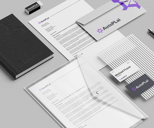
When your audience encounters your logo, colorscheme, and typography consistently in both online and offline settings, it builds trust and familiarity. Kander Branding Design Printed materials, such as business cards, brochures, and letterheads, play a pivotal role in creating a consistent brand image.
Tractors are a good example; not one brand has the same colorscheme, and now you know the reason. Typography and Colors are Important. As for colors, typography should be different from your competitors but also connected to the identity of your brand. Try to portray your brand values with design elements.
Enjoy: Creative Resume Design This template offer a wide range of design elements, such as bold typography, creative layouts, and unique sections, that allow you to infuse your personality and style into your resume. These templates focus on typography and use white space strategically to create an elegant and professional appearance.
Visual identity design, on the other hand, refers to the visual elements that represent the brand , including the logo, colorscheme, typography, imagery, and more. In the logo design process , designers experiment with shapes, symbols, typography, and colors to create a unique and impactful logo.
With a few clicks, you can modify elements like colorschemes, typography, and images. Adjust the Typography and ColorScheme This template features a modern, clean typography system. However, you can adjust the fonts and colorschemes to align with your personal brand or project needs.
They utilize ample white space, clear typography, and simple colorschemes to create an elegant and professional appearance. Simple and minimal resume templates are visually appealing due to their clean, uncluttered look. In today’s competitive job market, a well-crafted resume is your passport to career opportunities.
By embracing minimalist aesthetics, experimenting with geometric shapes and negative space, incorporating hand-drawn elements, focusing on typography, exploring abstract symbols, and prioritizing responsive design, you can create a logo that resonates with your audience and sets your brand apart from the competition.
These templates often incorporate striking colors, energetic typography, and vivid imagery to capture attention and convey enthusiasm. They use ample white space, elegant typography, and a restrained color palette to convey sophistication. Here are some key reasons why brochures are essential in branding.
It features a high-contrast colorscheme, beautiful design components, and outstanding typography. It features a modern aesthetic and support for multiple colorschemes. Each can be customized to fit your content and colorscheme. It’s a versatile choice for building web applications.
You can filter the gallery by Color, Black and White, Alphabet, Typography and Symbol Logos. Adobe Color is a web app where you can create and share color themes, using a color wheel or image. You can also browse thousands of colorschemes from the Adobe Color community. The Logopond.
A Friendly Christmas Touch: Font and Icon Choices The typography chosen by DesignCoach contributes to the card’s holiday appeal. The playful icons, like stars and ornaments, complement the typography, adding a whimsical touch that’s bound to resonate with audiences of all ages.
For example, pairing a minimalist design with a bold color palette can convey both sophistication and energy. Additionally, experimenting with typography or adding an unexpected geometric element can make a logo stand out. From bold typography to minimalist aesthetics, these designs push the boundaries of traditional branding.
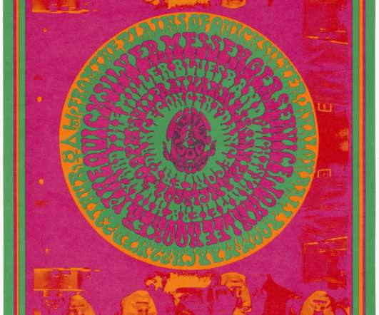
Psychedelic Art borrowed most of its design identity from art nouveau, using hand-drawn illustrations and typography styles that leaned heavily on curvilinear shapes and vibrant, almost neon, colorschemes. Design Movements in the 1960s. ” Wes Wilson’s The Red Hat from Wes Wilson. Roy Lichtenstein’s Whaam!
Such a designer excels in crafting images that harmonize with colorschemes and uphold the artistic essence representing both the brand and the organization. Additionally, the strategic use of symbols and typography enhances recognition, making the emblem easily identifiable across diverse platforms.
We organize all of the trending information in your field so you don't have to. Join 66,000+ users and stay up to date on the latest articles your peers are reading.
You know about us, now we want to get to know you!
Let's personalize your content
Let's get even more personalized
We recognize your account from another site in our network, please click 'Send Email' below to continue with verifying your account and setting a password.


Let's personalize your content