This site uses cookies to improve your experience. To help us insure we adhere to various privacy regulations, please select your country/region of residence. If you do not select a country, we will assume you are from the United States. Select your Cookie Settings or view our Privacy Policy and Terms of Use.
Cookie Settings
Cookies and similar technologies are used on this website for proper function of the website, for tracking performance analytics and for marketing purposes. We and some of our third-party providers may use cookie data for various purposes. Please review the cookie settings below and choose your preference.
Used for the proper function of the website
Used for monitoring website traffic and interactions
Cookie Settings
Cookies and similar technologies are used on this website for proper function of the website, for tracking performance analytics and for marketing purposes. We and some of our third-party providers may use cookie data for various purposes. Please review the cookie settings below and choose your preference.
Strictly Necessary: Used for the proper function of the website
Performance/Analytics: Used for monitoring website traffic and interactions
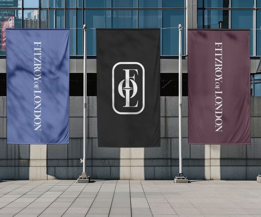
Since its inception, Toronto's Vanderbrand has carved a niche for itself through smart, considered work that largely centres on places and spaces with a range of clients across high-end real estate, hospitality, and cultural projects.
Others, meanwhile, would love to shout about what they've created, but their clients frustratingly forbid it. Their bold and fearless approach has earned them collaborations with clients across a variety of industries, from tech to hospitality. Studio DBD 13.
From neo-grotesques with a modern edge to culturally significant designs preserving endangered languages, these typefaces reflect the diversity and depth of contemporary typography. With low stroke contrast and two full sets of capitalsLatin and BlackletterPlace shines as a display face and a workhorse for complex typography.
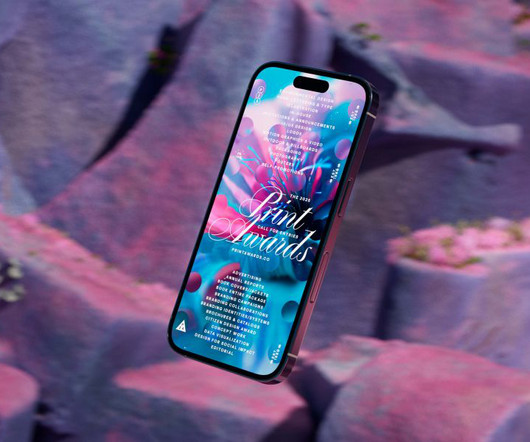
The awards' new visual identity embodies organic growth as a metaphor for creativity, blending generative design and dynamic typography. Typography played a fundamental role in ensuring the identity remained cohesive across all touchpoints. A major challenge, however, is enabling clients to independently generate branded assets. "A
Navigating the balance between boundless creativity and concrete client expectations is pivotal in graphic design. This balancing act is like walking a tightrope, where tilting too far in one direction can compromise creative integrity, and leaning too much the other way might not meet client needs. Who are they? What appeals to them?
Returning to Milton Keynes this May, All Flows has curated a proper treat for anyone with even a passing interest in graphic design, typography, illustration and creative innovation in general. Fancy rubbing shoulders with some of the industry's most exciting minds while soaking up fresh perspectives in an intimate setting? Who's coming?
No truer is this mantra than when you want to impress potential clients with your portfolio. That means incorporating the latest design trends so potential clients take notice and pick you over your competitors. It showcases your capabilities and convinces clients-to-be, creative directors, or hiring managers you are the real deal.
Since then, this New Zealand foundry has carved out its niche in the competitive world of typography through a combination of accessible design and creative merchandising. Economic pressures Looking ahead to 2025, Daniel sees the typography landscape evolving in response to economic pressures. "I
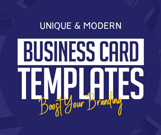
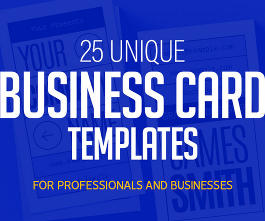
The right business card templates can enhance your brand’s image , reflect your creativity, and leave a lasting impression on potential clients or partners. Professional Business Card Template Make a great first impression to your clients with one of our professional and easy to customize business card designs.
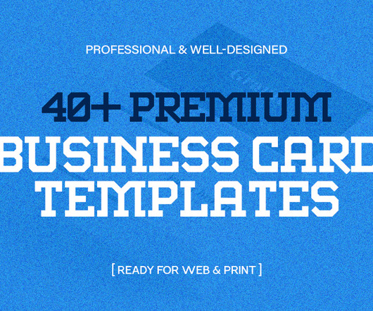
As technology accelerates, premium business card templates will continue to be the first tangible connection you share with potential clients or partners, combining cutting-edge design with a personalized touch. The post 40+ Premium Business Card Templates That Will Impress Your Clients first appeared on Graphic Design Junction.
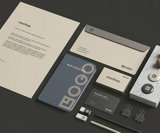
When presenting a brand to clients or stakeholders, one of the most powerful tools is a well-designed stationery mockup. Many free stationery mockups are created with high-quality resolution, ensuring that even the most intricate details, such as logo placement and typography, appear crisp and professional.
Originally from Denmark, Julie Solvstrom has become a leading light in Vancouver's creative community with her beautiful, organic approach to illustration and typography. Typically, clients will see something in her portfolio that they like, and she'll work from that basis, making tweaks and changes to ensure that each project is unique.
Text is represented through typography – it is a way to communicate efficiently. Although those elements are essential, they often forget about the typography of the website. These typography tips will help you unlock an impressive UI for your websites. This is especially necessary for mobile-based typography.
With offices in Helsinki, Amsterdam, Los Angeles, and soon Paris, Agent Pekka represents a hand-picked group of artists working across various disciplines, from 3D and animation to illustration and typography. Henrique Barone Agent Pekka now provides animation services to its clients, with Vancouver-based Henrique Barone leading the way.
SUN then carefully curated the brand's new colour palette, with hues chosen to classify the ranges and help clients navigate the styles and collections. For the typography, Wolstenholme says the design team "paired modernity with antiquity", balancing a lovely display font with an ultra-modern sans-serif.
So, to fill the time and continue developing her skills, she began a challenge entitled 365 Days of Grunge Typography Posters. I aim to encourage other designers to be bold, share their work, and attract their ideal clients and opportunities," she says. However, she struggled to find the right opportunities amidst the global pandemic.
The typography is clean and sans-serif, further enhancing the brand's no-nonsense, approachable personality. With so much goodwill on the market, the client requested that Grant utilise their existing logo in the new brand. The packaging is minimalist, using soft, muted colours that evoke a sense of calm and care.
Typography, advertising and photography When it came to the brand typography, Tomato Grotesk was chosen because it is modern, simple, and geometric while having a touch of quirk and flair. The contrast of weights within the typeface makes it feel more humanist, friendly, and organic.
Clients include disaster relief organisation Giro555, youth health community JOGG, research foundation Stichting Toekomstbeeld der Techniek, pregnancy and baby app 24baby and the Museum of Literature. This approach, they argue, enables them to create bespoke identities, websites, apps and print that truly reflect their clients' visions.
Ofir Mizrahi delivers award-winning websites that clients and visitors love. If ever a potential client needs reassurance of the high-quality results they'll get, they just have to glance at the stunning work on the studio's online portfolio, spanning clients in the gastronomy, lifestyle, culture, corporate and non-profit sectors.
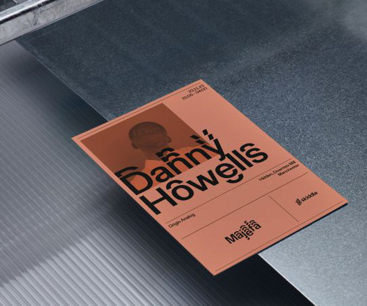
Using unique templates ensures your card stands out, leaving a memorable mark on potential clients or collaborators. Download Barber Shop Business Card Template Download Big Typography Business Card Design The degree of design quality found here far exceeds what is possible in Photoshop business card templates.
But how you market yourself will be the deciding factor for clients when choosing you over your competitors. What do clients consistently praise or appreciate about my work?' In other words, decide what it is that you (and only you) can offer a client. The client already likes your work: that's why they're talking to you.
Boasting dynamic typography and colours inspired by rave culture, the identity is a celebration of the UK's clubbing aesthetic. This is where our designers can really let loose (without client feedback!) The client was really inspired by the Hacienda artwork 'Faç Off' by Central Station Design. "It He's not wrong.
Best of all, this is a flexible degree that can be tailored to your interestsfor example, in app development, animation, visual identity and branding, illustration, photography, typography and publishing, or graphic design in general. She continues to judge major industry awards, including Creative Circle, D&AD and Campaign Big.
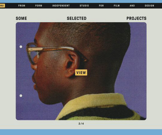
Its client list includes the likes of Ace & Tate, Skoda, Amsterdam Museum Night, and OFFF Festival. The new identity marks From Form’s tenth anniversary, and captures its “love of colour, film typography, and nostalgic aesthetics”, according to the studio.
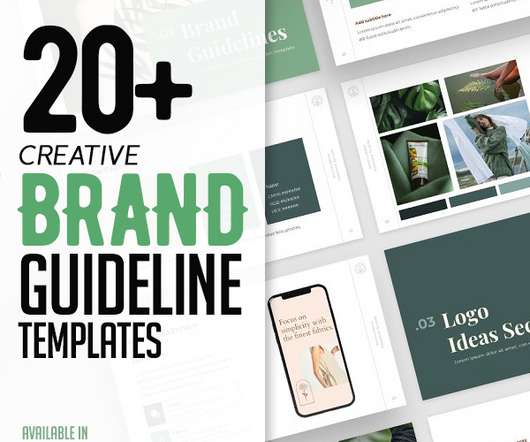
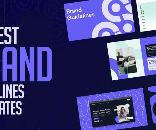
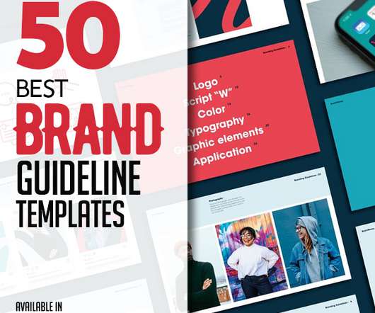
Brand design agencies and branding studios will use brand guidelines templates to present their clients how to implement their new brand. Brand guidelines templates are suitable for any a variety of clients. The templates including Introduction, logo, color, typography, digital, Stationery, photography, Iconography.
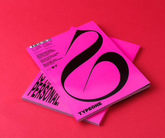
All photography by Yeshen Venema TYPEONE magazine isn't just a beautifully designed print publication; it's also full of key insights about the evolving interaction between typography and graphic design. Ultimately, typography doesn't exist in a vacuum but is just one element in a dynamic and ever-evolving design landscape.
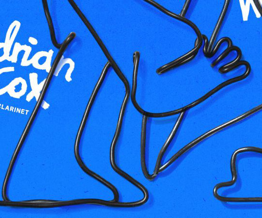
And he's teamed up with rising star illustrator Con McHugh to create a visual world that's as fresh and vibrant as the music itself, including album artwork, typography and an animated event poster. Adrian's very much been the dream client from the start, trusting me to take the lead in the artistic process," says Con. "We
Half-Greek and half-German, and based in London, Tina's work spans digital and print design, typography, branding, graphics, animation, and more, blending analogue and digital worlds by mixing various materials and techniques into her distinctive outcome. Her impressive client list includes LinkedIn, Kappa, Converse, The New Yorker, and Tate.
Guideline presentation templates are amazing to show off your talents, skills, services, and products to your clients in a professional and beautiful way with this Services & Pricing Guide template. Brand guidelines templates are the best way to show their clients how to implement their new brand identity.
Royal Television Society's annual two-day event by Studio Kiln We canvas a selection of design industry experts to learn what will be big in typography over the next 12 months. Whether you work as a type designer, graphic designer or any other form of creative, you probably find typography central to your work, at least occasionally.
Brand guidelines brochures are fully customizable, utilizing character, paragraph and object styles which means you can tailor your deck to each client and either send it to print or save it as a pdf for the client. Print as or export and send to clients as a pdf. Easy to replace typography and brand colours with your own.
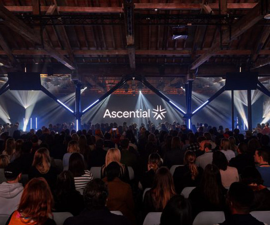
So it teamed up with DesignStudio , the global brand agency with studios in London, New York, Shanghai and Sydney whose clients include Airbnb, Premier League, Panasonic, British Airways, Logitech, AT&T and Riot Games. The lead brand colour, Ascential Yellow, acts as a spotlight highlighting UI, typography, and data to tell stories.
Fun character They based the new visual identity around a detective character who, with relentless persistence, finds the best jobs and talent for his candidates and clients. We know that in real life, Mathieu works damn hard to look after his clients and candidates. He's been wearing it for years.
This should briefly describe your project, introduce the client, and outline their main objectives. Share the story behind it, including information about the client's history and what makes them unique in their field. Who is the client, and what is their background? The brief What was the client's original brief?
Creative Stationery Design Tips To Wow Clients Let's get one thing straight. Picture unique layouts, engaging typography, vibrant colours, and even bespoke illustrations that scream personality. Importance of Innovative Stationery for Clients Now, let's dive into why innovative stationery matters for you , the client.
Founded by type artist and designer Dani Molyneux, Dotto is a creative studio that aims to bring about change through "words, purposeful play and typography for thought". Revisiting a previously made set of type prints, Dotto has collaborated with Buff Motion to create a kinetic typography loop series called Type That Moves.
Services like Google Drive and OneDrive offer secure storage and easy collaboration with clients and team members. Communication Tools Effective communication is essential for remote graphic designers to stay connected with clients and colleagues.
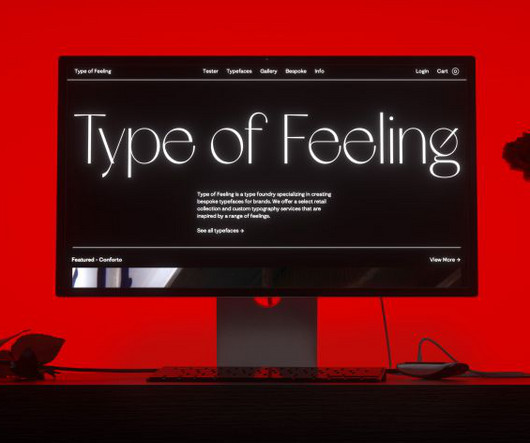
I have fallen in love with the power of unique typography and its power to tell stories and create an ownable brand language," enthuses Jessica, who's known for her New York-based creative studio &Walsh. Type of Feeling offers a select retail collection alongside custom typography services.
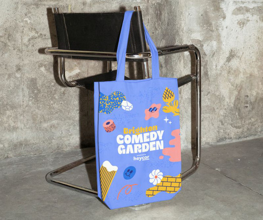
Finding an illustrator The design process started with in-depth discussions with the client to establish a new direction centred on a heavily illustrated poster border design. We wanted the typography to complement and enhance Hedof's playful illustrations while ensuring the festival names remained prominent."
Often, when a client comes to a design agency looking for brand reinvention, there are certain red lines you cannot cross: a case of working with what you've got. Wealth management isn't normally the sexiest of topics. But in its rebrand of Talagent Financial, &Walsh has reached into the heart of what makes us human.
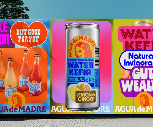
Typography and colour palette While water kefir is low in sugar and sophisticated in taste, it is a soda-style drink. The client was happy, too. "By jostling these with vibrant colours and nostalgic typefaces together, we were able to suggest the drinks' lively taste," he adds. Overall, this was a happy project, says Chris.
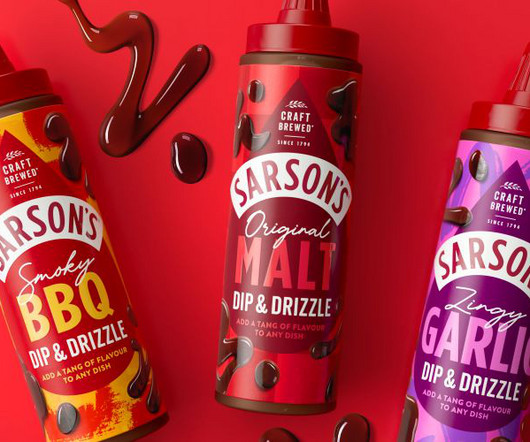
After one of the studio's long-term clients moved on to managing Sarson's brand, Robot Food was brought on board to reinvigorate the much-loved heritage brand and prepare it for the future. Robot Food took a simple approach to typography and didn't want to overcomplicate the identity with unnecessary additional fonts.
It showcases the best in visual communications, from typography to illustration and everything in between. The publication is based in California and covers graphic design, advertising, illustration, photography, interactive design and typography. Idea Idea is a magazine about graphic design and typography published quarterly in Tokyo.
We organize all of the trending information in your field so you don't have to. Join 66,000+ users and stay up to date on the latest articles your peers are reading.
You know about us, now we want to get to know you!
Let's personalize your content
Let's get even more personalized
We recognize your account from another site in our network, please click 'Send Email' below to continue with verifying your account and setting a password.


Let's personalize your content