This site uses cookies to improve your experience. To help us insure we adhere to various privacy regulations, please select your country/region of residence. If you do not select a country, we will assume you are from the United States. Select your Cookie Settings or view our Privacy Policy and Terms of Use.
Cookie Settings
Cookies and similar technologies are used on this website for proper function of the website, for tracking performance analytics and for marketing purposes. We and some of our third-party providers may use cookie data for various purposes. Please review the cookie settings below and choose your preference.
Used for the proper function of the website
Used for monitoring website traffic and interactions
Cookie Settings
Cookies and similar technologies are used on this website for proper function of the website, for tracking performance analytics and for marketing purposes. We and some of our third-party providers may use cookie data for various purposes. Please review the cookie settings below and choose your preference.
Strictly Necessary: Used for the proper function of the website
Performance/Analytics: Used for monitoring website traffic and interactions
In an era when attention spans are dwindling and visual overload has become the norm, Counter-Print's new book celebrates the transformative power of expressive typography. It led to a book that considers the challenges of visual clutter by showcasing typography as a bold and innovative medium.
One Living by Derek&Eric From simplified skincare to tech-infused cosmetics, these cutting-edge branding initiatives are reshaping the health and beauty landscape worldwide. This pressure has sparked a wave of innovation in health and beauty branding. Today, that sentiment extends far beyond just facial care. Want examples?
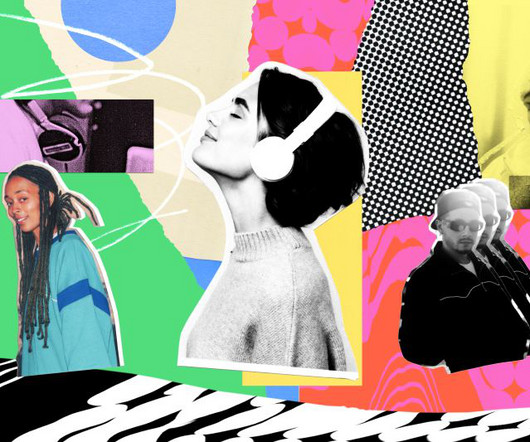
Illustration by Mia Angioy for Creative Boom In the last of our special six-part series, we explore how sonic branding can elevate your brand's presence by leveraging Epidemic Sound's expansive library of music and sound effects. In 2024, the auditory experience has become crucial to crafting a cohesive and memorable brand presence.
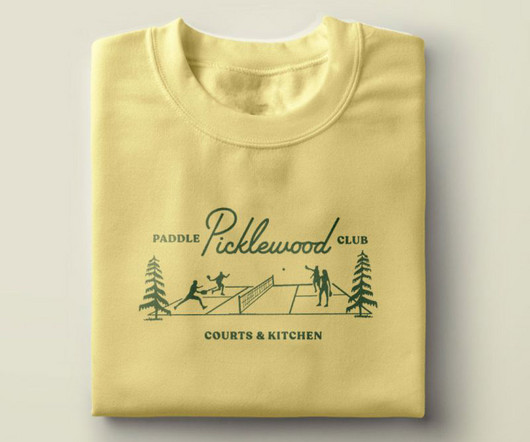
And they turned to local creative website agency People People to define and create a memorable brand and visual identity. From the midcentury script typography to the playful supporting illustrations and colour palette to the custom plaid and argyle patterns, everything is designed with tongue-in-cheek. It's pickleball, after all."
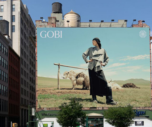
It has a great deal of equity and recognition in Mongolia, but wanted help in growing the brand outside the country. This makes them unique, and it's the story we needed to tell and build the Gobi brand around." To launch the new brand identity, Mucho created a campaign titled 'Go. So they turned to global creative agency Mucho.
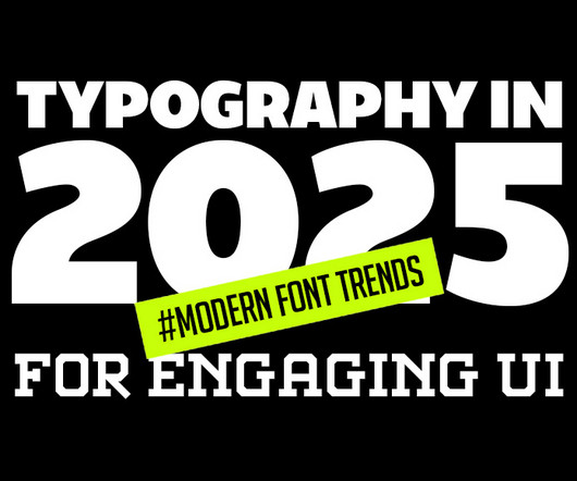
Typography is evolving rapidly, reshaping how we perceive and interact with digital designs. This article delves into the latest typography innovations that promise to make digital interfaces more engaging, accessible, and visually appealing. Minimalist and Clean Typography The “less is more” approach remains popular.
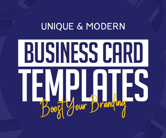
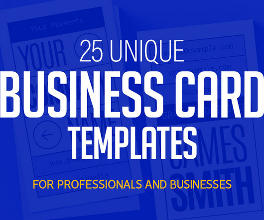
While the popularity of digital communication continues to rise, business cards remain a powerful tool for face-to-face networking and branding. The right business card templates can enhance your brand’s image , reflect your creativity, and leave a lasting impression on potential clients or partners.
In a drinks market overflowing with kombuchas, seltzers, and adaptogen-laced elixirs, where health-conscious consumers are becoming increasingly selective with their choices, being the go-to brand is no easy feat. Enter Earthling Studio, which was tasked with overhauling HALFDAY's visual identity and brand world.
A new monogram, sleek colour palette and complementary family of typefaces all contribute to a more memorable and emotive brand experience for the accessible luxury bathroom supplier. So, the brief asked SUN to communicate this through the new brand.
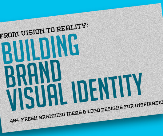
Creating a powerful brand with a unique visual identity requires more than just logo designs; it’s about building an emotional connection, crafting an impactful message, and visually representing values. Each element of logo designs — colors, typography, shapes — all contribute to how a brand is perceived.
A few years ago, the question was: should your brand identity include motion? So nowadays, the question is more like: how is motion interwoven into the heart of your brand? And rather than being a mere "add-on" to brand identity, it needs to be integrated into the brand identity process from the very start.
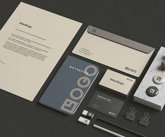
In today’s highly competitive business environment, branding is essential for making a memorable impression. When presenting a brand to clients or stakeholders, one of the most powerful tools is a well-designed stationery mockup. This attention to detail can make a substantial difference when presenting branding concepts to clients.
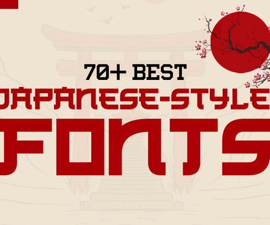
Whether you’re working on branding, packaging, or web design, the right Japanese-style font can evoke cultural authenticity, elegance, or contemporary simplicity. This guide explores 70+ Japanese-style fonts , categorized by their design styles, and provides insights into how each category can enhance modern design and branding.
Paula Scher , Michael Bierut, Marina Willer, Samar Maakaroun, Eddie Opara and others have led some of the most iconic branding and design projects of our time, and it's ultimately Pentagram's ability to evolve while maintaining high standards of creativity that's led them to top our list.
Enter Lazy Tan, the brand that wants to flip the script with its innovative, easy-to-apply, skin-friendly formula. Of course, the self-tan market has boomed in recent years, and we've seen everything from celebrity brands to natural claims, foams, oils, moussesyou name it.
The Canadian agency is all about smart, strategic branding that breathes life into real estate, cultural, and hospitality spaces. With a collaborative vibe and a knack for timeless design, its team creates brands that don't just look great—they feel like they truly belong.
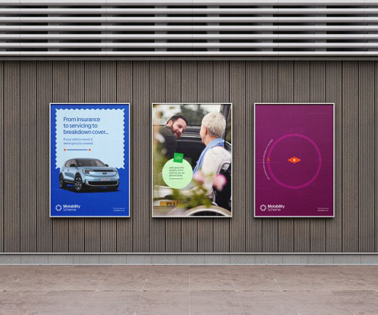
SomeOne founding partner Simon Manchipp delves into their recent project with the Motability Scheme, explaining why brands in this sector need to change. Nowadays, there's no excuse for brands and services to be inaccessible with so many tools at their disposal to ensure otherwise.
While brands in the fusion space are already falling into stereotypes, STEP is standing out from the crowd with a colour palette inspired by the synthetic image of future plasma. Among Equals is behind the identity for new UK energy programme STEP, designed to position the brand as ambitious as NASA's Apollo missions.
From neo-grotesques with a modern edge to culturally significant designs preserving endangered languages, these typefaces reflect the diversity and depth of contemporary typography. With low stroke contrast and two full sets of capitalsLatin and BlackletterPlace shines as a display face and a workhorse for complex typography.
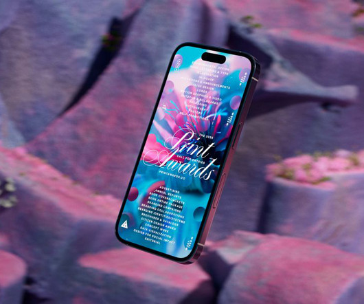
The awards' new visual identity embodies organic growth as a metaphor for creativity, blending generative design and dynamic typography. Typography played a fundamental role in ensuring the identity remained cohesive across all touchpoints. The hero film also actively shaped the overall brand identity.
Leeds International Festival of Ideas covers some tricky topics, so the branding and visual assets needed to be sensitive. Credit: Tom Martin When it came to branding, the event organisers turned once again to Leeds and Glasgow-based design studio Rabbithole. Rabbithole explains how it developed it.
Now, it has an identity that competes with global brands without compromising on its roots in the country's culture. Known for its unconventional campaigns and innovative designs over the last nine years, the brand contributes approximately 74% to the company's total revenue, selling millions of pairs globally.
At the cutting edge of conservation, Chester Zoo wanted a new brand and website to champion these nature-positive efforts. The branding agency soon got to work repositioning Chester Zoo's look and feel in a way that represented both the experience within the zoo gates and its greater purpose of serving nature as a whole.
A professional business card is more than just contact informationits a reflection of your brand. These templates are fully customizable, allowing you to tailor every element to fit your brands aesthetic. You can use this item for personal branding,identity,corporate namecard, business card or any marketing purposes.
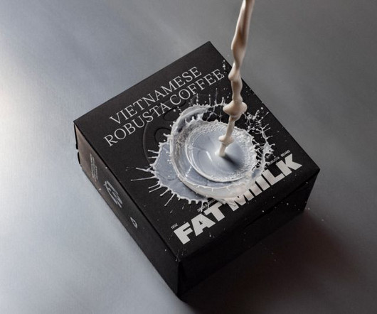
Still, getting attention and conveying the quality of your brand isn't easy. The company was founded by Vietnamese-American Lan Ho, a daughter of immigrant political refugees, but was not the only Vietnamese coffee brand in the US by any means. To do so, they turned to award-winning LA branding agency Truffl.
To help spread their message far and wide, Fluz recently teamed up with Koto , a brand and digital agency with studios in Berlin, London, Los Angeles, New York and Sydney, to craft a fresh brand to fuel Fluz's expansion. Typography and colours At the centre of the new identity is a bold and confident wordmark.
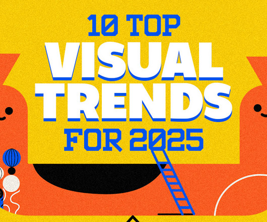
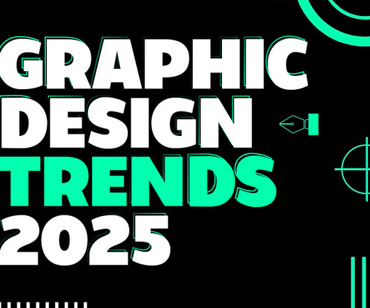
Whether you’re a designer, marketer, or brand strategist, staying ahead of these trends is essential to creating relevant, impactful designs. As we delve into graphic design trends 2025 , web design trends 2025 , and logo design trends 2025 , we’ll also highlight the influence of AI, typography innovations, and sustainable practices.
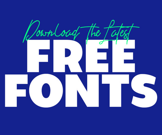
Using the latest free fonts and fresh typography styles can instantly improve your work and keep your designs looking modern and creative. Whether you’re working on advertisement posters, brand guidelines , or even designing a logo, fonts play a pivotal role in creating visual impact.
With big, industrial-era typography, a "straight-talking" tone of voice and a vibrant colour palette, the new identity marks a fresh chapter for the arts centre. It is marking this milestone with a bold brand refresh by EDIT Brand Studio. One of the most noticeable changes is the shift in tone and language. "For
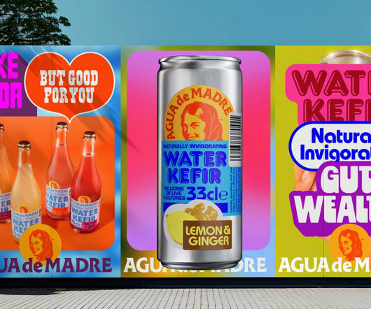
Designed by award-winning creative director Chris Chapman, adam&eveDDB's new brand identity for Agua de Madre fizzes with joy and purpose. We decided it would be a good idea to keep the illustration of the Madre's face and the font of the wordmark," he explains, "as these felt like the most salient features of the branding. "By
This new identity for the Norfolk coast by Lantern is a masterclass in place branding. Most of the work in branding is about either creating entirely new brands or refreshing existing ones. One of the most intriguing challenges in branding is bringing together several discrete entities and making them sing as one.
Elements of Goldbug's old identity were retained and refreshed where possible to preserve the brand's 56-year legacy. Lafayette American's Scorpion Rose Studio has rebranded the women-owned infant and children's accessories brand Goldbug, introducing a new visual language to help the company transition from B2B to B2C.
Forest Gum by Jens Nilsson From plant-based ice cream to sustainable chewing gum, these forward-thinking branding projects are reshaping the food and beverage landscape across the world. With that in mind, we've picked five of the best new branding projects for September to inspire your own projects.
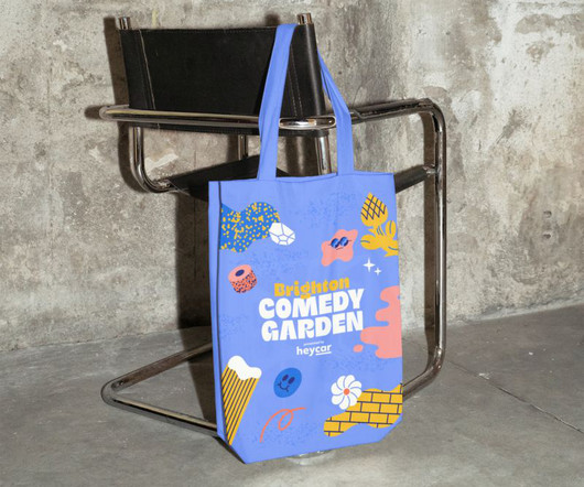
The London-based studio collaborates with renowned illustrator Hedof to create upbeat and engaging branding for the Comedy Garden Festival. The closest reference we found was music festivals, which helps set the design and branding of the 57 Festivals events apart from anything in the same category."
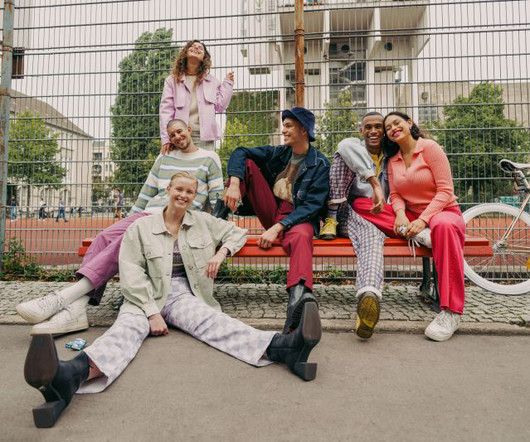
Today's audiences are craving authenticity, with brands shifting from selling products to experiences and human connections. This trend captures real, unfiltered moments that feel raw and relatable, particularly evident in lifestyle and clothing brands. Candid Photos The polished aesthetic of the 2010s is officially pass.
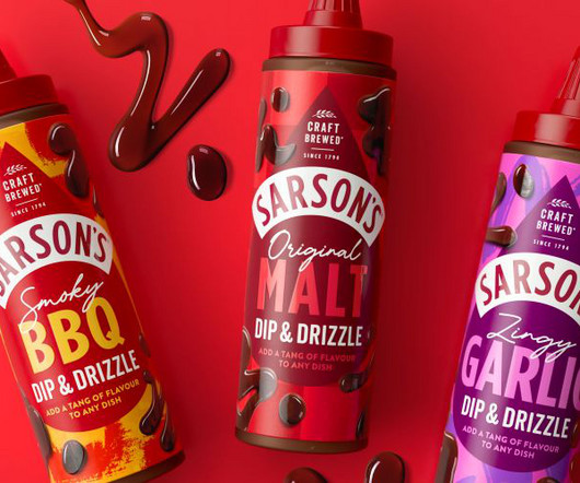
Robot Food has partnered with Sarson's on a new omnichannel advertising campaign, brand world toolkit and packaging design coinciding with the vinegar brand's first piece of new product development in 230 years. One strategy the studio used was tapping into popular food trends.
This trend takes inspiration from the past’s vision of the future, often characterized by neon colors, metallic accents, bold geometric shapes, and vintage typography. Retro-futurism reflects a playful yet sophisticated look, making it popular across branding, website design, and digital art.
"As an exciting and disruptive extension to our line, Refreshers is designed to drive penetration, recruiting new users and boosting our ambition to become the most loved RTD coffee brand in the market." The rebrand brings a sense of freshness and flair that matches the product's personality.
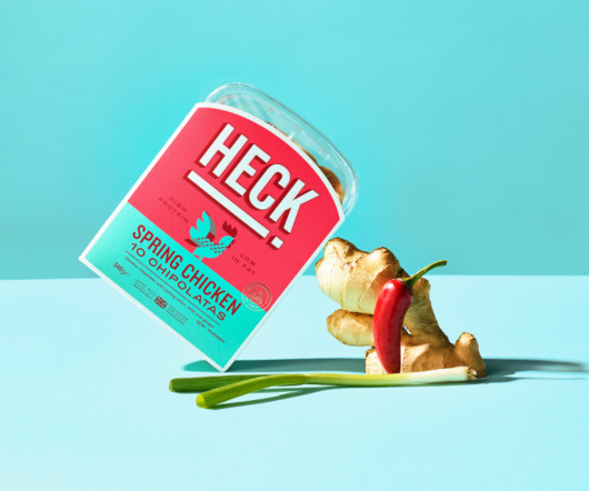
The high-protein, gluten-free UK sausages get a brand overhaul courtesy of the global consultancy. They've now unveiled playful new branding designed to reinvigorate the category appeal to a younger audience. Brand concept Elmwood aimed to bring HECK! The brand overhaul also dials up HECK!'s So, in recent years, HECK!
As a graphic designer or branding studio, getting your latest project featured in Creative Boom can significantly boost your visibility and reputation. And as we explain in our article What we stand for , we don't just want to narrow it down to the biggest agencies, the biggest brands or (God forbid) the biggest cities.
Branding needn't be about conveying a sense of innate perfection. Bettr isn't just any old coffee brand. Now brand practice Anak has unveiled new branding for Bettr. This identity heralds a transformative shift in conscious branding, resulting in a fresh approach to sustainability.
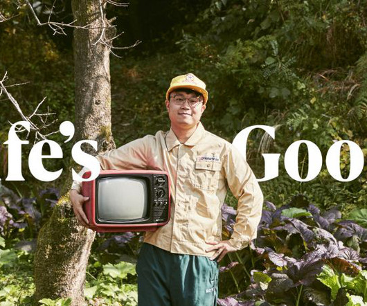
The global electronics brand is going against the tide with an upbeat campaign focusing on positivity. Given the rising uncertainty and instability worldwide, the campaign aims to motivate customers, spread a positive influence and reinforce the brand's unwavering belief that 'Life is Good'. Everyone's down in the dumps right now.
But now it's back, and the brand has been reinvented from the ground up. Now, though, it's being brought back to life with a brand-new visual and verbal identity in partnership with Tavern. Tavern is a branding and design agency based in Brooklyn specialising in crafting modern heritage brands.
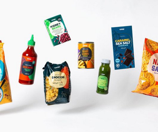
The challenge The scale of this task was huge: over 3,500 products across four countries, each with its own unique brand identity, needed to be unified under a single cohesive design system. Until now, that brand identity has been very much fragmented.
We organize all of the trending information in your field so you don't have to. Join 66,000+ users and stay up to date on the latest articles your peers are reading.
You know about us, now we want to get to know you!
Let's personalize your content
Let's get even more personalized
We recognize your account from another site in our network, please click 'Send Email' below to continue with verifying your account and setting a password.


Let's personalize your content