This site uses cookies to improve your experience. To help us insure we adhere to various privacy regulations, please select your country/region of residence. If you do not select a country, we will assume you are from the United States. Select your Cookie Settings or view our Privacy Policy and Terms of Use.
Cookie Settings
Cookies and similar technologies are used on this website for proper function of the website, for tracking performance analytics and for marketing purposes. We and some of our third-party providers may use cookie data for various purposes. Please review the cookie settings below and choose your preference.
Used for the proper function of the website
Used for monitoring website traffic and interactions
Cookie Settings
Cookies and similar technologies are used on this website for proper function of the website, for tracking performance analytics and for marketing purposes. We and some of our third-party providers may use cookie data for various purposes. Please review the cookie settings below and choose your preference.
Strictly Necessary: Used for the proper function of the website
Performance/Analytics: Used for monitoring website traffic and interactions
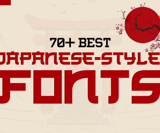
Whether you’re working on branding, packaging, or web design, the right Japanese-style font can evoke cultural authenticity, elegance, or contemporary simplicity. This guide explores 70+ Japanese-style fonts , categorized by their design styles, and provides insights into how each category can enhance modern design and branding.
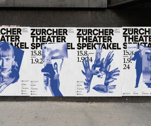
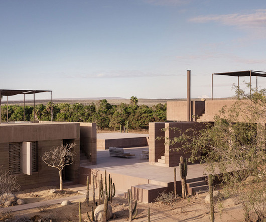
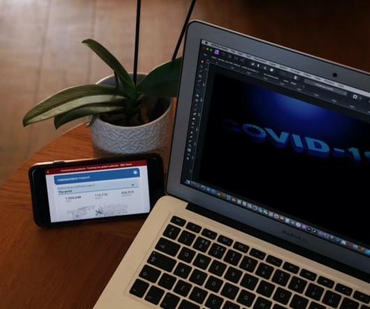
Leeds International Festival of Ideas covers some tricky topics, so the branding and visual assets needed to be sensitive. Credit: Tom Martin When it came to branding, the event organisers turned once again to Leeds and Glasgow-based design studio Rabbithole. Rabbithole explains how it developed it.
He predicts that next year: "AI will transition from being a behind-the-scenes tool for processes and sketches to an actual execution tool, creating brand assets and content in real-time. That's something that I think will be more important to brands going forward." Kiser Barnes, partner and CCO at Red Antler , believes so.
A typeface can define the character of a brand just as much as a logo or colour palette," he says. By designing a typeface specifically for the festival, we were able to infuse the brand with a unique visual voice that extended across all its materials, from posters to digital interfaces."
Branding needn't be about conveying a sense of innate perfection. Bettr isn't just any old coffee brand. Founded in 2011 and based in Singapore, it's Southeast Asia's first certified B Corporation and is committed to bettering our planet through providing holistic vocational programs to educate and empower marginalised communities.
Senior Designer at Nike Global Brand Design Retail Yenny Zhang takes us through her education and career so far, revealing the best bits and the challenges she faced along the way. After graduating, Zhang continued working for Nike, leveraging those connections and building on her understanding of the brand.
Through accessible e-books and practical advice, Seasoned aims to demystify branding and provide actionable insights for aspiring creatives. At its core, it's a collection of engaging e-books with essential tools for mastering brand creation.
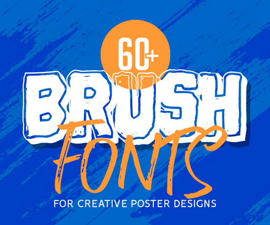
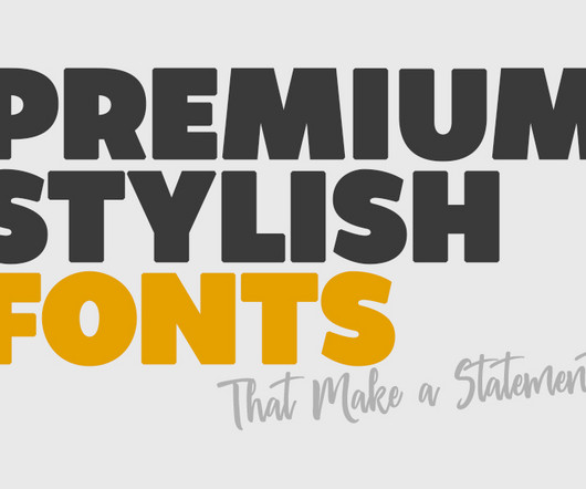
Whether you’re working on advertisement posters, brand guidelines , or even designing a logo, fonts play a pivotal role in creating visual impact. Why Fonts Matter Fonts are more than just letters on a screen; they help communicate the tone, personality, and message of a brand or project. The good news?
Made for any professional project branding. It is the best for logos, branding and of course quotes. The font is suitable for any branding project like logo, sport, and many more. This font is suitable for any design like branding, quotes, book title and etc. Every letter has a unique and beautiful touch.
Traditionally, city centre markets didn't really need much in the way of branding other than maybe a sign at the entrance. It's honestly not the most prestigious program," he says, "but I'm thankful for growing up in a city that appreciates the arts. We speak to the Washington, D.C.-based Today, that's all changed.
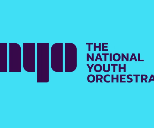
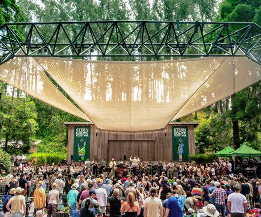
Currently, there are 160 teenagers in the orchestra and many more in the NYO Open program. One of the self-confessed goals was to avoid clichés of branding aimed at youth audiences, which was achieved with success. The branding works particularly well when repeated or animated, as it give a very musical vibe with the rhythm it creates.
We chatted with Ed Little, director of the London studio Regular Practice , about putting design at the heart of strategy, how the nature of branding is (fast) evolving, and what agencies need to do to keep up. It's got to come through in how people feel the brand for it to be effective in most cases.
When big brands decide to reinvent not only themselves but also their brand strategy, it can make for some big news. The point of that little story is that sometimes, even the biggest brands need a brand strategy or need to change theirs up to succeed in today’s economy. Related: 101+ Brand strategy resources.
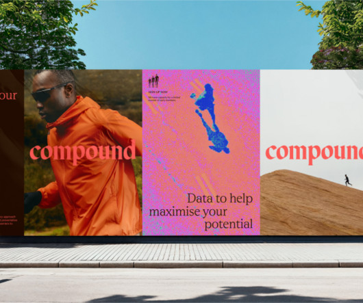
At its heart, Compound is a preventative healthcare and performance brand. Its offering comprises a mix of clinical diagnostics, diet planning, fitness programming, measurement and accountability, and its goal is to help clients meet their health and fitness goals.
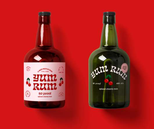
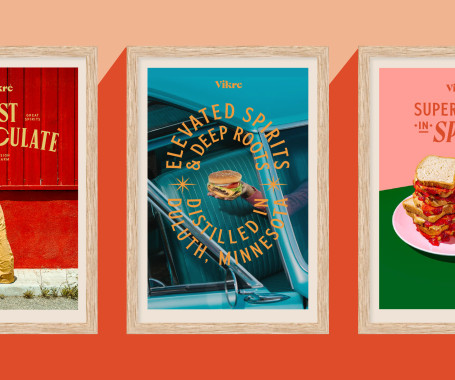
If your eccentric grandma was a hip spirits brand, she might look a little like this. And here's a fun example from US craft distillery brand Vikre. To build Vikre's brand, website and packaging, SMAKK used hints of surrealism to build a world that reflects its vibrant Duluth community and Nordic heritage.
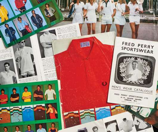
You'll also see how sporting and musical collaborations helped shape the brand's identity, including collaborations and work from Amy Winehouse, Charles Jeffrey, Gorillaz, Comme des Garçons, Nicholas Daley, Raf Simons and The Specials. But this isn't just for fashion appreciators.
In today’s digital world, stylish fonts have evolved from being just aesthetic additions to becoming essential elements of brand identity. These stylish fonts not only capture attention but also help communicate a brand’s personality and tone effectively. It’s a perfect font for your hand drawn logos and branding.
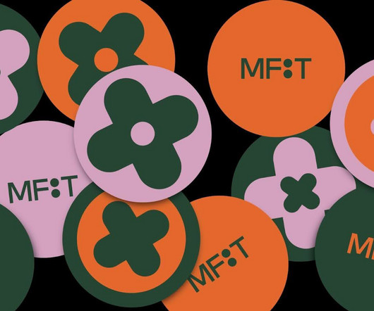
As an innovative graphic and UI/UX designer, Liu brought a new twist to the museum’s brand using her digital design skills and an eye for fashion. Liu was interested in fashion, so she selected MFIT and jumped at the chance to help inject youthful and vibrant energy into the MFIT brand.
Not exactly the best choice when you’re working on the branding or a logo for a new client. To help, we thought that giving your wrist a break from trying to perfect your skills by offering our choices for the Best Handwritten Fonts for graphic design, logos & branding. Like people, fonts, too, have varied personalities.
For example, in layouts there are vertical dividing lines reminiscent of beat intervals while the new logo is a symbol referencing keys of a keyboard, drum pad or laptop to play on the brand's musical and technical sides. This sits nicely alongside sub-headers and body copy in Gerstner Program Medium. "It
A new protest-inspired brand symbol was designed to compliment Mozilla's custom wordmark and typeface family, helping the brand to stand out in a sea of sameness. JKR's approach to the rebrand involved understanding how the brand exists already in people's minds to unearth what is truly memorable about it.
She made modules via a computer software program, and then printed, cut, and assembled three-dimensional forms. The diamond-shaped symbol of her brand, Diad, represents her exploration, utilizing paper sculptures to capture her journey. The tiles include four directionally scattered surfaces for total acoustic enhancement.
From doodling characters to illustrating for global brands, Alyah Holmes shares her colourful journey in the world of illustration. We didn't have any creative university or college programs that really matched what I wanted to do. So it wasn't until years later that I ended up finding a program, moving away and actually pursuing it."
Brooklyn-based CG artist and creative director Haruko Hayakawa specialises in creating stunning, bizarre visuals which tackle consumer culture, brands and nostalgia. But it wasn't until she stumbled upon a tutorial for a 3D landscaping program called Bryce that she became aware of the potential of digital creativity. "I
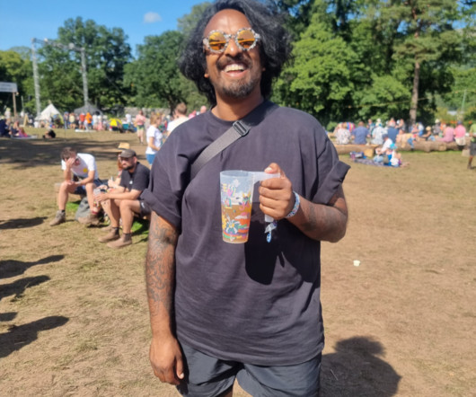
Murugiah explains how he got the gig, developed his branding ideas, and what it's like to be surrounded by your own work at a festival. So when we were offered the opportunity to chat with Murugiah , who designed the branding for this year's event, we jumped at the chance! The summer of 2023 has been an amazing year for UK festivals.
For this most recent brief, the festival's new artistic director, Matthias von Hartz, wanted to focus on the top-class artistic program in communications. When Studio Marcus Kraft was commissioned eight years ago to create the brand, the team decided very early to adopt a simple typographic solution for the word mark and typography.
A popular editing tool on its own, the Australian brand provides a vast number of free badges, design templates, icons, cartoons, and even stock images—things Photoshop doesn’t supply. The Affinity Photo program can be purchased for both Windows or Mac for $25 or even your iPad for just $10. Learn More. Learn More. Luminar AI.
So the organisers approached global design agency Mucho for a brand refresh that would help appeal to a younger audience, be flexible enough to work with any genre of music, and establish the festival as a world-class event. In future, they envision large digital screens behind each performer, including live interaction with the brand.
From grids to the branding process, these superb books cover a diverse array of topics between them. She examines the widespread lack of inclusivity in design across different sectors and points to familiar brand missteps rooted in stereotypes and assumptions about customers' lived experiences. This ambitious book aims to fill the gap.
Leeds International Festival of Ideas covers some tricky topics, so the branding and visual assets needed to be sensitive. Credit: Tom Martin When it came to branding, the event organisers turned once again to Leeds and Glasgow-based design studio Rabbithole. Rabbithole explains how it developed it.
Cubic Orange worked to position the brand as fearless yet caring. Based in San Diego, California, branding studio Cubic Orange is used to working with hip companies such as Death by Tequila, Lift Coffee and CBD skincare brand Flowerkist. But recently, they've been working on something quite different.
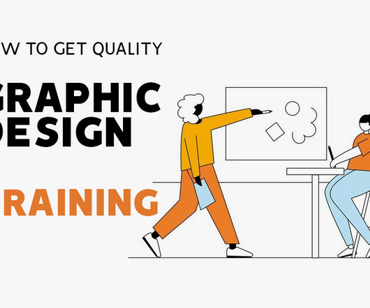
Choose the right institution Boosting your graphic design career is all a matter of picking a good training program that fits your goals and equips you with both practical and technical knowledge. Know who will be training you You know youve picked the right graphic design program if youre being handled by the best instructors.
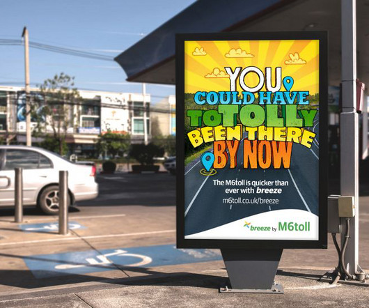
Now Birmingham-based creative agency One Black Bear has launched a bold new advertising campaign for the M6 Toll to promote its upgraded technology and new customer account program, Breeze. The illustrations give life to the different benefits of the new M6 Toll experience: cheaper, simpler and quicker thanks to Breeze."
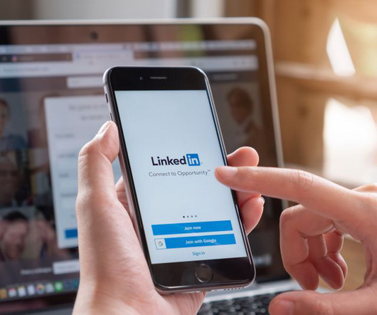
With the platform's built-in trust factor, it's a key space for brands seeking creative partners." Visual artist Jeff T Owens describes LinkedIn as "a brick wall of algorithmic programming and a lot of cryptic corporate lingo and cheerleading bordering on dystopian parody". LinkedIn is 100% an engagement trap," he argues.
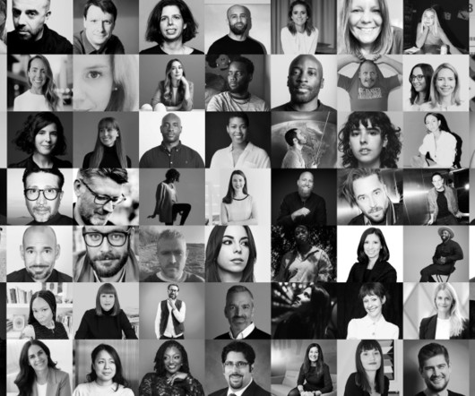
From pioneering entrepreneurs to innovative brand leaders and multidisciplinary creative forces, these are the movers and shakers propelling their respective fields forward. To answer that question, we turned to Frontify , our favourite cloud-based, brand-building platform. So, who are the names we need to know? Not rocket science."
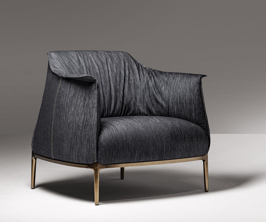
” Poltrona Frau is an Italian furniture brand, with over 100 years of experience in the interplay between product, brand, and communication. There is an expressive, almost creature-like offering in the curve of the armrest, as if to say, “Come on in, sit awhile.”
When it comes to the ever-illustrious raft of heritage Danish design brands theres perhaps no company more agile than Vipp. Established in the late 1930s, the boutique manufacturer named after the Danish word for tilt gained renown for its trash bins with a hyper-efficient pedal function and durable metal shell.
Recently, though, the network expanded its programming to include sports and other types of content. And so they asked London brand and design consultancy DixonBaxi to update their branding to reflect this new mix and their self-proclaimed vision of themselves as "scrappy underdogs".
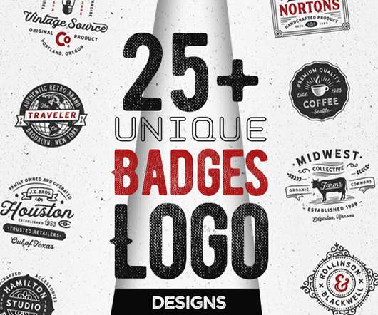
Unique examples of vintage badges logo design concepts and ideas that can use for branding projects, labels, apparel design, typography and more. All logos were designed with vector shapes and strokes and have live text paths so they are easy to customize and are perfectly scalable in vector based programs. Modern Vintage Logos.
We explore how Universal Favourite crafted a visual identity for a new fintech brand, and how it helps raise their name above the noise. In short, it had outgrown much of its early brand work. Evolution not revolution It was important to retain brand attribution by keeping the DNA of the original identity intact.
Lightweight and user-friendly, this program also offers a generous 90-day free trial. Gravit Designer Discover the all-in-one GNU image manipulation program and vector illustration software that surpasses traditional image editing. Experience seamless collaboration between these robust programs and take your designs to the next level.
Camper is so confident in the timelessness of their shoes, they have recently launched the ReCamper program, which reclaims old shoes in need of repairs, refurbishes them, and offers them a new life. SUNNEI is an Italian lifestyle brand, constantly thinking outside the box of streetwear with unconventional fit and solid basics.
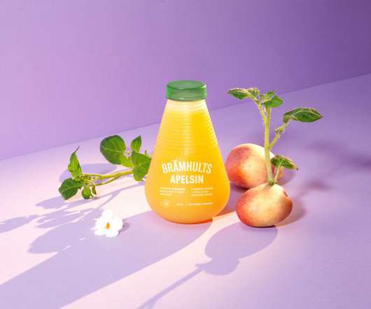
Inspired by how nature protects its content, Tomorrow Machine and their partners, the global juice company Eckes Granini and the branding agency F&B Happy , set out to develop a juice bottle made from material so pure you can eat it – think along the lines of a fruit peel.
We organize all of the trending information in your field so you don't have to. Join 66,000+ users and stay up to date on the latest articles your peers are reading.
You know about us, now we want to get to know you!
Let's personalize your content
Let's get even more personalized
We recognize your account from another site in our network, please click 'Send Email' below to continue with verifying your account and setting a password.


Let's personalize your content