This site uses cookies to improve your experience. To help us insure we adhere to various privacy regulations, please select your country/region of residence. If you do not select a country, we will assume you are from the United States. Select your Cookie Settings or view our Privacy Policy and Terms of Use.
Cookie Settings
Cookies and similar technologies are used on this website for proper function of the website, for tracking performance analytics and for marketing purposes. We and some of our third-party providers may use cookie data for various purposes. Please review the cookie settings below and choose your preference.
Used for the proper function of the website
Used for monitoring website traffic and interactions
Cookie Settings
Cookies and similar technologies are used on this website for proper function of the website, for tracking performance analytics and for marketing purposes. We and some of our third-party providers may use cookie data for various purposes. Please review the cookie settings below and choose your preference.
Strictly Necessary: Used for the proper function of the website
Performance/Analytics: Used for monitoring website traffic and interactions
Attend workshops, webinars, and conferences, and read design blogs and magazines to keep your skills and knowledge fresh. Follow design blogs, attend workshops or conferences, and engage with the design community to stay informed and continuously improve your skills. You may be interested in the following articles as well.
Whether you’re looking for a simple blog theme, a powerful eCommerce theme , or something in between, we have you covered. You’ll have everything you need to create a professional-looking website, including a responsive design, a built-in blog, and eCommerce support. New Demos on the way.
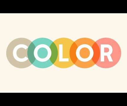
Browse our color combinations to step up your creative game and reap the rewards. Knowing what colors go together is a skill in itself and it can have a positive impact on all areas of your life. Once you gain an understanding of what different colors mean and the theory of color , you’ll see how they can influence perceptions.
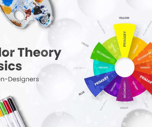
As a continuation of our inspirational examples and palette ideas for great color combinations, today we will have a look at the basics of colortheory and go beyond that. You can also review the colortheory article overview below and fast-travel to the specific sections you need. The Color Wheel.
Color Selection Matters. Again, this seems a bit obvious, but you shouldn’t use the same colors for a poster about events based in the forest or for one about corporate services or products. If you are not familiar with colortheory, take some time and educate yourself about the topic. Make It Readable. Conclusion.
Thanks to this collection of 1600 Infographics Templates, you can easily put together a colorful story through professional pictures and charts. 1600 Premium, Customizable Infographics Templates. You’ll never need to worry about getting your point across again! 24 instead of $750 – Get it now !
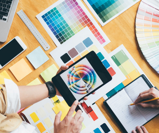
Color palettes are a crucial component of design. They can either make or break your design, and therefore it is essential to invest time and effort into creating the perfect color scheme. But creating a complex color palette can be challenging, especially for those who are not well-versed in colortheory.
ColorTheory and Pride. At Designs.ai, we’re recognizing Pride Month by exploring a spectrum of colors that best embody its spirit – […] The post ColorTheory and Pride: Designing with the Rainbow Palette appeared first on Designs.ai. June is a time of celebration, reflection, and unity.
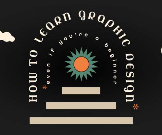
By the end of this blog, you’ll have a solid foundation to start your journey in learning graphic design , and who knows, maybe even ignite a passion that could lead to a fulfilling career. It is about repeating shapes, typography, style, colors, and design elements to be recognizable and not confuse viewers.
Visual Design Theory – Understanding colortheory, the basics of composition, and how to use typography among other things are all necessary for designing visually appealing websites. Publications – You can read dedicated websites, blogs, and online media outlets that cover web design and related topics.
Every page is created with excellent sections designed with fine colors and fonts. it has 04 Blog Layout Style. The Consulting WordPress themes are special designs for websites. They help consulting businesses have a good and useful website without needing to know a lot about technology.
To know how to accurately combine colors is a critical skill that artists, designers, marketers, and brand owners spend years learning and mastering. The perfect examples that just click with you, vibe on the same frequency with you and you know this is the right combination of colors just by seeing it. Colors also have a temperature.
Besides 35 different brushes, 25+ textures, 5 images and 2 color palettes, you’ll get a super helpful 10-part workbook that takes you through every step of the lettering process from letter anatomy to colortheory to printing. $9 9 instead of $25 – Get it now !
Put together a portfolio and blog. Week 3 – Fundamentals of Shape and Color – Graphic designers use shapes and colors as the fundamental building blocks of their work. Choosing colors for the logo. The Complete Graphic Design Theory for Beginners Course (8.5hrs). Using simple shapes in a design.
But, there are some things that you can’t just find in blog articles and forums. Interaction of Color by Josef Albers. Josef Albert’s Interaction of Color is thoroughly used in art education. Albers explains the complex colortheory principles, and it’s regarded to be the ‘last word’ on colortheory.
Maybe you just graduated from design school, or you’ve read through all the fundamental lessons offered here and on other design blogs, and you feel you’re ready to start taking on clients. ColorTheory. A signature color palette is as good as a brand for a designer. Same as above. Choose yours wisely.
To guide you through the labyrinth of trends, techniques, and innovations, we have listed some of the best web design blogs on the internet. From insightful articles to practical tutorials, these blogs are your gateway to the latest industry insights, expert advice, and creative inspiration.
In this blog post, we delve deep into the mesmerizing fusion of art and design, exploring the harmonious symphony that emerges when these two worlds collide. At its core, design is the conscious arrangement of elements, be it colors, shapes, or materials, to create a functional and aesthetically pleasing composition.
Included in the kit from Lisa Glanz is a smorgasbord of content that you can use including logo templates, branding boards, decorative elements, and additional color themes for both Photoshop and Illustrator. Compatible with Adobe Photoshop CS6 and newer, the Fourth of July bundle can make any branding project a celebration.
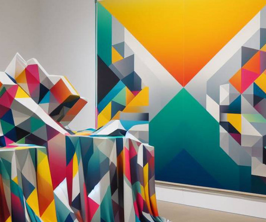
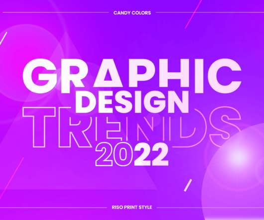
Candy colors. CANDY COLORS. Vibrant eye-candy color schemes. Skillful designers and digital artists who know their colortheory already roll their sleeves to create bold and striking graphic design creations with beautiful candy colors. Top Graphic Design Trends 2022 Overview: 1. 2D/3D Mashup. Paper Cutout.
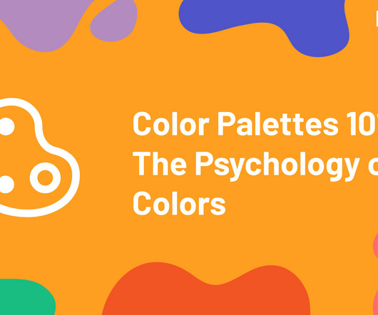
Colors play an essential role in our lives, influencing our emotions and behaviors in different ways. As such, choosing the right color palettes for your branding or design is crucial to effectively convey your message […] The post Color Palettes 101: The Psychology of Colors appeared first on Designs.ai.
50 Totally Free Lessons in Graphic Design Theory. Color, Texture, and Imagery. It's important to understand the basics of colortheory and get a feel for how to work with colors. Color can make areas of a design pop off the page or recede into the background. Advanced ColorTheory: What Is Color Management?
Color selection is a stage in a design process that requires both smart thinking and gut feeling. In today’s digital era, you can have as many colors and color combinations as you like. The human eye can see millions of…
And for some more inspiration, explore Design History 101 in the Throwback Thursday series on our blog for brief lessons on design legends like Aaron Douglas, Louise Fili, Alan Kitching, Emory Douglas and many more. Step 5: Study the Fundamentals of ColorColor affects the mood and personality of a design.
Find out how playing with space and colors can help you make a difference with these visual merchandising tips. Visual merchandising in retail uses tools like colors, lighting, displays, layout, and other elements to draw attention to particular products and areas of a retail space. Full-color experience. Display the right way.
Additionally, there are plenty of online resources available, such as YouTube tutorials, blogs and forums dedicated to learning graphic design online. These resources can teach you everything from the basics of colortheory to advanced design software techniques. appeared first on Shillington Design Blog.
Choosing the right colors for your products is not just about aesthetics – it’s about before you even say hello. When it comes to selecting the best color for your Business Cards, this is totally subjective. We asked color expert, Laura Perryman , for her opinion on the best colors for Business Cards by industry.
There are a many courses online taught by industry leaders to help you get a well rounded education in the essentials of graphic design such as design principles, colortheory, typography, idea generation, mastering design programs (ie: Figma, Adobe Photoshop, InDesign and Illustrator), portfolio development and presentation.
It’s a dance of color, functionality, and user psychology. Get color schemes for an appealing website. Suggest some color schemes that are effective for a Fitness and Exercise website. Color suggestions for a specific type of website. Suggest some color psychology tips for designing Personal Finance website?
In this article, we’ll provide a material design definition, go over the main principles, and see how icons and colors are used in material design. Icons and Colors in Material Design. Pay attention to colors. The Material Design color palette is specific. Icons and Colors in Material Design. Resources.
color palettes. We all want to design better and inclusive experiences, but sometimes we might be forgetting about just the right color contrast, or a proper tab order. For accessible color palettes, Geenes.app is a reliable and sophisticated tool that allows you to create, maintain, sync and test color palettes and their variations.
You’ll learn color manipulation, lighting, and other small tricks of the trade. Smashing Magazine is a very popular web design blog that also writes publications. Then you’ll add colors and details to design varying styles of icons. Mastering Photoshop for Web Design.
From colortheory and typography to layout and composition, mastering these fundamentals will help you to create visually compelling and effective designs that stand out from the crowd. The post How to Become a Graphic Designer with No Experience appeared first on Shillington Design Blog. Learn more.
MILU is one of our top user experience design examples for a couple of reasons: not only does the color palette indicates who these products are for, but there are a lot of high-quality images and videos, and on top of that – there are explanations of each product (ingredients, target audience, etc.) MILU – Product Tutorial.
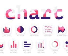
They often represent data in different colors for different characteristics in each region. Use Colors to Your Advantage. In every form of visualization, colors are your best friend and most powerful tool. Even here, colortheory is important. It’s appropriate to use color blind-friendly palettes.
That’s why this blog post is a compilation of my ideas for awesome Christmas presents for graphic designers. Graphic Designer Gift - CMKY Badge This set of three badges makes a perfect gift for your favorite graphic designer, photographer, artist or anyone who appreciates super fun and colorful badges. There are 28 of them.
Choose colors that will help accentuate your design elements , it’s always a good idea to revise your colortheory to pick the right palette. The post Make a positive impact using negative space appeared first on MOO Blog. Play with contrast. When it comes to negative space in graphic design , contrast is everything.
If users needed to, could they find the blog with ease? Your font types, color schemes, graphics, icons, and logo usage should all be described in this. It’s likely that you’ll start to see haphazard font choices and color schemes, which might detract from your message or confuse viewers who are attempting to convert.
Try using colorful tangrams on a white paper, then outlining the shapes you make and removing the tangram pieces. Color-theory. Tangrams come in a variety of colors, but you can make your own out of almost any shades you want. Use varying colors to help develop an eye for what looks good together.
Freepik’s filters (photos, colors, style, etc.) A really cool feature is each image has color variations, so you can keep a theme but differentiate key slides, areas, or show progress. Click on colors scale for the Presentation tab. 120 rooms of all shapes, sizes, and colors. Free-power-point-templates.
Your sense of color comes through loud and clear in your work, as well as your app, Ranpal. Can you tell us a little bit about your approach to color? Colors are weird and they appear randomly most of the time. I start with one color and add others to it. It’s a pretty subjective process.
Depending on the age, gender, and culture of the ideal viewer, you already have the right approach on what tone to set in, what colors to use, and what sort of visuals to include. It’s entirely visual with a well- crafted colorful illustration with fun characters that instantly reveal the main concept: what animals live underground.
Follow the principles of colortheory, proportions, and other features that make the result of graphic design successful when you create your icons. I’ll tell you a secret - you can never go wrong with traditional Christmas colors of green, red, blue, gold, silver or even purple. You can easily change colors and edit text.
The digital transformation is setting a new standard, with hyperrealistic graphics meeting the simplicity of minimalism, while dark mode and colorful gradients create impactful, high-contrast visuals. For instance, AI can quickly adjust layouts, select color palettes, or even generate typography variations that align with a brand’s tone.
We organize all of the trending information in your field so you don't have to. Join 66,000+ users and stay up to date on the latest articles your peers are reading.
You know about us, now we want to get to know you!
Let's personalize your content
Let's get even more personalized
We recognize your account from another site in our network, please click 'Send Email' below to continue with verifying your account and setting a password.


Let's personalize your content