This site uses cookies to improve your experience. To help us insure we adhere to various privacy regulations, please select your country/region of residence. If you do not select a country, we will assume you are from the United States. Select your Cookie Settings or view our Privacy Policy and Terms of Use.
Cookie Settings
Cookies and similar technologies are used on this website for proper function of the website, for tracking performance analytics and for marketing purposes. We and some of our third-party providers may use cookie data for various purposes. Please review the cookie settings below and choose your preference.
Used for the proper function of the website
Used for monitoring website traffic and interactions
Cookie Settings
Cookies and similar technologies are used on this website for proper function of the website, for tracking performance analytics and for marketing purposes. We and some of our third-party providers may use cookie data for various purposes. Please review the cookie settings below and choose your preference.
Strictly Necessary: Used for the proper function of the website
Performance/Analytics: Used for monitoring website traffic and interactions
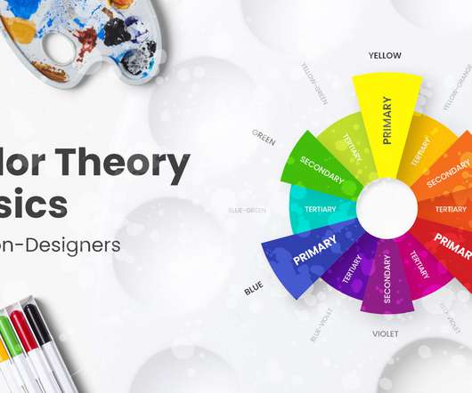
As a continuation of our inspirational examples and palette ideas for great color combinations, today we will have a look at the basics of colortheory and go beyond that. You can also review the colortheory article overview below and fast-travel to the specific sections you need. What are Colors?
They can either make or break your design, and therefore it is essential to invest time and effort into creating the perfect colorscheme. But creating a complex color palette can be challenging, especially for those who are not well-versed in colortheory.
Maybe you just graduated from design school, or you’ve read through all the fundamental lessons offered here and on other design blogs, and you feel you’re ready to start taking on clients. ColorTheory. A signature color palette is as good as a brand for a designer. Same as above. Choose yours wisely.
Color selection is a stage in a design process that requires both smart thinking and gut feeling. In today’s digital era, you can have as many colors and color combinations as you like. The human eye can see millions of…
I t remains the same whether you are choosing colors for a flyer, a photograph, a business card design, and choosing the perfect color combination for a logo or your website. Knowing What Color Combinations Work is Key. Finding What Colors Go Well Together. It is impossible to go wrong by following strict colortheory.
Get colorschemes for an appealing website. Suggest some colorschemes that are effective for a Fitness and Exercise website. How to optimize my website's Loading Speed without compromising on design? Display elements effectively on your website. Tips for creating a specific type of page. Get UX design best practices.
If users needed to, could they find the blog with ease? Your font types, colorschemes, graphics, icons, and logo usage should all be described in this. Your website can be used to market your business, sell goods and services, or host a blog. Advantageously utilize color. Delete cheesy graphics and vague language.
The fundamentals of graphic design are about seeing (and understanding) how the qualities of visual material—shapes, images, colortheory , typography , and layout—work, and work together… and then being able to decide which qualities of each are relevant and engaging and useful for visualizing a particular idea or solving a certain problem.
Follow the principles of colortheory, proportions, and other features that make the result of graphic design successful when you create your icons. A pleasant colorscheme creates a feeling of coziness and brings holiday vibes. Just think about adding some slight flavor of uniqueness through small changes or details.
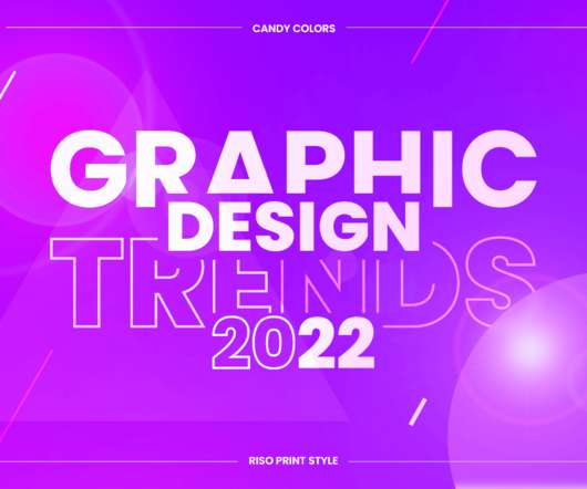
Vibrant eye-candy colorschemes. Skillful designers and digital artists who know their colortheory already roll their sleeves to create bold and striking graphic design creations with beautiful candy colors. The post Top Graphic Design Trends 2022: Raising the Game appeared first on GraphicMama Blog.
Combining colors has always been a critical skill for graphic designers which requires years of learning and mastering. Aside from the basics of colortheory , however, a big part of finding the right color combinations is getting the right inspiration. Examples of Black and Neon Green in Graphic Design.
Eco-friendly materials, earthy colorschemes, and eco-conscious design elements now resonate with a growing audience of consumers who prioritize environmental responsibility. One of the most visible aspects of accessible design is the focus on color contrast and text legibility.
We organize all of the trending information in your field so you don't have to. Join 66,000+ users and stay up to date on the latest articles your peers are reading.
You know about us, now we want to get to know you!
Let's personalize your content
Let's get even more personalized
We recognize your account from another site in our network, please click 'Send Email' below to continue with verifying your account and setting a password.


Let's personalize your content