This site uses cookies to improve your experience. To help us insure we adhere to various privacy regulations, please select your country/region of residence. If you do not select a country, we will assume you are from the United States. Select your Cookie Settings or view our Privacy Policy and Terms of Use.
Cookie Settings
Cookies and similar technologies are used on this website for proper function of the website, for tracking performance analytics and for marketing purposes. We and some of our third-party providers may use cookie data for various purposes. Please review the cookie settings below and choose your preference.
Used for the proper function of the website
Used for monitoring website traffic and interactions
Cookie Settings
Cookies and similar technologies are used on this website for proper function of the website, for tracking performance analytics and for marketing purposes. We and some of our third-party providers may use cookie data for various purposes. Please review the cookie settings below and choose your preference.
Strictly Necessary: Used for the proper function of the website
Performance/Analytics: Used for monitoring website traffic and interactions
You may be interested in the following articles as well. You may be interested in the following articles as well. Learn the basics: Start with the fundamentals of design theory, colortheory, typography , and composition. Here are some tips to help you improve your skills and stand out in the industry.
This is a guest article written by Lauren Marie who is a graphic designer in corporate America. The basic elements of design include color, line, shape, scale, space, texture, and value and these are the fundamental pieces that make up any piece of work. Want to know how to design?
This article touches on misused terms and explains some important typesetting terminology. In this article, get familiar with the history of display fonts and how they came to be so popular. In this article, you'll learn how to use this important tool with simple tips and tricks. Check out this article to learn more.
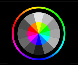
Colors are a powerful visual tool that can help us evoke certain emotions. In this course, you’ll learn all about the fundamentals of colortheory that can help you create your own color palette. What are color harmonies? What Is ColorTheory in Art? What are RGB and CMYK?
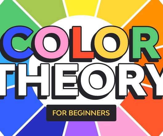
Colortheory is one of the first things graphic designers get taught about. It deconstructs the subject of color, turning it into simple rules that can be easily applied in your work. It teaches you about the color wheel, primary/secondary/tertiary colors, color temperature, color harmonies, and color wheel psychology.
Because it demonstrates how the website seems and moves when animated, designers utilize a variety of programs, such as Photoshop, to create the design and animations following the specifications provided by the client. A wide variety of educational opportunities are available to study web design theory.
Visual Design Theory – Understanding colortheory, the basics of composition, and how to use typography among other things are all necessary for designing visually appealing websites. Adobe Creative Suite – Adobe XD (Figma alternative), Photoshop and Illustrator (graphic design), etc.
Whether youre working on a website, branding, product packaging, or any other visual project, the right color choices can make all the difference. Fortunately, in todays digital age, designers have access to a variety of color tools to help them achieve harmonious and impactful color schemes.
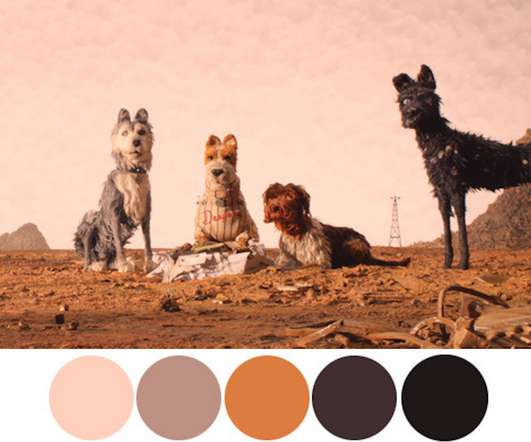
Anything from the past century can qualify as vintage and as a result, it’s quite difficult to narrow it down to a couple of color palettes. We hope this article helped you understand vintage color palettes better and we also hope that these examples we provided might prove useful for your projects.
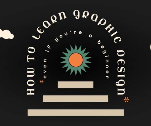
If you would like to learn and study graphic design from the ground up, then this article lists some great resources that will get you started. 50 Totally Free Lessons in Graphic Design Theory. Color, Texture, and Imagery. It's important to understand the basics of colortheory and get a feel for how to work with colors.
In this article, we’ll discuss seven key steps on how to become a successful graphic designer with no experience. From colortheory and typography to layout and composition, mastering these fundamentals will help you to create visually compelling and effective designs that stand out from the crowd.
In this article, I want to share ten tips that helped me grow and become a better designer, and I hope these tips will also help you while you’re trying to find more solid ground under your feet. In this first part of the article, we’ll start with the first five tips , and the rest will continue into the second part. We’re all worthy.
In this article, all historical styles are generally referred to as 'vintage' graphic design. How to Create a Vintage Portrait Photo Manipulation in Adobe Photoshop Get inspiration from the past! These Photoshop letterpress textures allow you to mimic the look on your computer without the need for a specialized printer.
In this article, we’ll provide a material design definition, go over the main principles, and see how icons and colors are used in material design. We will end the article with some useful resources you can apply to your projects. Article overview: What is Material Design? Color palettes.
You can learn more about kerning through this article, A beginner’s guide to kerning like a designer. Have you ever struggled to get through an otherwise interesting magazine article? When compiling a color palette, it might be worth looking into colortheory and past uses of color. Use this template.
Here’s How to Create It: Step 1 Create a new document in Photoshop at the size you’d like, I used 1024×1500. Hit ‘d’ on the keyboard to reset your colors to the default black and white. Open up that pic in a separate file in Photoshop. It was because of that inspiration that I decided to keep my colors for this poster simple.
The first time I used Photoshop was when I was 16 years old where I manipulated pictures for fun. It is still important to abide by the design principles like hierarchy, composition, colortheory etc, but the content has overwhelming priority. Often, the eye gets tired of reading the same line of text.
Designers learn about the meaning of each color, color combinations and how the palettes can be used for emotive impact. When selecting colors for a design, it’s important to have a solid foundation of color and the science behind it.
Adobe Photoshop. VR headset mockups for Photoshop. Pink Actions Photoshop action. 15 Best Fonts to Pair With Times New Roman In this article, you'll learn the best font to pair with Times New Roman to bring a modern look to your designs. ColorTheory. Jonathan Lam. 15 Feb 2021. Scary stuff. 90s Sans Serifs.
This article is a comprehensive guide on how to become a UI UX Designer and discusses other relevant topics related to the UI UX field. Other concepts like colortheory will also be required. UI/UX design aims to create a positive user experience that encourages customers to stick with a brand or product.
Follow the principles of colortheory, proportions, and other features that make the result of graphic design successful when you create your icons. They have transparent backgrounds and include PSD Photoshop. You can open this illustration with various graphic editors, including Adobe Illustrator, Photoshop, and more.
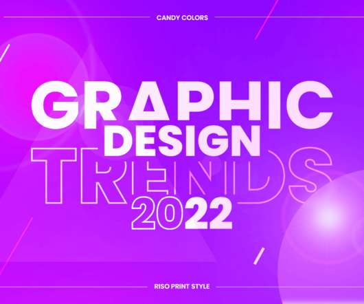
Vibrant eye-candy color schemes. Skillful designers and digital artists who know their colortheory already roll their sleeves to create bold and striking graphic design creations with beautiful candy colors. You may also be interested in some of the related articles: Top 80+ Sources To Find Design Resources and Assets.
PSD (Photoshop Document) is a format for uncompressed raster images. Clients who do not have Adobe Photoshop installed will not be able to open this file. ColorTheory. Colortheory is used to create a special mood of the design and evoke a certain emotion. Logotypes And Branding Terms. Abstract Mark.
80s-inspired Retro-Futuristic Sci-Fi Event Poster Template by Blackcatstudio for Adobe Photoshop One of the primary features of retro-futurism is its bold, often saturated color schemes that evoke a sense of optimism and energy. Displaced Glitch Text Effect Photoshop Mockup – available via Adobe Stock.
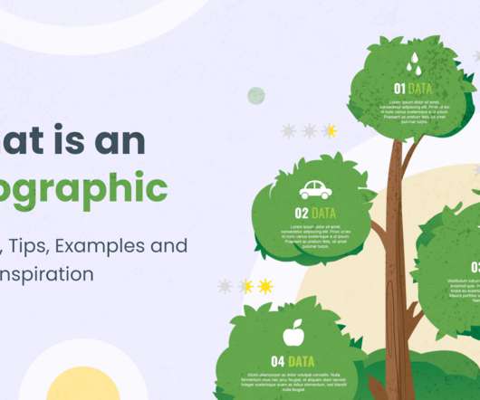
In today’s article, we’ll review all you need to know about what is an infographic. Below is the overview that includes the main topics of the article, so don’t hesitate to fast-travel to specific sections of interest if you’re looking for something in particular. What Is an Infographic: Overview. Simplicity.
We organize all of the trending information in your field so you don't have to. Join 66,000+ users and stay up to date on the latest articles your peers are reading.
You know about us, now we want to get to know you!
Let's personalize your content
Let's get even more personalized
We recognize your account from another site in our network, please click 'Send Email' below to continue with verifying your account and setting a password.


Let's personalize your content