This site uses cookies to improve your experience. To help us insure we adhere to various privacy regulations, please select your country/region of residence. If you do not select a country, we will assume you are from the United States. Select your Cookie Settings or view our Privacy Policy and Terms of Use.
Cookie Settings
Cookies and similar technologies are used on this website for proper function of the website, for tracking performance analytics and for marketing purposes. We and some of our third-party providers may use cookie data for various purposes. Please review the cookie settings below and choose your preference.
Used for the proper function of the website
Used for monitoring website traffic and interactions
Cookie Settings
Cookies and similar technologies are used on this website for proper function of the website, for tracking performance analytics and for marketing purposes. We and some of our third-party providers may use cookie data for various purposes. Please review the cookie settings below and choose your preference.
Strictly Necessary: Used for the proper function of the website
Performance/Analytics: Used for monitoring website traffic and interactions
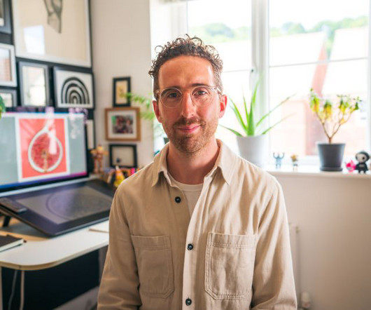
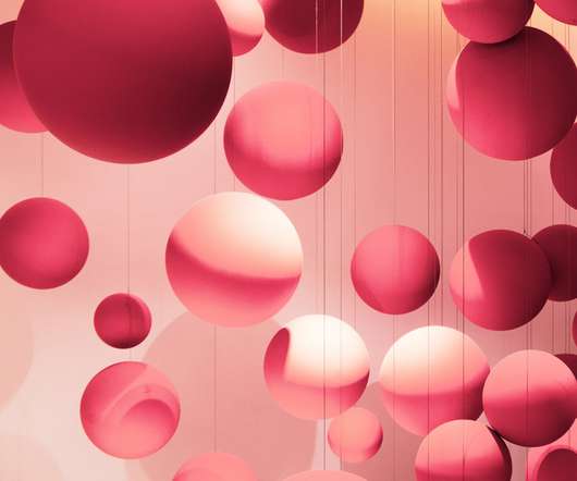
Paul Faassen – The Mob RoomFifty has a new collection of art prints on sale curated by Jaap Biemans, aka Coverjunkie. The concept was to sell limited-edition prints by the world's best contemporary illustrators and graphic designers. We chat to both parties to find out more about the release. Who is Jaap?
He's illustrated the showstoppers and signatures since the very first season of the show aired back in 2010, but his subject matter wasn't always of the foodie variety. It was really nice to do a poster for them in a completely different way," he says, adding that the illustration has just been reproduced and released as a screen print.
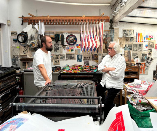
Alan Kitching, one of the most celebrated letterpress printers of our time, is bringing his work to Madrid for a new exhibition that explores heritage, craftsmanship, and the evolving role of print in a digital world. Yet, despite his accolades, his passion remains rooted in the hands-on craft of printing. Kitching's Travels (2012).
Verònica Fuerte, Founder & Creative Directress of Hey Print by Hey Studio Sweatshirts by Hey Studio Work by Hey Studio for Arrels 6. For example, during the pandemic they redesigned the D&AD Annual as a digital-only publication , in a way that gave more access to images and video content than had been possible in print.
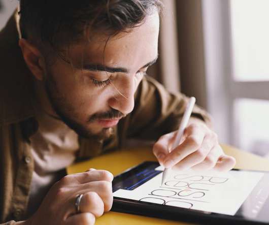
Creative Boom has today launched eight new art prints by some of your favourite illustrators and graphic designers. Each artwork is available in an A3 poster, printed on the finest Giclée art paper and produced to museum-certified archival standards, guaranteed for more than 100 years. The Last Emperor by Noma Bar.
Paul Faassen – The Mob RoomFifty has a new collection of art prints on sale curated by Jaap Biemans, aka Coverjunkie. The concept was to sell limited-edition prints by the world's best contemporary illustrators and graphic designers. We chat to both parties to find out more about the release. Who is Jaap?
Malin's journey began in Sweden, where she initially studied animation at the Royal College of Art Craft & Design before embarking on an MA in animation and illustration at HSLU in Luzern, Switzerland, in 2010. In a recent piece titled The Metamorphosis, Malin references her love of the printed form. "At
Zack graduated from Columbia College Chicago with a BFA in graphic design in 2010. Professional Business Card Templates (30 Print Design). He is an average dude with a passion for science fiction, video games, cartoons, illustration, mid-century design, and a penchant for writing in the third person. 50 Best Logos Of 2020.
Image licensed via Adobe Stock In print and online, these are the best places to find visual inspiration, tips and tutorials, and expert advice on photography. Both online and in print, these titles will provide a wealth of insights, tutorials, reviews and breathtaking imagery to ignite your passion.
Pixeden Club Since its founding in 2010, Pixeden Pixeden has offered high-quality web and design assets you won't find anywhere else. Its Adobe Photoshop mockups cover a wide range of categories, including clothing, devices, OOH, packaging, print, products and retail. Art Directed 9.
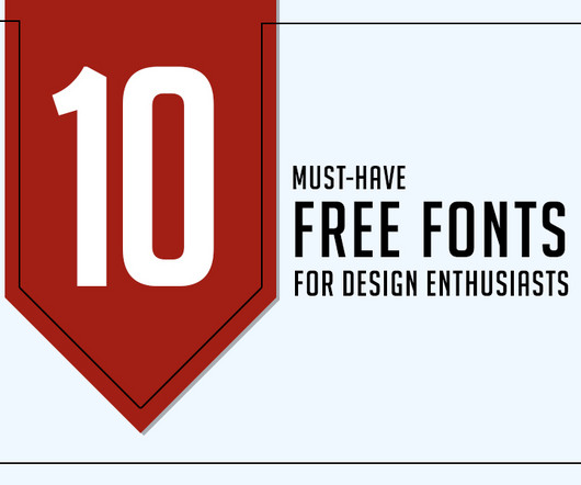
Beyond their design enthusiasts, high-quality free fonts demonstrate exceptional legibility across different media, from print to digital platforms. It is also a good choice for print design because it has a clean and modern look. They maintain clarity even at smaller sizes, guaranteeing a pleasant reading experience for users.
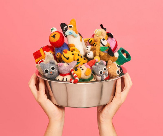
Grumpy Ant plush toy by Aysha Tengiz Diana F+ CMYK by Lomography Felt hanging decorations by Wrap and various artists Built upon creative collaborations with designers, illustrators and artists, Wrap started life in 2010 as a magazine and now includes a stationery and product range, online shop and editorial content in print and digital.
Titled Ensemble, Susie's new collection of paintings and limited-edition silkscreen prints are beautiful, bold portraits that champion female empowerment and self-expression through fashion. It's a question we might not have enjoyed answering during the pandemic, but one we might embrace now restrictions are over.
Cutting and creasing since 2010, Think is a design-driven structural packaging agency with an over-arching emphasis on form: ‘the neat bevels, the tight creases, the perfect fit’.
First launched in 2010, Google Fonts is a repository for open-source typography projects, and they're typically very high quality. For example, diacritic marks are larger than how they'd be in print. Released by ParaType in 2010, PT Serif is a pan-Cyrillic font family. Two words: Google Fonts. Playfair by Claus Eggers Sørensen.
I graduated in 2010 with a first-class honours degree and have worked as a commercial illustrator ever since." Chris has spent the last 12 years applying his skills to the problem-solving and deadline-intensive task of editorial illustration while working on books and releasing his own prints. The rest, as they say, is history.
Zuzunaga officially founded his self-titled brand in 2010, on a mission to explore what it means to be human by creating textiles that are timeless, gender neutral, and sustainable. “Color is at the heart of everything we do,” says Zuzunaga.
Designer Desktops is one of our longest running columns (going back all the way to March 2010!) Tucker, founder of The Aesthetic Union, a letterpress print shop in San Francisco, featuring a simple commandment DOWNLOAD. December 2021 by Tafui McLean, a Canada-based artist, with a simple Greyscale print DOWNLOAD.
2020 | 2019 | 2018 | 2017 | 2016 | 2015 | 2014 | 2013 | 2011 | 2010 | 2009. Design tip: Make sure all color shades in your logo render well in print. Overlapping Geometry. Negative Space. Fine Lines. Past Logo Design Trends. Top 10 Logo Design Trends for 2021. Simplification. Disappearing Letters.
These templates are meticulously crafted to ensure seamless compatibility across various design platforms, ensuring that your brand guidelines look exceptional both on screen and in print. Instant download availability guarantees immediate access post-purchase, while the A4 paper size with 3mm bleed ensures optimal printing results.
Designer Kris Sowersby originally encountered it when he picked up interior design magazine Apartamento in 2010. Designed by Swiss graphic designer Martina Meier, Konrad is a contemporary take on the first printed Roman typeface, which was printed in 1465 by the Germans Konrad Sweynheym and Arnold Pannartz in the monastery of Subiaco, Italy.
Creatives who came up through the era of print design are now faced with a world of TikTok, Temu, and live-streamed shopping on Twitch. Now, attention is increasingly turning to Gen Alpha, who were born after 2010 and are now reaching their teens. For older hands, this can all get a bit scary. Who knows what they'll be like?
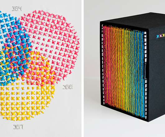
“XXXX Swatchbook” (2010-2016), 180 x 210 millimeters. In “ XXXX Swatchbook ,” Evelin Kasikov ( previously ) explores all of the variables of CMYK printing without a single drop of ink. Of course, my ‘print resolution’ is very low, about 3-4 lines per inch compared to 300 in print.”
Visit Website Castor & Pollux Web Design Since 2010, We have written brand stories, crafted brand identities and make them alive on the web. Visit Website The Silly Bunny Web Design A highly immersive and interactive digital experience that blurs the line between the real world and fairytale.
With the help of pedigreed Sonoma grape growers, the Wonderland Project was born in 2010 to celebrate California. Set of 6 Echo Printed Vintage French Linen Napkins by Pluck Collective $240 Linens are the perfect base to any holiday table setting. Each bottle is adorned with eye catching artwork commissioned by Cheyene Randall.
Inspired by blackletter elements and lithographic prints from the 1890s, this is a solid text face with modern proportions, clearly defined shapes and an angular physique. This was arguably the first transitional typeface: a bridge from designs modelled on handwritten letters to typefaces created specifically for the printing press.
Water Towers of Ireland, Kildalton, 2010 Photo: Jamie Young 1. Jamie Young’s extensive archive, “Water Towers of Ireland,” established in 2010, explores the history of these structures and their connection to various architectural eras and styles through photographs, drawings, maps, and narratives.
Design tip: Double-check that all of your logo’s color tones print properly. After all, we must consider the number of printing materials as well as the time and work required to produce them. Except for the decade that started in 2010, it was a trend in 1960, 1970, 1980, 1990, 2000, and 2020. Animated Logo. Retro Logos.
In collaboration with Vogue , Magnum Photos just launched a massive print sale with half of all proceeds being donated to the NAACP. All 6 x 6-inch prints are signed or estate-stamped, museum-quality, and available for $100. The Danish artist, Olafur Eliasson’s installation of a huge artificial sun in the Turbine Hall.
Founded in 2010, WE AND THE COLOR is an award-winning online magazine featuring the very best from various creative fields. Founded in 1986 as a printed publication, Design Week mostly transformed into an online publication in 2011. Creative Review has started in 1980 as a print magazine. WE AND THE COLOR. Design Week.
This is obviously outside the ranking, but WE AND THE COLOR is a great creative resource that was founded in 2010. In 1986, Design Week was created as a printed publication. Creative Review was originally a print magazine that started in 1980. WE AND THE COLOR. We would like to start this list off with our own publication.
Midcentury graphic design, which straddled the print and emerging digital worlds of its time, had technical restrictions that resulted in simpler, more abstract work. Social media accounts, digital ads, and apps add a new dimension to the world of storefronts, websites, and print. Burger King rebrand by Jones Knowles Ritchie.
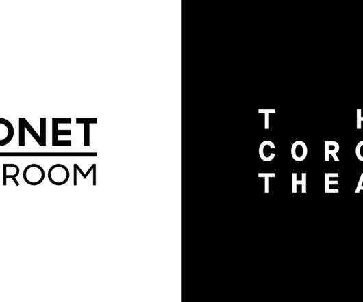
Established in 2010 as the Print Room, The Coronet Theatre presents a risk-taking, eclectic program of theatre, film, dance, music, poetry, and visual art in London, UK. The V&A's archive houses many of the original play-texts and printed collateral from The Coronet Theatre's past, and was a rich source of visual inspiration.
We organize all of the trending information in your field so you don't have to. Join 66,000+ users and stay up to date on the latest articles your peers are reading.
You know about us, now we want to get to know you!
Let's personalize your content
Let's get even more personalized
We recognize your account from another site in our network, please click 'Send Email' below to continue with verifying your account and setting a password.


Let's personalize your content